Designing a new Component
This page describes the process designers should follow when creating new components within Figma and what should be included with the final design (acceptance criteria).
Workflow for adding a new Component
- In the Figma Atlas Core library, create a new branch.
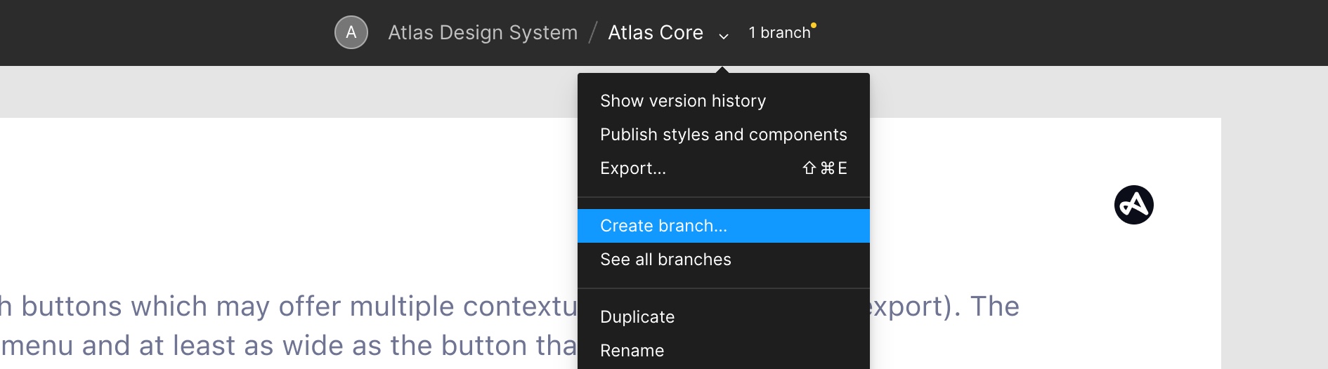
- Name your branches the following way:
[Jira Ticket Number]/component name. For example: ATLAS-15000/drag-card - Navigate to the related category page and create a new index card for the to be added component. The index card templates can be found in the Atlas Utilities library, or you can duplicate an existing component card.
- Make sure to name your layers and groups. All layer names, component names and variant names must be written in lowercase. In addition to a name, you should add a description for each component (note: don’t add a description for variants, the two are often confused). The description should look like this:
Component Name (variant1; variant2; variant3), for example: Drag Card (size; type; state) - Make sure to only use colours from the Core Library. In the image below, the colour
text-primaryhas been used to tint the label of the action menu component.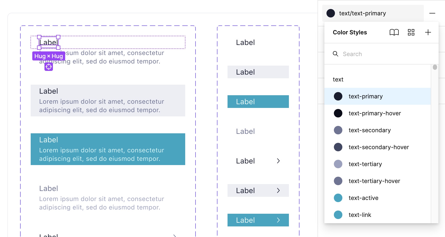
- Make sure to only use text styles from the library. In the image below,
text size 2(font size 14px) has been used for the title text in this component.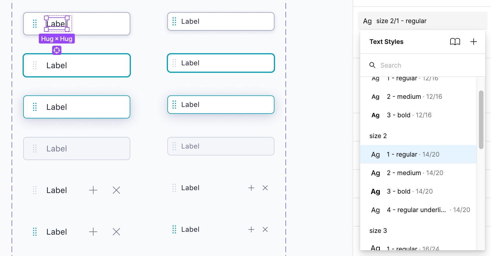
- Always use Figma auto-layout to ensure that all elements in the component scale and align correctly when the component instance is being resized. Auto-layout works very similar to the CSS flexbox model and further documentation how to use it correctly can be found here.
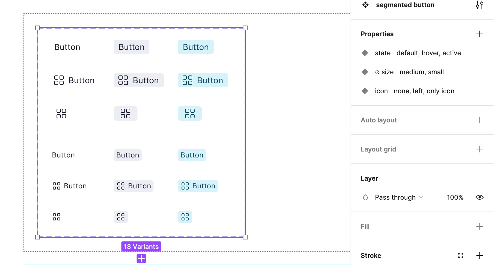
- If you require extra states for your component, you should make use of Figma component variants. Avoid creating separate components for things that could just be built as a variant. In the below image, you can see a typical variant setup for a segmented button. There are 3 variants (state, size, icon) with multiple options for each variant. Consider boolean variants when you just need a simple switch instead of multiple options per variant.
- Once you have created and organised the component with all of its variants, make sure you are adding additional examples (if required) about how to use the component, special edge-cases etc. to the component index card. This helps the developers that build the component to discover how the component will be used, as well as any edge cases or behaviours that the developers may need to consider. Document everything important in the right documentation sidebar. Make sure to update the status on the index card and add yourself as the last editor.
- Final testing - Make sure your component:
- uses system colors, system text styles and system effects only.
- follows the naming conventions and has a description.
- is resizable vertically and horizontally.
- resizes correctly when text is edited in a component instance.
- Once you have completed your component design and tested it: create a Pull Request in Figma. Always add a description to the Pull Request of what has been changed, introduced, etc. Review the list of changed components in the PR window (image below) and make sure you haven’t accidentally changed any component you didn’t want to change.
- Add Ivo Mynttinen and Vadym Grynchenko as mandatory Reviewers. Add any additional designer who might be working on something similar, you want to get feedback from, etc. to the list of reviewers.
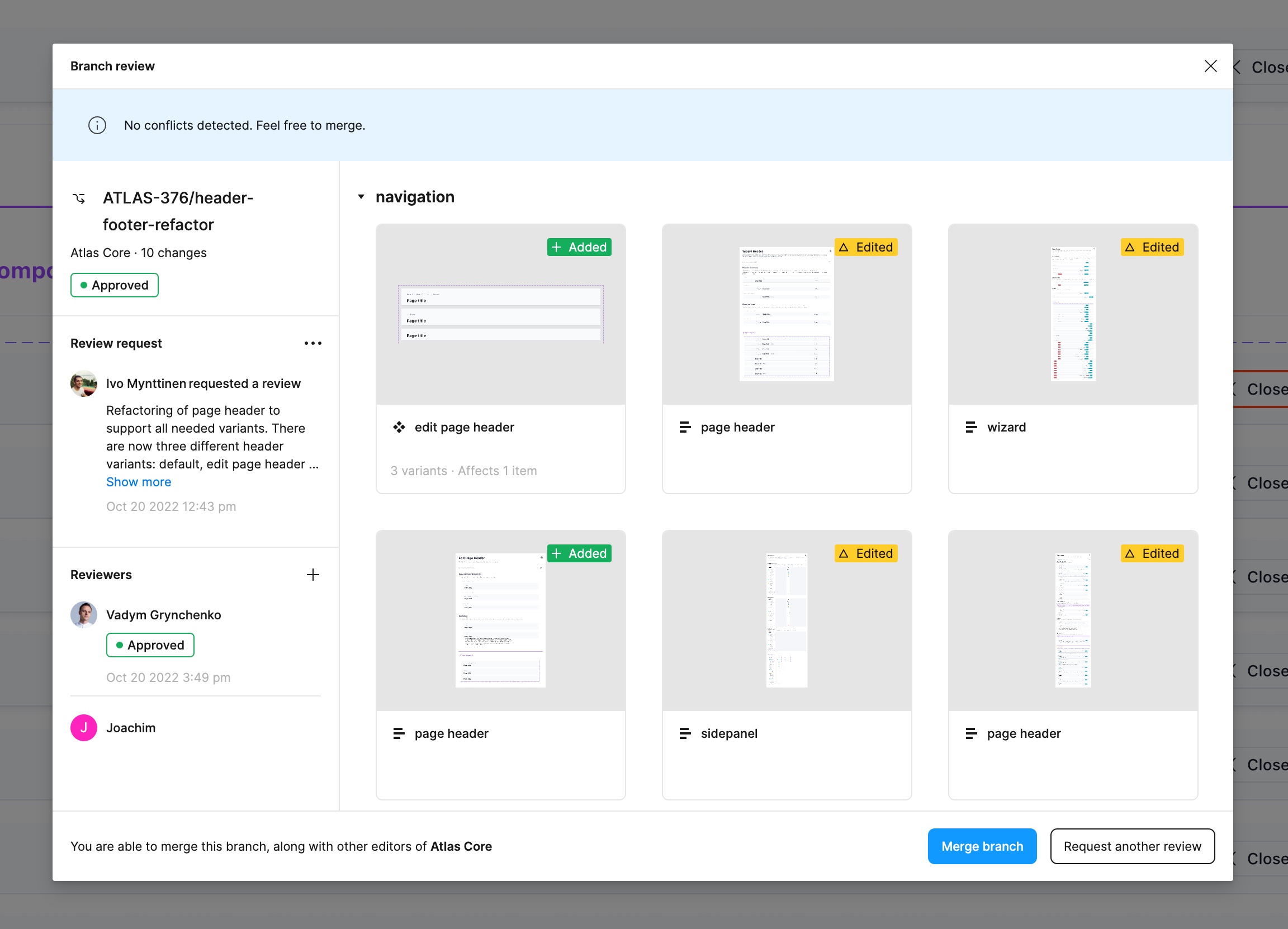
- Your branch needs to be peer-reviewed by at least one reviewer. Never self-merge any branches unless you’ve got approval from a designer from the Design System team.
- Once your Branch has been reviewed and approved, your component will be merged to the core library master branch and will be ready to be picked up by the developers. At this point, designers can start using the component!
- Once you have requested a review for your component, it’s time to write up some guidelines for how to use the component. This documentation will be added to the website to help designers best use your component. Have a look at some documentation for our other components to help get started. Make sure to hand these off in the Jira ticket for the epic of this component.