Contributing to the Component Library
The main UI building block for a frontend developer at Adjust is Atlas's component library. In this section, you will learn how to contribute to the Atlas components: development, documentation and pull request.
Overview
In order to successfully contribute to the Atlas components you should be familiar with ATLAS working process and follow some rules during your contribution.
ATLAS Boards
ATLAS team is using Jira boards to manage the working items, you are recommended to use following boards to update the working progress.
- Planning board
- Development board (daily meeting status)
Contribution workflow
Contribution workflow is a part of ATLAS team workflow, it helps ATLAS team acknowledge the progress of the tasks and offer the support to contributors if needed. Hence, the contributors are requested to follow this workflow
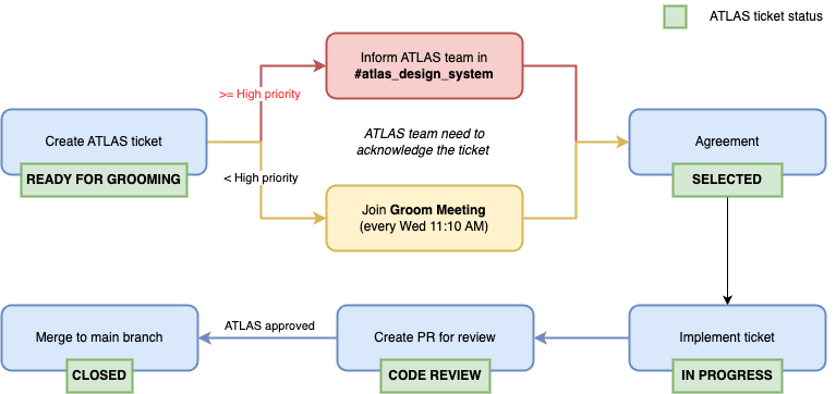
You can create a new ticket which you would like to contribute or take an existing item in ATLAS Board. And you are strongly recommended to communicate with ATLAS team before your starting via slack channel #atlas_design_team or our weekly meeting.
Groom Meeting is a weekly meeting to clarify the new tickets and estimate them. You are recommended to join this meeting to share with ATLAS team about your contribution and you can discuss with team if any concern about the implementation.
Setup Project
To start your development, you should setup ATLAS project locally.
Clone ATLAS repo
You need to first fork the Atlas repository from github:
git clone [your fork SSH/HTTPS]
cd atlas
Make sure to have a compatible Node.js and Bun version installed. You can find these under the engines key in the root package.json. Install Bun 1.3.5 (see .bun-version).
Authentication
To install and publish private NPM packages of the design system you have to be authenticated with the @adjust organisation.
Create a copy of .npmrc.template, fill in your personal access token and save the file as .npmrc.
If you are not sure what personal access token is please refer to Github tutorial.
Start development server
For a comprehensive list of useful scripts, please check our repos Readme section
To install all of the dependencies for the component library as well as the website package (this website) run:
bun install
For Cypress visual tests, install the binary once after dependencies:
bunx cypress install
To start the development server and watcher over the component library, run:
bun run start
If you use VSCode as your source-code editor, it's recommended to use the workspace configuration settings in .vscode/settings.template.json
Troubleshooting
Module not found: Error: Can't resolve '@adjust/components'
If you encounter the error Module not found: Error: Can't resolve '@adjust/components' when trying to start the development server, you can try this workaround solution:
-
In your terminal, navigate to the components package:
cd packages/components -
Build the components package:
bun run build -
Once the build is successful, navigate to the docusaurus package:
cd packages/docusaurus -
Start the development server:
bun run start
This ensures that the @adjust/components package is properly built and available for the docusaurus application to resolve and use.
Git Branch
masteris main branch and recommended to checkout for new changes.- The name branch should be named as ticket number (eg. FECORE-XXX)
Development
During your development, you should pay attention to following sections:
Design Token
You’re required to use design-tokens instead of hard-coded colors, sizes or spacing values.
Accessibility
At Adjust we aim to provide an accessible UI. Each component in the Atlas library must meet all accessibility requirements according to our accessibility guidelines.
Unit Tests
You’re recommended to write the unit test for your change. At the root directory, run:
bun run test
Package version
- Your change may be required to add a new package version in
components/src/package.json. - The version naming should be followed the version schema.
- And you also need to update @adjust/components dependency in docusaurus with new package version in
docusaurus/package.json.
Release note
Your change is required to update the Release Note (docusaurus/docs/components/release.md)
Documentation
You’re requested to contribute Component documentation when:
- Your change needs to provide some examples.
- Your change adds or updates the props of components.
Create new page (new component)
In case you are contributing a new component, you need to create a new page to Components section.
Please add MDX files describing the functionality of the new component in docusaurus/docs/components based on the component documentation template:
Link new documentation file to the sidebar:
- In
docusaurus/sidebars.jsonadd the path to your new documentation file inComponentsobject.
Edit existing page (existing component)
In case you are contributing an existing component, you need to add more or update the examples.
You're recommended to add examples for each component's feature to present information and the usage.
These examples contain the title, description of the feature's purpose, usage and code snippets for this example.
You can check the 📄 Component Documentation Template, Variants section to see how you can put examples of the new feature.
To keep readability, please follow the guideline below:
-
Add your example in alphabetical order.
-
Don't name the variant titles with the component name. E.g., If you add an example for the disabled variant of the Button component. As a title, use
Disabledinstead ofButton Disabled -
In some cases, using the prop name as the title is better as we describe what the prop is doing in the description. E.g.,
OnSortinginstead ofCallback for on sorting. -
Use warning tags for the props or features that will be deprecated before retiring them from the component.
E.g,
warningpropXwill soon be deprecated. Please use newpropYinstead. -
Use info tags for the props or features that cause some exceptional cases with other props.
E.g,
infoIf you use the
propXyou need also providepropYfor this feature. -
The description of the feature should include information on all use cases regarding this prop. E.g,
To disable a accordion item you need to add
isDisabledproperty to your item object. If you prefer to make all accordion items disabled, you can use thedisabledprop. -
Please don't keep other optional props in your example if they are not releated. E.g., If you add example of a
Disabledvariant for theButtoncomponentLive Editor<Button label="Click me!" size="small" disabled />ResultLoading...As
sizeprop is optional and not related; use instead:Live Editor<Button label="Click me!" disabled />ResultLoading... -
Please keep data as short as possible for the components that render a list like Table, Accordion, etc. If you don't need to show a long list of data in your example, you can use 2 or 3 items.
-
Don't add unneccessary wrappers to component example.
Live Editor<> <Button label="Click me!" size="small" disabled /> </>
ResultLoading...As in this example, we don't use multiple components in the render, use instead:
Live Editor<Button label="Click me!" disabled />ResultLoading...
Update prop table
If you need to add more or update props in Prop table. At the root project, run:
bun run gen-types
and you need to update the snapshot as well.
bun run test - u
Pull Request
Ready for review
Before creating a PR, you are recommended to follow the checklist:
- Lint style,
bun run --filter @adjust/components lint:styles🌸 - Unit tests are passed and updated the snapshot,
bun run test -u🌸 - The changes is well-documented.
- New props are added or updated in Prop Table.
- UX follows the design guidelines, used design-tokens instead of hard-coded colors, sizes or spacing values.
- UX follows the accessibility checklist.
- Package version are updated (both component and docusaurus) 🌸
- Release note is updated 🌸
🌸 they are mandatory check to help GitHub Actions run workflow successfully.
Create PR
- You’re required to create a new PR with ATLAS template and each ticket should have its own PR.
- You’re recommended to add screenshot or recording.
- If your ticket is high priority, please add label
priority review.
Release
Merging PR to the master branch automatically creates a new release of the component library. Make sure you follow the checklist provided here before merging the PR.
References
Definition of done for the new component
- ✅ Component UX follows the design guidelines
- ✅ Component uses design-tokens instead of hard-coded colors, sizes or spacing values
- ✅ Component follows the accessibility guidelines
- ✅ Component supports the css prop, if applicable
- ✅ Component is covered with unit tests and pipeline checks are green
- ✅ Component is well documented (including realistic, real-world examples)
- ✅ Component information is added under features section in release notes for the upcoming version
Tech stack design system website
The foundation of the design system website is a static site generator from Facebook called Docusaurus.
Deployment and hosting of the website is done via internal infrastructure. Our CI workflow generates a unique preview URL for every pull request.
The production documentation site is automatically updated when the PR is merged to the master branch.
Versioning schema
The component library follows the SemVer versioning scheme.
In brief, given a version number MAJOR.MINOR.PATCH we increment as such:
MAJORBreaking API changes.- Examples: dark-mode support is deprecated, the
iconOnlyproperty of the Button component was removed, the iconMegafonis now calledMegaphone
- Examples: dark-mode support is deprecated, the
MINORAdded functionality that is backward compatible.- Examples: a new component is introduced, additional icons are added to the Icon component, the ActionMenu component now support sub menus
PATCHBug fixes that are backward compatible.
CI/CD infrastructure
GitHub Actions is used as to run tests and other workflows on every pull request. All workflows can be found here.