Tooltip
Tooltips can appear on hover, focus or click and should display very short (single-line) contextual descriptions of interface elements. You may also show Tooltips when button labels are absent (icon-only) or truncated.
Tooltips should be used to add context or extra information to a specific action in order to help the user understand the action they are performing. Tooltips should not be used for every action, but rather sparingly for more complicated or difficult to understand actions. Also all Icon Buttons should have a tooltip, since they do not have any text to help describe the action.
Example
<Tooltip content="Peek-a-boo!">
  <Button label="Hover me" />
</Tooltip>
Usage Rules
Do:
- Put helpful extra information in Tooltips
- Keep text short and direct
- Use Tooltips to label unlabled icons
- Use Tooltips to expand on truncated text
Don’t:
- Put unnecessary information in Tooltips
- Reiterate text from where the tooltip originates
- Use Tooltips as the only place to display valuable information to the user
Variants
Close programmatically
You can programmatically close the tooltip by using the close prop. To be informed of the visibility state of the tooltip, you can use the onTooltipToggle callback.
If the onTooltipToggle prop is provided, Tooltip will stay open while the close prop value is not true.
function TooltipExample() {
  const [isClosed, setIsClosed] = useState(false);

  const onTooltipToggle = (isTooltipOpen) => {
    if (isTooltipOpen) {
      setIsClosed(false);
    }
  };
  return (
    <>
      <Button label="Close tooltip" onClick={() => setIsClosed(true)} />
      <Tooltip
        content="Peek-a-boo!"
        onTooltipToggle={onTooltipToggle}
        close={isClosed}
      >
        <Button label="Hover me" />
      </Tooltip>
    </>
  );
}
Customized
It's possible to render any valid React component as the Tooltip's content.
<Tooltip
  content={
    <div style={{ maxWidth: 300 }}>
      This is a rich tooltip. You can create annotations or even tables in here.
      <b>Any</b> HTML tags or React components are supported.
      <ul style={{ paddingTop: Spacing10 }}>
        <li>Tooltip for advice</li>
        <li>Tooltip for attention</li>
      </ul>
    </div>
  }
>
  <Button label="Customized tooltip" />
</Tooltip>
Customized with Icon
It's possible to render any valid React component as the Tooltip's content.
<Tooltip
  content={
    <div style={{ maxWidth: 300 }}>
      <div>
        Default colored Check <Icon name="Check" />
        Red Check <Icon name="Check" color="red" />
      </div>
    </div>
  }
>
  <Icon name="Check" />
</Tooltip>
Delayed
Delays are used to ensure the reader is actually interested in the element, and not accidentally displaying a tooltip when navigating somewhere else.
<Tooltip content="This tooltip appears slightly delayed" position="top" delay>
  <Button label="Slow tooltip" />
</Tooltip>
Display
It is possible to ommit a tooltip whenever necessary in a easy way. When the prop display is false, it will render directly the children passed to it. The default value is true.
<>
  <Tooltip content="This tooltip will be shown">
    <Button label="With Tooltip" />
  </Tooltip>

  <Tooltip content="This tooltip will not be shown" display={false}>
    <Button label="Without Tooltip" />
  </Tooltip>
</>
Disabled Wrapper
We have a wrapper to show the tooltip for disabled children, which can be accessed by disabledWrapper.
<>
  <Tooltip content="This tooltip appears for disabled" disabledWrapper>
    <Button label="Slow tooltip" disabled />
  </Tooltip>
  <Tooltip content="This tooltip does not appear">
    <Button label="Slow tooltip" disabled />
  </Tooltip>
</>
Also, if you want to use double Tooltip for special cases. then you can also use the disabledWrapper prop.
Here is an example for the Copy to Clipboard, which itself uses the tooltip internally and we are adding an additional layor of Tooltip.
<Tooltip content="Peek-a-boo!" disabledWrapper>
  <CopyToClipboard
    text="Sample text"
    notificationMessage="Copied!"
  >
    <IconButton iconName="Clipboard" aria-label="copy" />
  </CopyToClipboard>
</Tooltip>
Offset
Offset can be used for fine positioning of the tooltip, sometimes needed in niche cases, it has a default value of [0, 10], 0 is equal to centred, 10 is distance tooltip appears from reference.
This should only be used for small refinements.
<>
  <Tooltip
    content="This tooltip appears 40 to the right"
    position="right"
    offset={[0, 40]}
  >
    <Button label="Offset Right" />
  </Tooltip>

  <Tooltip
    content="This tooltip appears 100 to the right and 40 down"
    position="bottom"
    offset={[100, 40]}
  >
    <Button label="Offset Bottom" />
  </Tooltip>
</>
Position
Readability is paramount. Choose the right position to make sure your Tooltip doesn’t cover anything important. In case there is no enough space on the screen, the Tooltip will be auto-positioned.
<>
  <Tooltip content="Heya! Have a nice day :)" position="top">
    <Button label="Top" />
  </Tooltip>

  <Tooltip content="Heya! Have a nice day :)" position="right">
    <Button label="Right" />
  </Tooltip>

  <Tooltip content="Heya! Have a nice day :)" position="bottom">
    <Button label="Bottom" />
  </Tooltip>

  <Tooltip content="Heya! Have a nice day :)" position="left">
    <Button label="Left" />
  </Tooltip>
</>
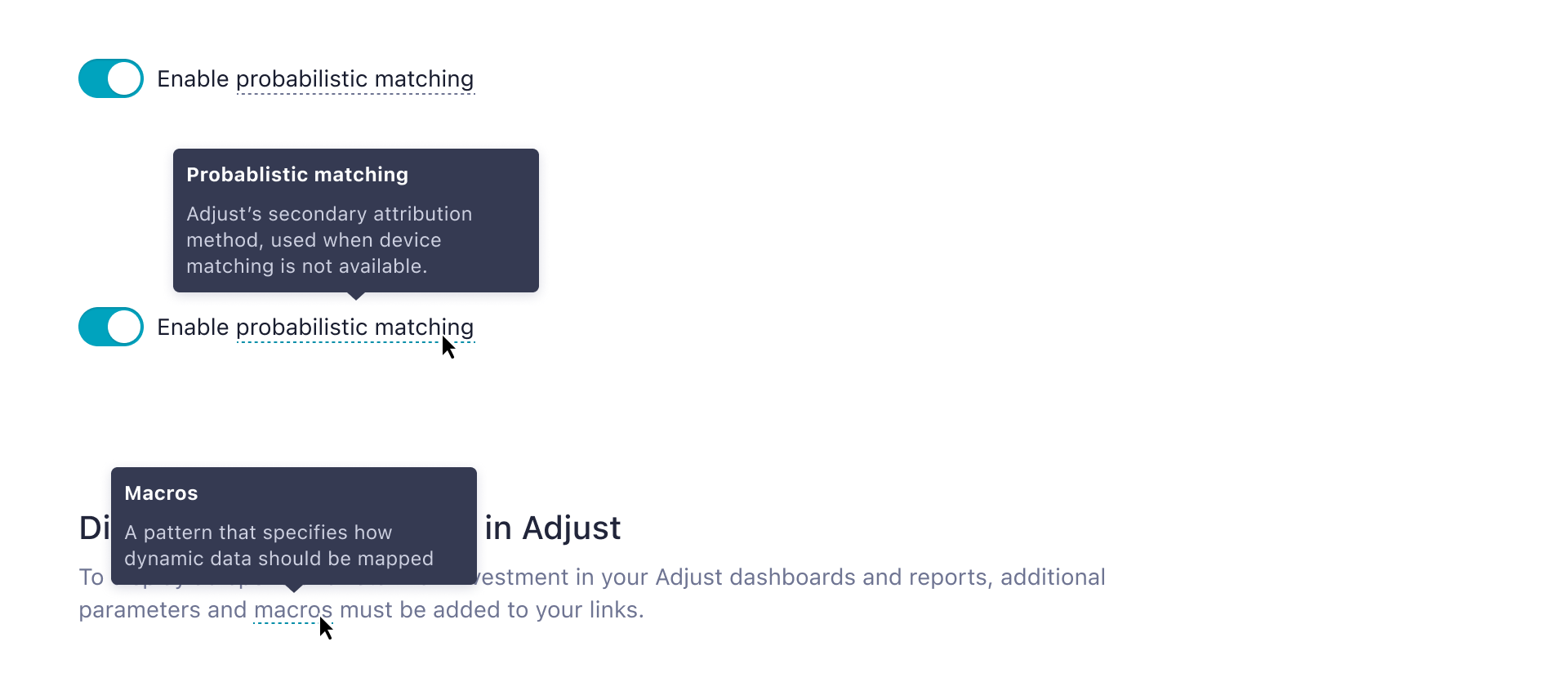
Definition Tooltips
Definition tooltips are a tooltip design pattern used to provide additional help, or to explain complex technical terms. It may be used on labels, embedded in paragraph text, or in compact spaces like table headers.
Best Practices
- Use on labels where an additional info icon would clutter the UI
- Use on proper nouns, technical terms, or acronyms with two letters or more
- Do not use a definition tooltip on words with fewer than two letters
Props
| Name | Type | Default |
|---|---|---|
children * The trigger element. |
| — |
content * The content of the tooltip can either be pure text or any rich content wrapped in a React component |
| — |
position The position of the tooltip |
| "top" |
offset Allows you to specify finer positioning of the tooltip |
| "[0, 10]" |
zIndex Use this prop to increase z-index on message tooltip |
| — |
delay Delay tooltip visibility |
| false |
display Defines if the tooltip should be rendered, not influencing on the rendering of the content
wrapped by it |
| true |
id Native HTML attribute: Link .
Internally, this component uses a random id. We use it to associate an input with a label element.
As the random id might break snapshot tests it can be overridden by setting an explicit id. |
| — |
disabledWrapper A warapper for disabled Button |
| — |
close Allows you to close the tooltip |
| false |
onTooltipToggle The callback to inform the parent component with the tooltip visibility state |
| — |
data-{foo} Data attributes can be used by testing libraries to retrieve components or assert their existence |
| — |
| * - the prop is required. |