Grid System
The Atlas Grid system is a fully responsive, robust, 12 column layout system with five default breakpoints. It’s fundamental to everything we design, and the geometric foundation of all high-level layouts.
Glossary
Columns
There are 12 columns in the responsive grid system. Column widths change with the size of the grid.
Gutters
Gutters are the gaps between the columns. Gutter widths are fixed values (16px, 24px, etc.) based on breakpoints.
Grid margins
Grid margins are the outer margins of the grid. They can be the same width as the gutters or greater.
Layout regions
Areas of the layout that contain the content. Layout regions can span over any number of columns and resize with the grid. Layout components can be used as a region, such as Tile and Panel.
Grid Types
Fluid

The fluid layout does not impose any width restrictions to page containers, so elements expand across the screen to fill all available space. By default the grid will make use of fluid width columns. It will calculate margins and gutters first, then the column width will adjust to fill any remaining space.
Use fluid grid layouts for any type of dashboards with multiple Panels, large data tables, or large lists of structured content.
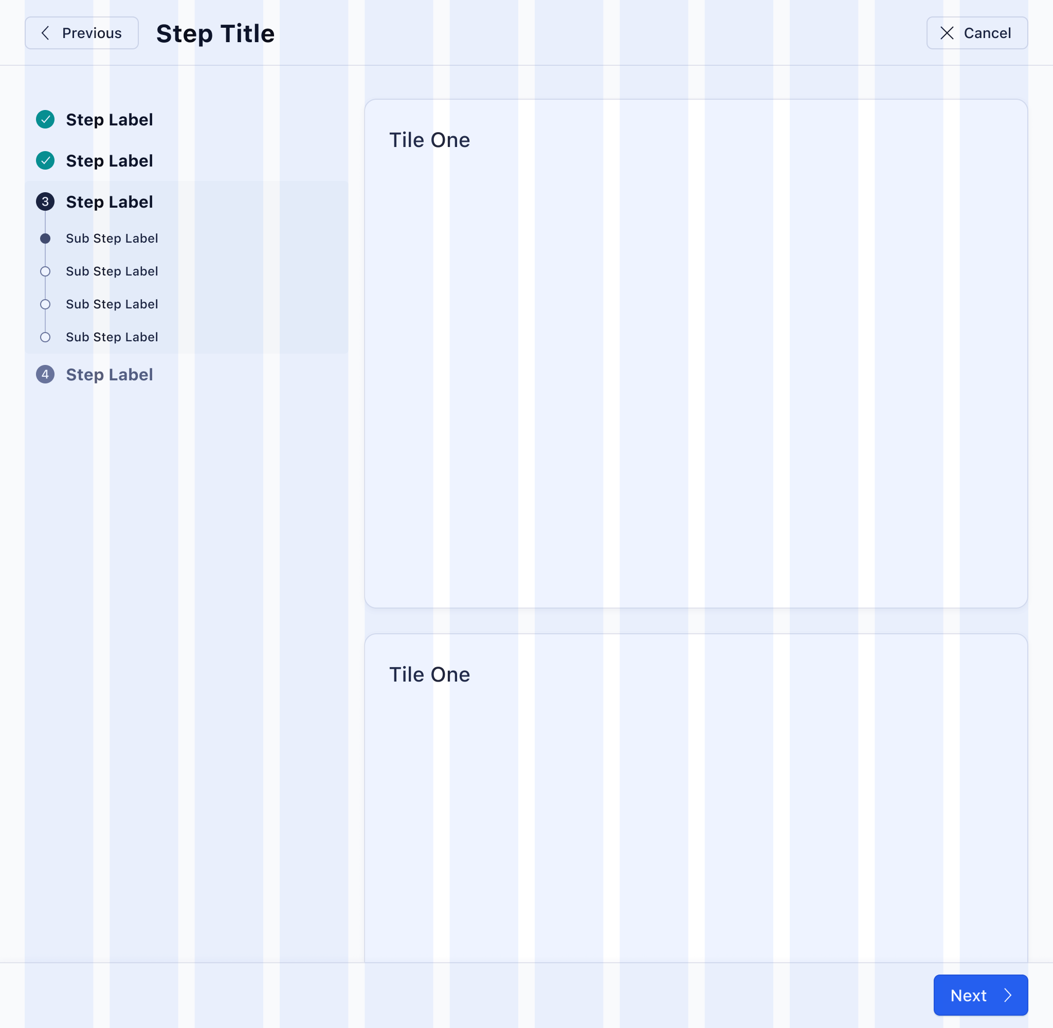
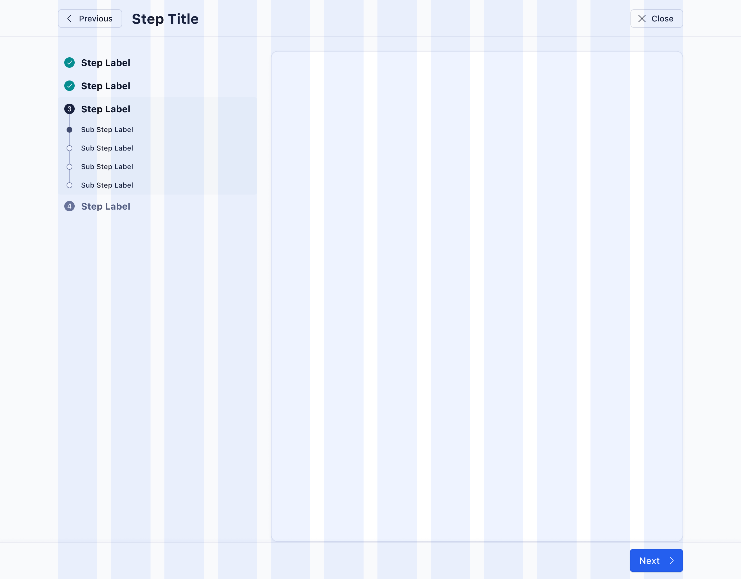
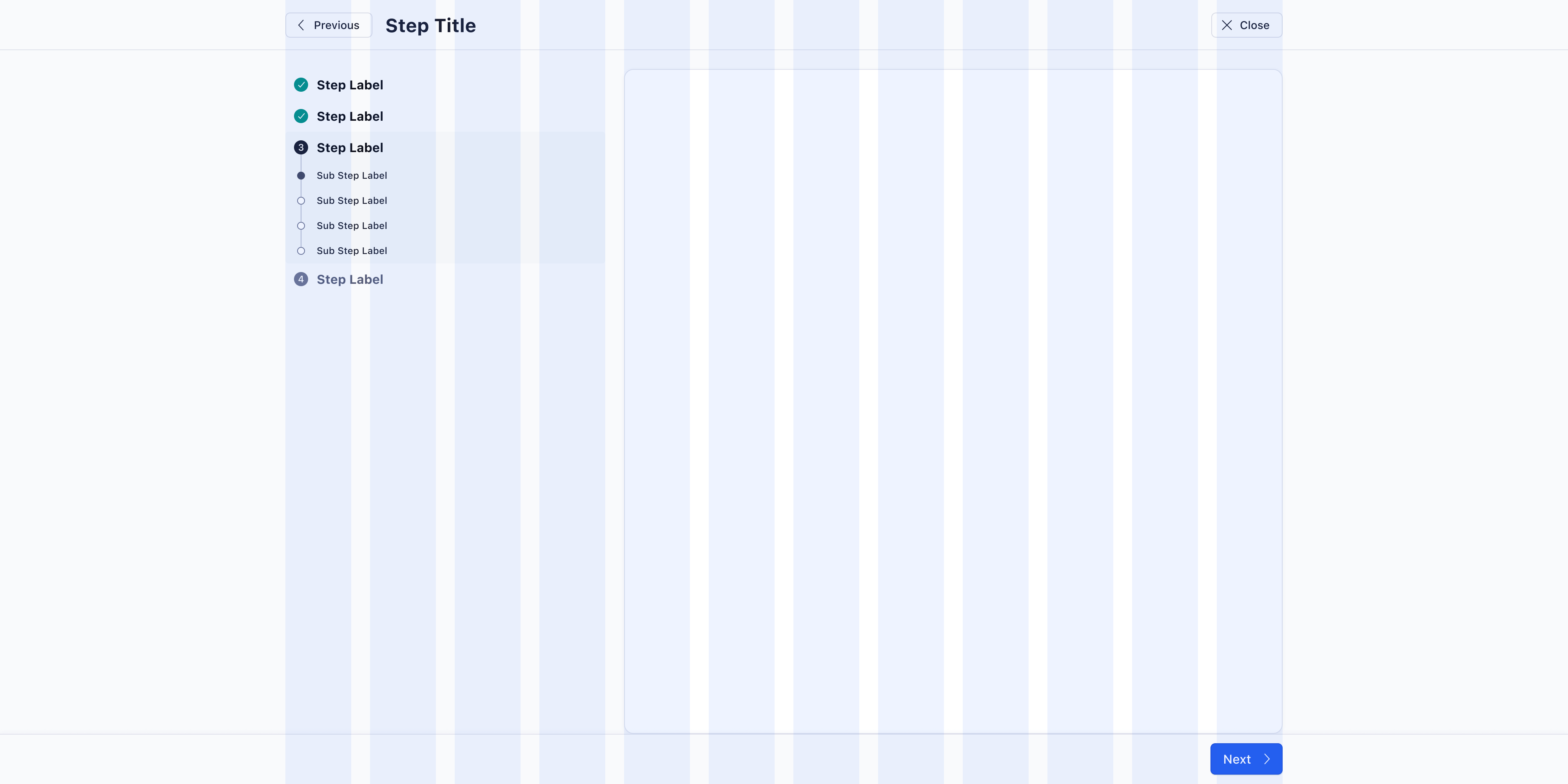
Fixed

To prevent the grid from scaling, a maximum page container width can be set. At that point the grid will become fixed, with known values for column size. Fixed grids are always centered and the outer margin grows/shrinks when the window is resized.
Use fixed grid layouts for large amounts of text, linear tasks, and forms.
Breakpoints
Breakpoints allow for the layout to change on different screen sizes, so that the experience is always optimised for the device and browser width the user’s viewing it on. Breakpoints are defined as min-width attributes. This means that screen sizes in between two defined breakpoint dimensions will inherit all dimensions of the breakpoint of smaller size. Column widths are fluid and equate to 8.33% width of the grid.
| Breakpoint | Min. Width | Gutters | Margin Left/Right | Width Fluid | Width Fixed |
|---|---|---|---|---|---|
| x-small | - | 8px | 16px | 100% | 100% |
| small | 480px | 12px | 16px | 100% | 100% |
| medium | 720px | 16px | 24px | 100% | 100% |
| large | 1200px | 24px | auto | 100% | 1080px |
| x-large | 1400px | 24px | auto | 100% | 1272px |
Responsive Gutters
The gutter width depends on the current breakpoint. This allows the grid to maintain a visual balance on larger and smaller viewports.
Margins

Grid margins are the outer margins of the grid layout. Margins are turned on by default, but are totally optional, except for fixed grid layouts (where the margin always equals window width - 1076px / 2). Do not use margins, when the grid layout should go from edge to edge, which often applies to nested grids.
Layout Regions

Layout regions are regions defined by the designer and allow for responsive layouts. Widths are defined by the number of columns they span at each breakpoint, which allows for layouts to change and optimize for any screen size. The margin between rows should always match the current gutter width (changes based on breakpoints). Complex responsive designs should always be specced out for all breakpoints, either with separate designs, or in written form for the developers to apply the correct column spans to regions.
Layout regions do not have any internal spacing, but need to comply with our spacing guidelines. At minimum, they are equal in height to the components composed within them.
Columns
Layout regions can span any number of columns and are separated by the grid gutter. Layouts can change at any of the designated breakpoints.
The page content does not always need to span across exactly 12 columns; it can occupy a smaller region in the center of the page. When using offset columns, consider using the fixed grid variant instead.
Fixed Elements
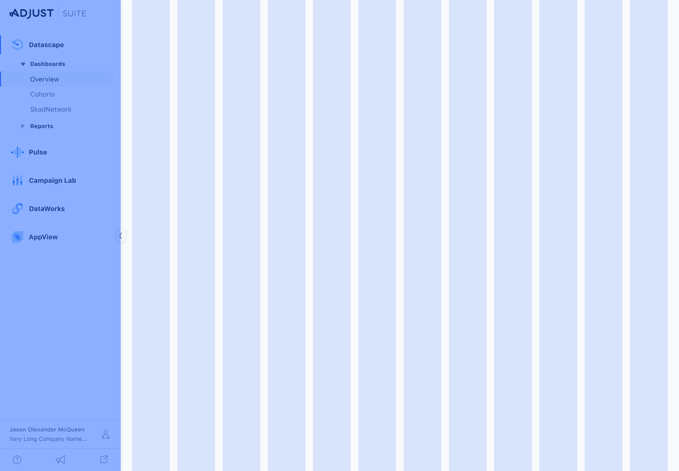
Fixed Elements, such as the sidebar navigation will offset the grid by the width of the component. The responsive grid typically fills 100% of the viewport. When a fixed element is present, the grid fills 100%, minus the width of the fixed component. For example, on a screen with a collapsed left sidebar, the responsive grid will be 100% - 72 px, with the offset on the left to account for the sidebar navigation panel.
Best Practices
- Keep layouts simple and prevent extensive grid nesting (maximum nesting should be 3 levels).
- Maximum line length should span up to eight columns, which is the ideal size for all content types. Do not go over this size for normal text.
- Don’t overuse the grid: layout regions should be the only elements that align to grid columns, while the content within layout regions can be, but doesn’t have to be aligned to columns.
Examples
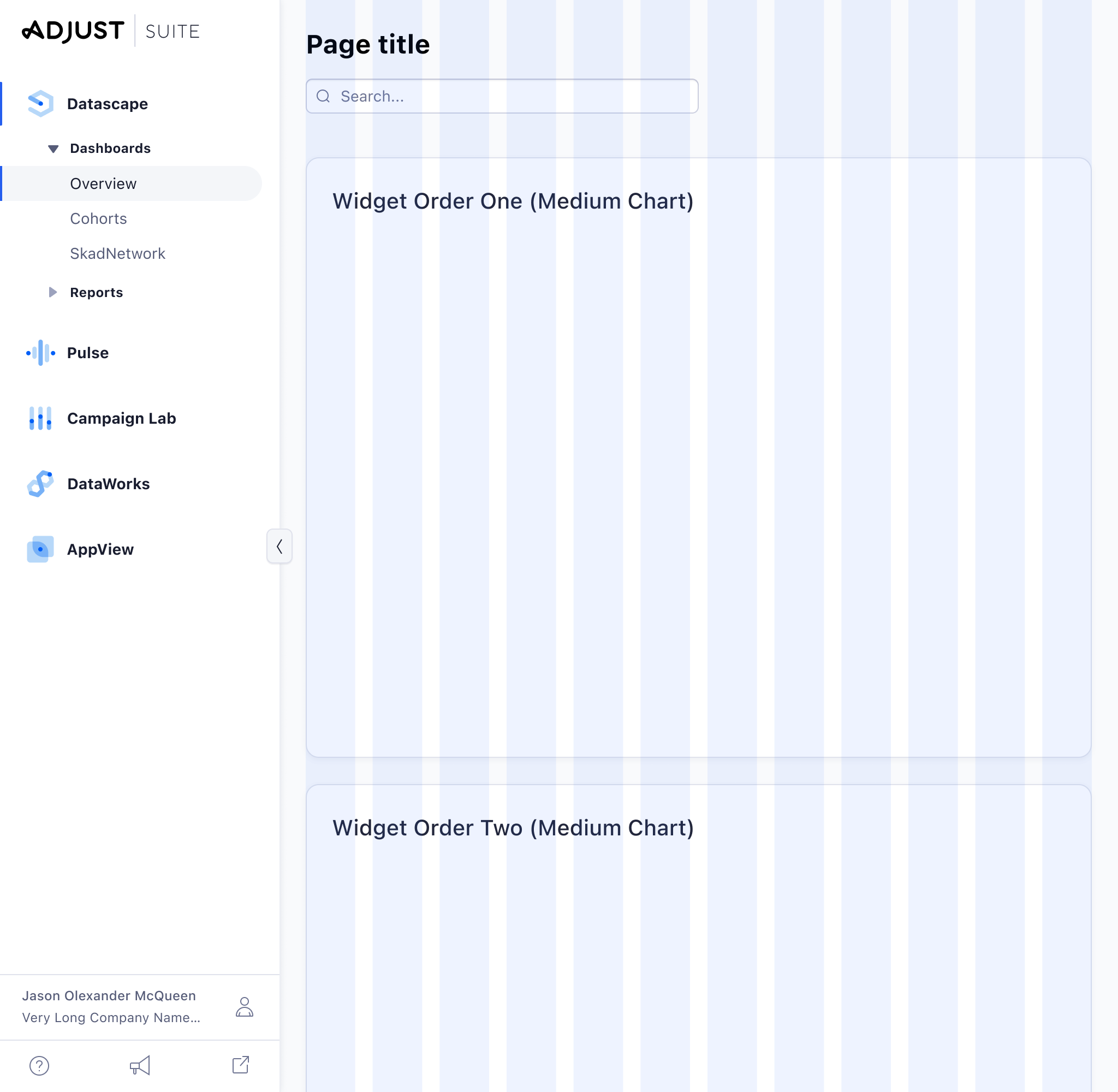
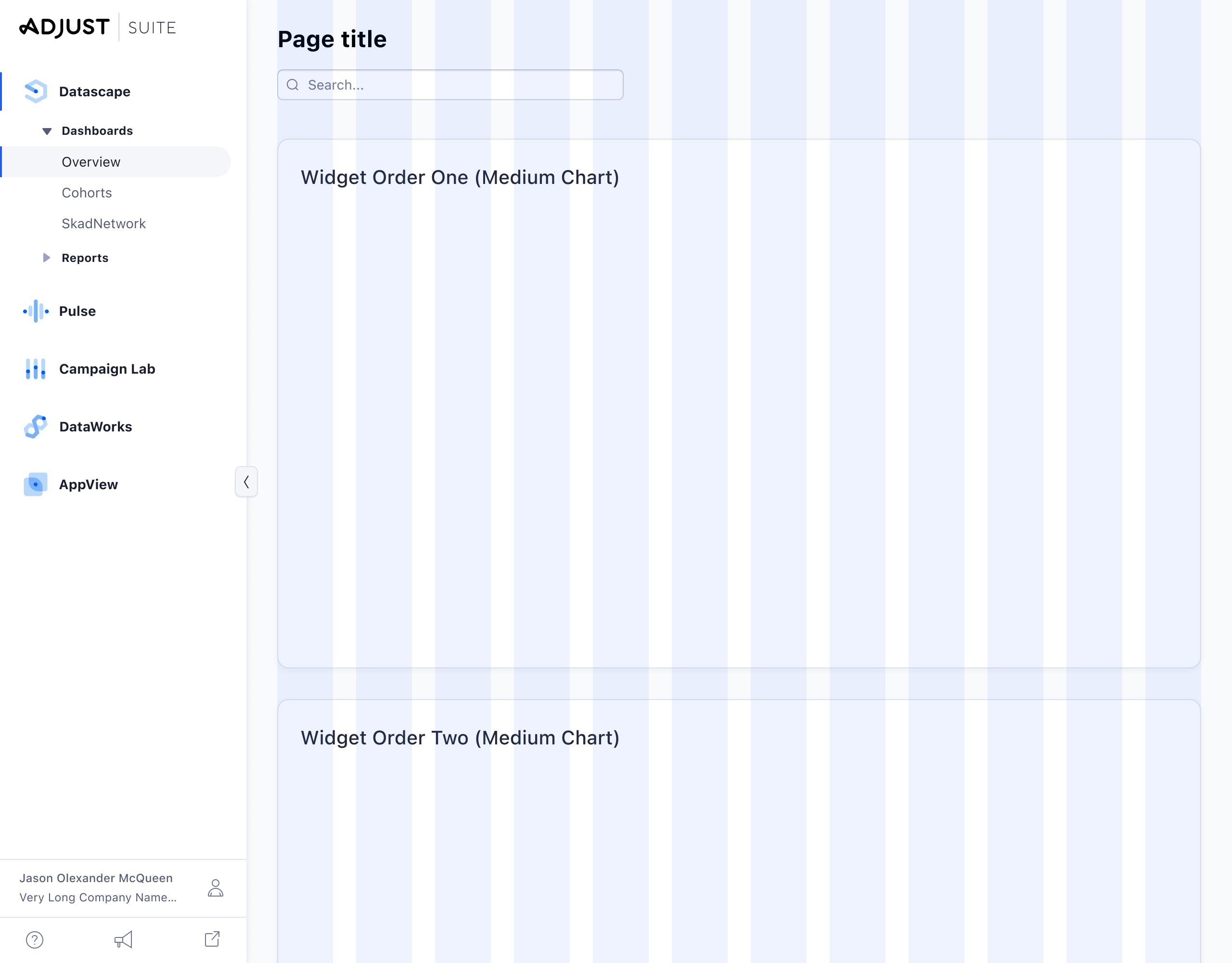
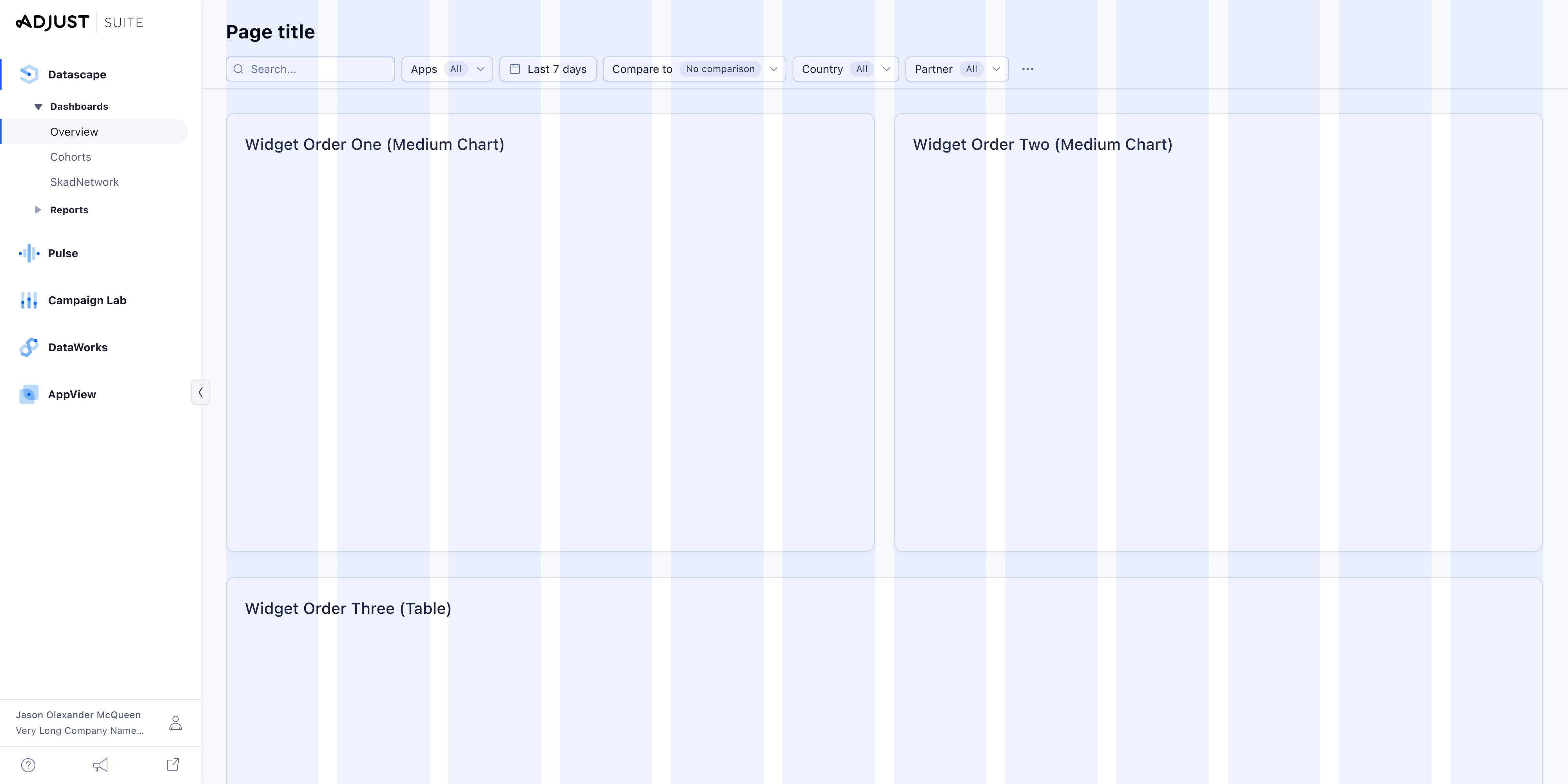
Fluid Grid applied to a responsive Dashboard
Fixed grid used on a Wizard