Spacing
Consistent and precise spacing produces visual balance and helps users to scan the UI. It shows care for detail and contributes greatly to the perceived quality of a product.
Purpose & Principles
Well-balanced layouts with a consistent yet limited scale of margins and paddings effectively reduce visual noise. Users end up less distracted and may be able to focus better while using the UI. As a welcomed side-effect, this also helps to amplify the perceived quality of a product — which may ultimately lead to increased trust by the user and customer.
As a principle, Atlas does not come with a set of strict spacing rules, e.g. by defining fixed spacings between certain components. While we aim for precision by always applying the Spacing Scale, we also want to allow for flexibility.
The following guidelines will help designers and developers to chose suitable spacings for individual layout problems.
The Grid
Spacing and Alignment
At the very base of its spacing system, Atlas uses an even grid for alignment. In most cases the space between components is a multiple of 8px. When you need higher precision, use multiples of 4px.
Constrained Sizing
The same applies to any constrained sizes. For any fixed, minimum or maximum value for width and height, use multiples of 8px. When you need higher precision, use multiples of 4px.
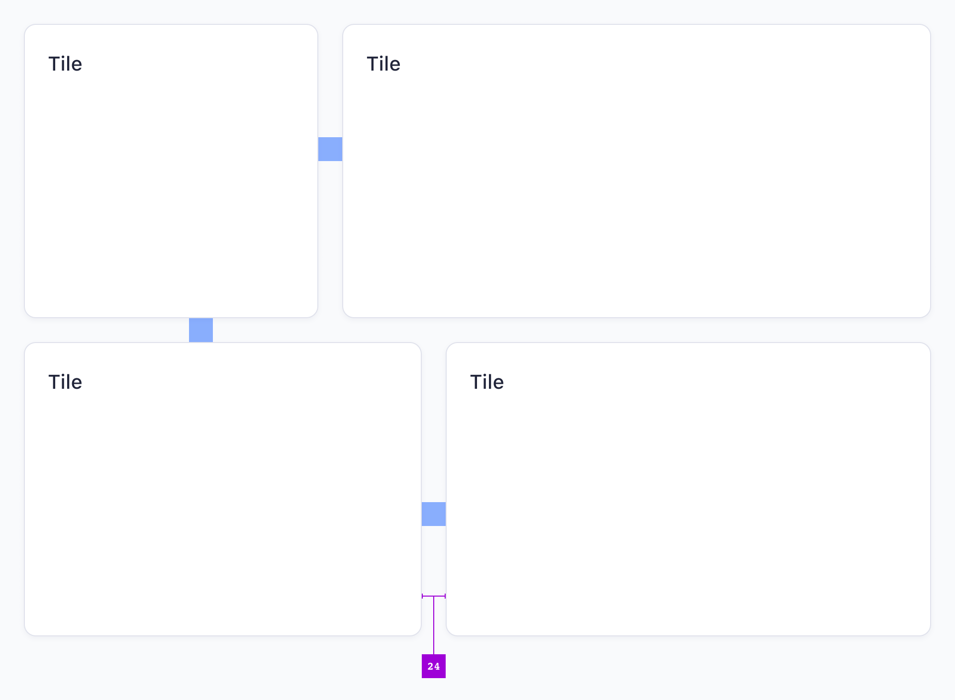
Fluid Sizing
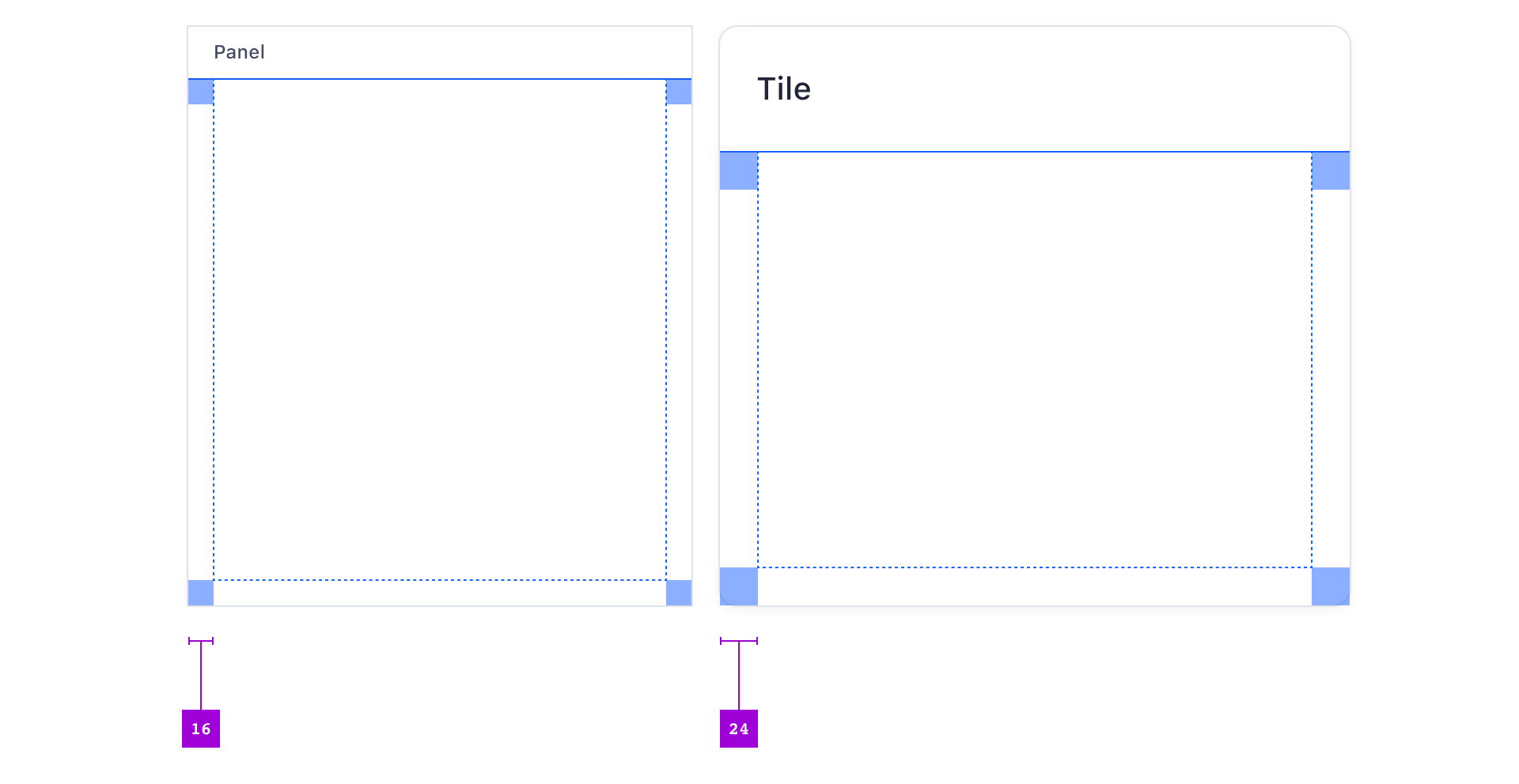
Some parts of a Page — usually container elements like Panels and Tiles — are flexible in width and height. They respond to the dimensions of the viewport 1. You cannot restrict this to the underlying grid but you must always preserve correct spacings in between components 2.

Vertical Rhythm
You cannot fully control all widths due to fluid layouts but you have good control over the vertical axis. As a result, all heights and vertical margins always add up to match the 4px grid. This helps a lot with alignment, especially when dealing with multiple layout columns.
- Every line height for every bit of text is a multiple of 4px.
- Every vertical margin or padding is ideally a multiple of 8px and sometimes a multiple of 4px.
- Every fixed height is ideally a multiple of 8px and sometimes a multiple of 4px.
Dealing with Borders
To not interfere with the vertical rhythm, Atlas has rules for border placement:
- Any 1px border is set to the inside of an object’s boundaries. 1
- Padding and margin are always measured from object boundaries — borders are never counted in.
- We rarely use 2px borders but when we do, we set them to center. 2

You cannot change border positioning in CSS the same way layout software like Sketch can do. CSS borders are always outside of an element ("outset"). However, because it's important that a coded component's height is 100% correct so that it aligns with the 4px grid, we took the effort to reproduce inset borders. This is achieved by the adapt-padding SASS function.
Using this approach, coded components exactly match the symbols in Sketch
Spacing Guidelines
The Spacing Scale
Analogous to the Type- and Color Scales, Atlas’ spacing values are defined via the Spacing Scale and encoded in Atlas’ Design Tokens. For any margins or paddings, you must not use spacing values other than these in the scale. The Spacing Scale is an intended restriction for the sake of consistency.

While designers might mostly use the pixel values directly, developers might refer to the token names, eg. s-40 (as in 4 × 8px = 32px) or s-25 (as in 2.5 × 8px = 20px).
How to Chose Spacing

To make objects appear related, use less spacing. To logically separate objects, increase spacing. Generally you can use less spacing between smaller components.

If you compose a very dense UI, you can decrease spacing to save space. The opposite is also true — a very simple page like a single login form on a large screen should have generous white space.
Default Spacing
In order to arrive at a truly modular system, components are generally not aware of their surroundings. This means while spacing is already specified in the scope of the encapsulating component, you can choose the spacing outside of components.
As a rule of thumb, the smaller the component the less space you can reserve around it, the larger the more. You must not use any spacing smaller than 4px (s-5).
The following examples illustrate some reasonable defaults:
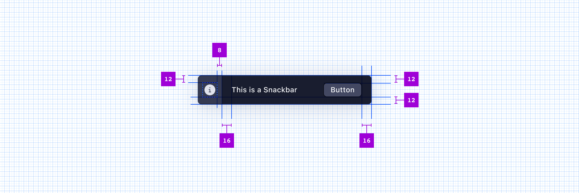
Margin Between Buttons

Margin Between Icons & Text Labels, Small Components
![]()
Margin Between Form Elements

Padding Inside Tiles, Panels
Margin Between Tiles
Exceptions
Very Large or Small Sizes
In certain situations, you might want to modify spacing — even inside components:
- If a component is very small, you may want to reduce default paddings to fit all content.
- If a component is very large, you may want to increase default paddings and margins to add more space and reduce visual complexity.

The example show a Tile Header and Body appear to have too much padding and the Title might appear too large. In scenarios like this you are free to compose the Tile so it suits your problem — but you must stick to the typographic scale and spacing system.
A simple guideline could be that if you see yourself making more than e.g. three modifications per component or if you need to modify a larger number of components per page, you should consult the Atlas Team to request a new component.
Vertical Centering

When text is vertically centered inside a component, the top and bottom spacing is allowed to be off-scale.
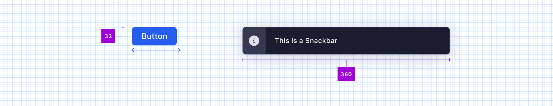
Width Determined by Text

For several components the length of text determines their size- For example, a Button’s width would depend on its label text. While the space between such components is always on-grid, the components boundaries do not always align to the grid — which is perfectly fine.
Fluid Resizing
Similar to the exception above, components that resize with the viewport will most often deviate from the underlying grid. This is also valid as long as you keep all other spacing and padding on-grid. (See Fluid Sizing above for illustration).