Tile
Tiles group similar concepts, tasks or data which directs the user’s focus on the most important subject of a page. Unlike Panels, a Tile may be resizeable and/or draggable.
Purpose
Tiles either represent screen areas to customize and interact with (eg. a chart) or important, logically grouped bits of information (eg. a grid overview of recorded apps). If you are unsure whether to use a Tile or a Panel, have a look at the comparison table.
As a rule of thumb, use Tiles to present the parts which have the highest priority for the user, the main subjects of any given page.
Anatomy
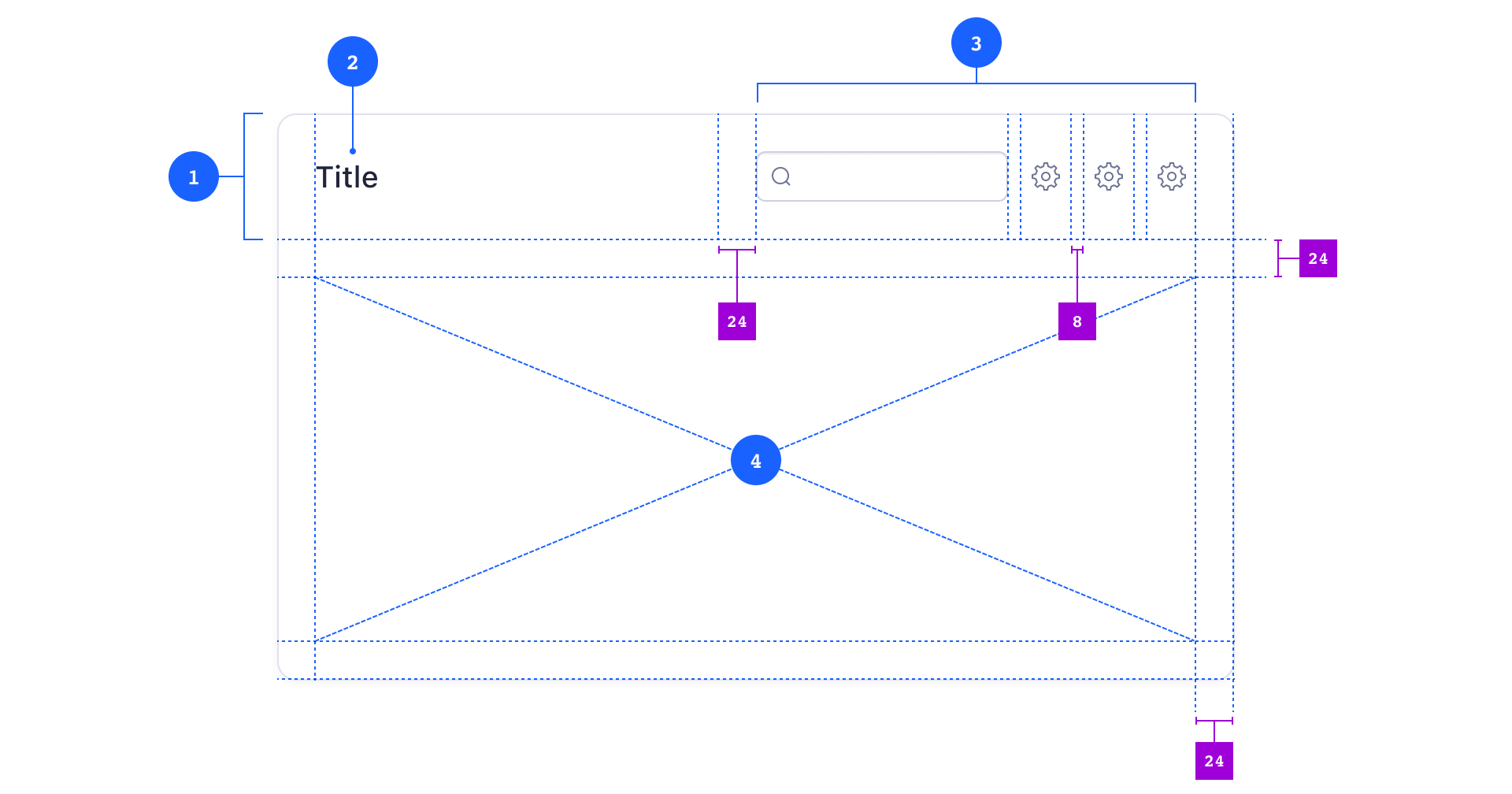
Composition
- 1 Tile Header (optional)
- 2 Tile Title (optional)
- 3 Tile Actions (optional)
- <Input type="search"> (optional)
- <IconButton> (optional)
- 4 TileBody (required)
Tiles consist of at least a Tile Body and may have a single Tile Header. A TileHeader may contain a Tile Title and a Tile Actions section.
All components inside Tile Actions are right-aligned and have a standard vertical spacing of 8px | s-10. The Tile Body has a standard padding of 24px | s-30.
Child Componenents
You can put pretty much every other component inside a Tile but you must not nest Tiles. For further segmentation, you can place Panels inside Tiles.
When you lay out the content inside Tiles, make sure you learn about Atlas’s spacing system first.
Variants
Tiles may be set to draggable and/or resizeable (see Behavior on this page for more information). If you like to see different Tile compositions, have a look at the examples further down.
Usage
Like their real-world counterparts, Tiles always have an even joint space. By default, this is space-30 (24px).
Make sure you always place Tiles against a contrast background — that’s usually a Panel, set to the contrast variant.

You can arrange Tiles in several different layouts and all of them have different qualities to suit different design- or user objectives.
Grid Layout

An even grid of Tiles is best suited to display a set of evenly important objects. This could be an overview page of all recorded apps. The default space between tiles is s-30 (24px), the minimum space is s-10 (8px).

Use rhythmic Tile layouts to create hierarchy where larger Tiles may be perceived as more important than smaller ones. The layout pictured above may also be the result of a user-customized layout, eg. a dashboard.
Single Colum Layout

You can also create single column layouts with wide but vertically condensed Tiles. Such layouts may be useful to display sets of data which might be too complex for a simple table. Depending on the overall visual complexity, you might decrease the space between Tiles to s-20 (16px) or even s-10 (8px).
To learn more about structuring a Page with Tiles, see the Page pattern.
Behavior
Content and Size

By default, a Tile is always as high as its content. The width of a Tile is limited by its parent element — this could be an invisible layout box 5 or the Page itself.

If you create even grids of evenly important Tiles, all Tiles should arrive at the same height. This is the height of the Tile with the most content 6.

Unlike Panels, Tiles usually do not resize with the viewport. Since they always sit inside (contrast) Panels, the Panels will scroll instead.
User-Resize

Tiles can be both draggable and resizeable to give users the option to customize layouts (eg. charts in Data Canvas).
User-Position
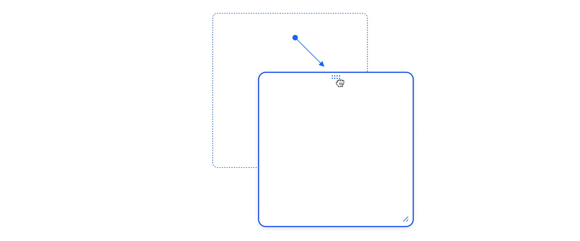
Tiles can be draggable to give users the option to change the order of Tiles inside a layout.
Other Actions
Tiles may contain a Tile Actions section with several Buttons or form elements (eg. Search Input, Checkbox, …). These controls are contextual and must not affect any objects outside of the scope of their parent Tile.

Examples
Tile with App Selection List
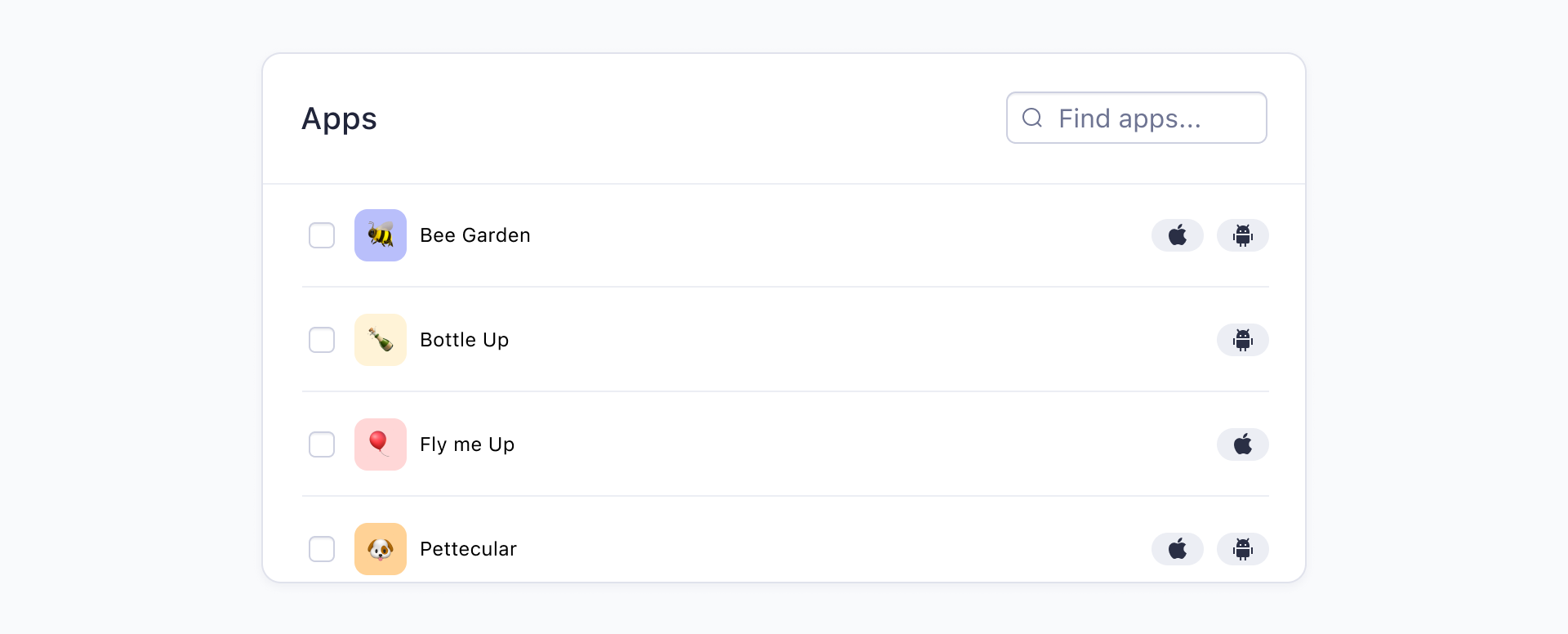
A searchable Tile with a scrollable Panel right after the Tile Header. Inside the Panel is a list of selectable rows. This layout might be useful to let the user select a number of apps, eg. to create a new data set.
Tile with Chart
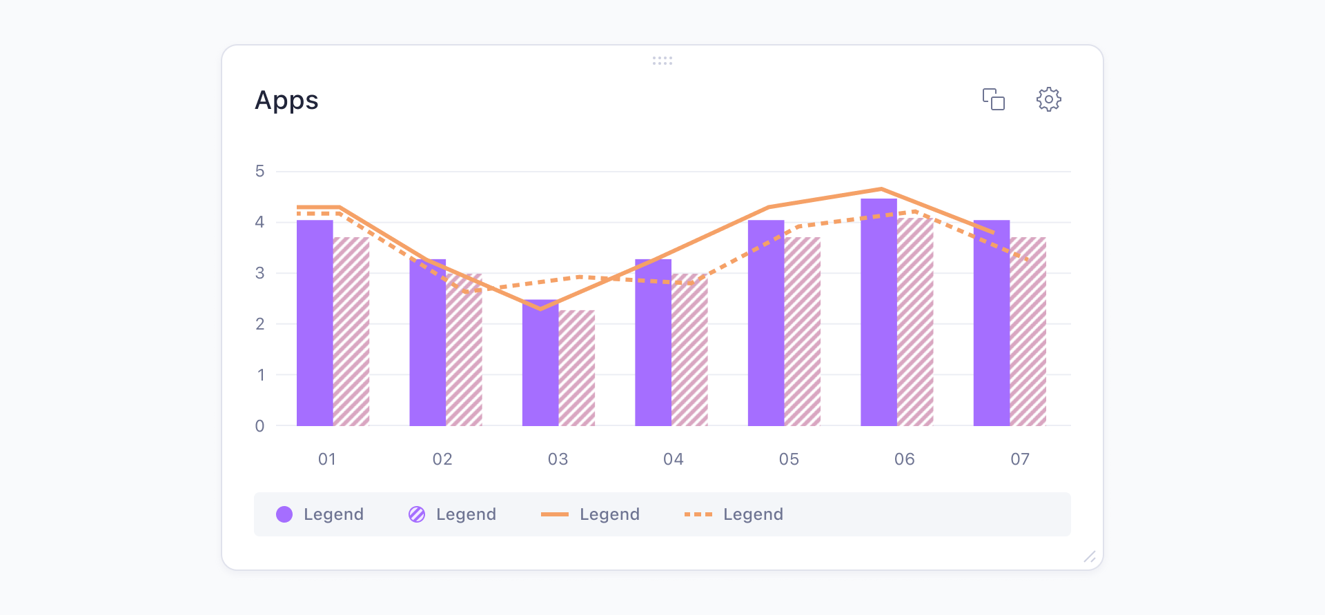
A draggable and resizeable Tile to display a chart. This Tile might be part of a user-customizable dashboard.
Row Tile
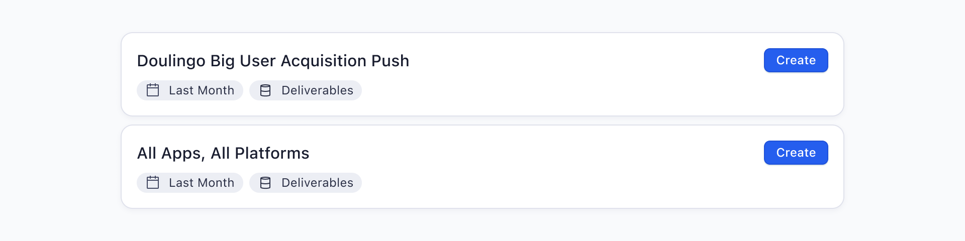
Two row-like Tiles with reduced padding, reduced margin and no Tile Header. Such layout might display a list of user created datasets from which a chart widget like the example above could be generated.