Standard Page Template
The Standard Page Template layout is used for regular pages that contain a collection of data visualization widgets, data tables, or lists.
Overview
Standard pages are the regular page template used for all pages inside the Adjust application, except Wizards. There are two common variants of a standard page: entry level pages, and inner pages.
Entry Pages
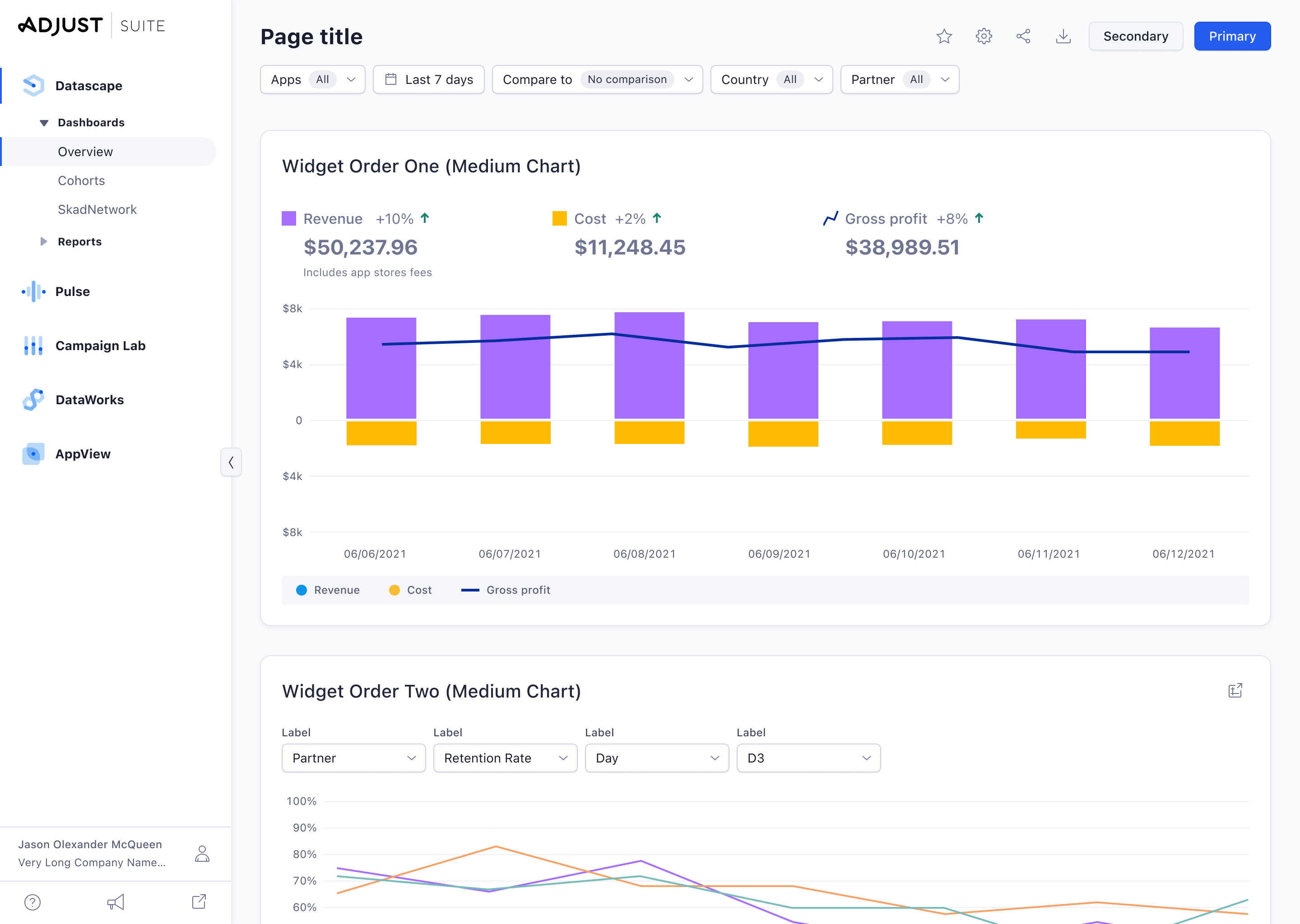
Entry pages are used to display a larger collection of data, either in form of a dashboard, or detailed lists and tables. Oftentimes, entry pages allow for extensive filtering and sorting of data via the Page Header component.
Inner Pages
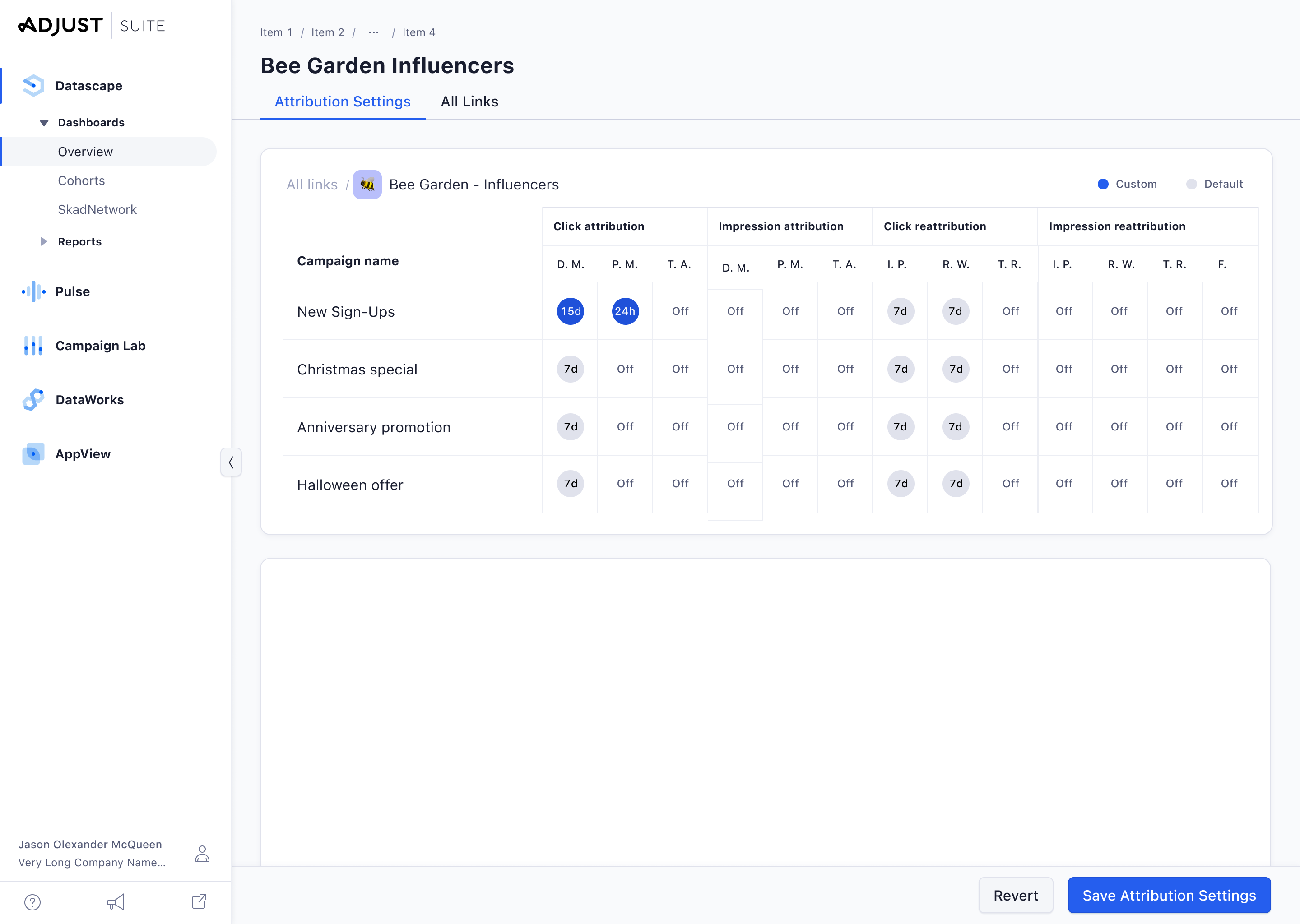
Inner pages are located one level deeper in the page hierarchy than entry pages and are usually used to view and edit a single object from a list of multiple objects. Inner pages can have an optional page footer if they contain any larger forms.
Page Anatomy
Sidebar Navigation
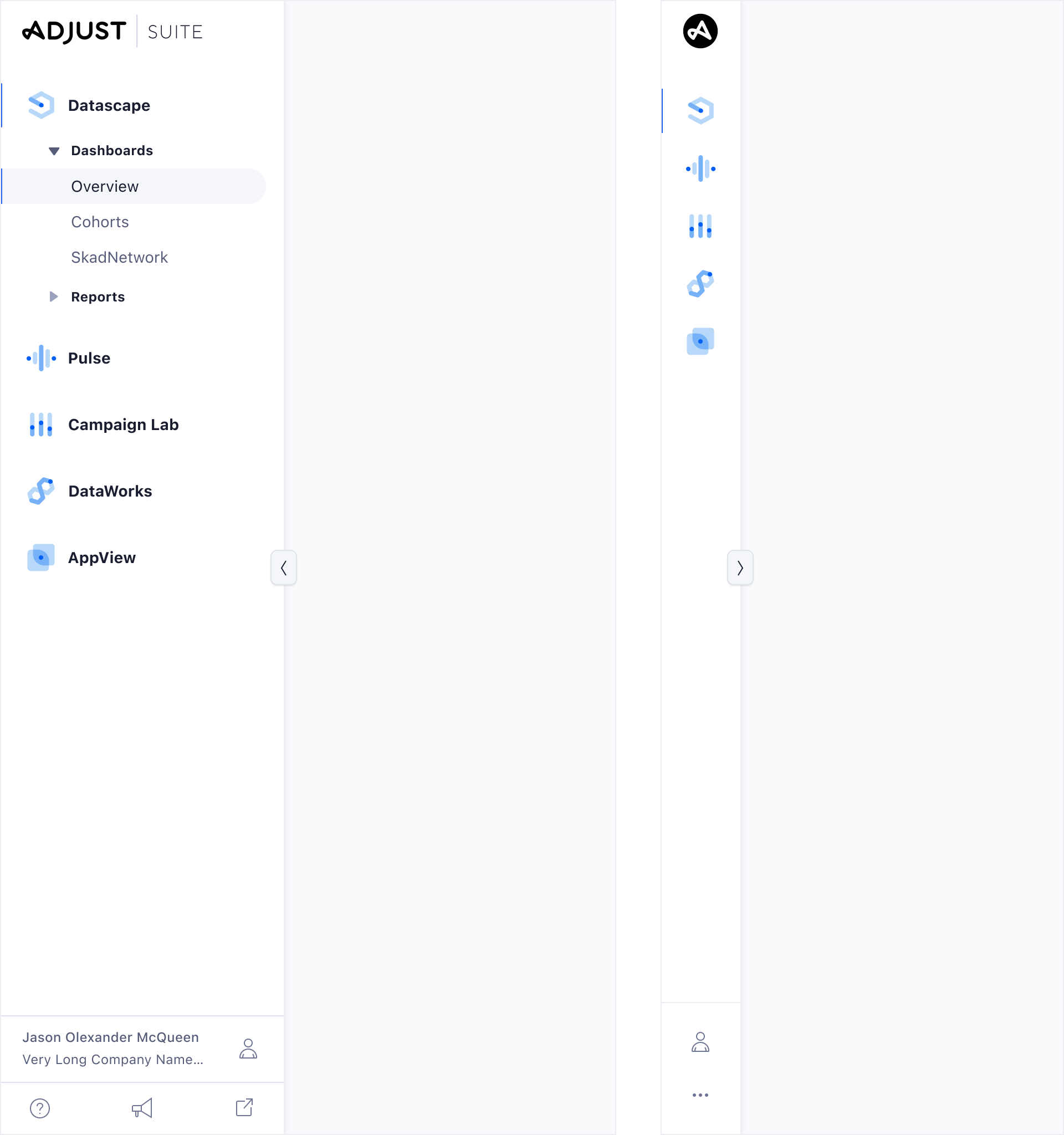
Standard pages do have the Sidebar Navigation component visible and fixed at all times. It can be collapsed by the user, but never leaves the viewport.
Page Header
Page Headers help users to orient themselves, navigate through the application, apply filters, search through a collection of list items, as well as take actions on the current view. The page header is highly standardized, but offers a lot of optional subcomponents to cater to every possible scenario. Read more about the Page Header on the component page.
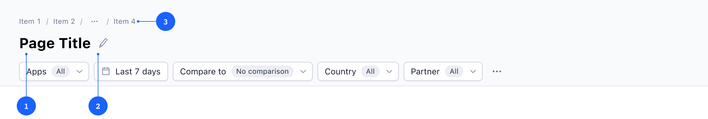
Page Title 1
The page title is a mandatory part of the Page Header. The wording should be short and concise, and match the section of the menu if it’s an inner page. Long page titles that exceed their possible available space are truncated automatically. Some page titles might be editable, in this case there will be a small pencil icon 2 displayed next to the title.
Breadcrumbs 3
Breadcrumbs offer a secondary way (next to the main sidebar navigation) to navigate through the application. Breadcrumbs are only visible on inner page templates, but mandatory on those.
Do not use the breadcrumb component on pages with a flat structure, or to show progress through a linear journey or transaction.
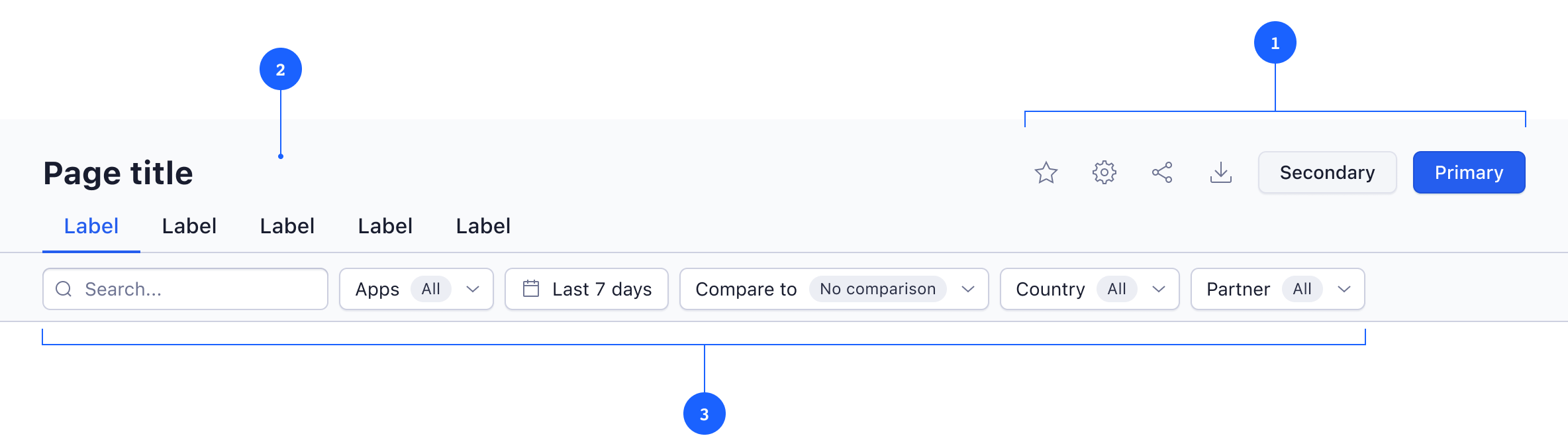
Actions 1
Page headers contain an optional area for all kinds of action buttons. There can only be one primary action and one secondary action, but up to 5 tertiary actions (as Icon Buttons). In case the page header contains a tab navigation, all actions that do not apply to all tabs must be moved into their respective tab.
Tab Bar 2
Tabs within page headers are used to separate a page into independent sections that belong to the same context. The content within each tab has to be completely independent from other tabs and should never rely on content of another tab. If there are forms present in a tab, the Save action should only be available within the given tab and needs to be executed within the tab, before switching to another tab. For more guidelines about the Tabs component, head over to the component documentation.
Toolbar 3
The toolbar contains components that allow users to search, filter and sort the current collection of data. The search bar must always be available in case the page shows a list of items. The amount and type of filters can vary depending on the current view, but only Date Picker Buttons (for date filters) and Filter Buttons should be used for filter controls. Additionally, there can be a control for sorting (such as an Action Menu), but that should be avoided as long as there is an alternative way to apply sorting, such as sort table headers.
Content Area
The content area can be fully customized on standard pages – but layout, spacing, and behavior need to comply with our Page Pattern guidelines.
Page Footer
Page footers are only used for pages that contain larger forms that require a single action to save changes. Footers are always placed at the bottom of the page, and stay fixed during scroll. The save action becomes only enabled after changes have been applied on the current view, and all validation requirements are met. The page footer should never contain elements used for navigation.
Behaviour
Loading
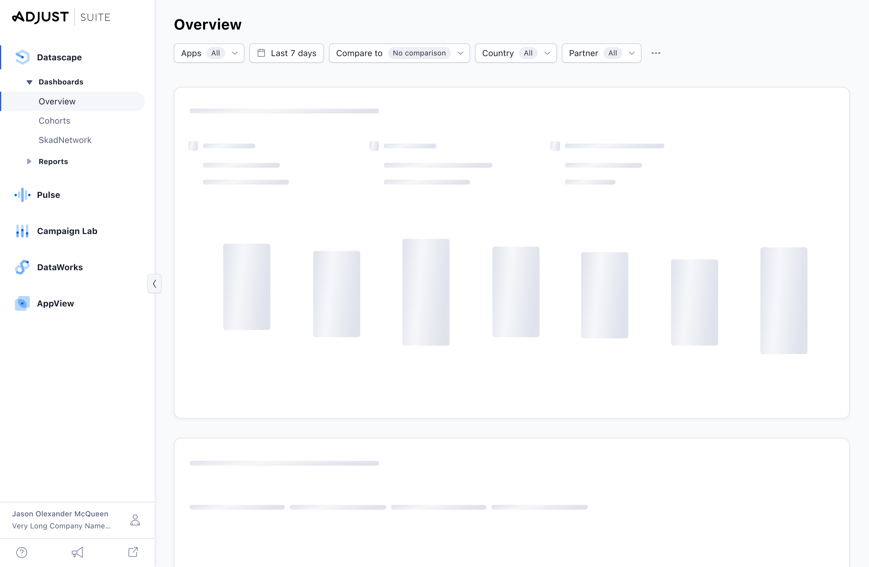
When a page is loading, it should show an abstract user interface that resembles the interface when it’s fully loaded. Labels, controls and images should be replaced by skeleton loaders that mimic the structure of the final page.
Empty States
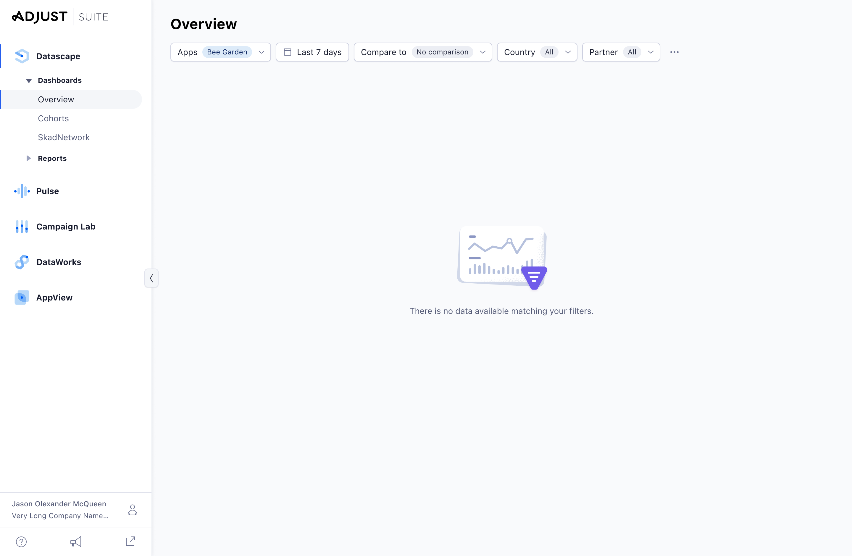
Use empty states when there is no data to show. Ideally, they will give an orientation about the next steps a user should take, and provide guidance with a clear call-to-action, or communicate the benefits of a feature. Avoid too many empty states on one page and check if you can show one large empty state on page level instead. For more guidelines about the Empty State pattern, head over to the dedicated documentation.