Data Visualization
Data visualization is the graphical representation of data to help users understand context and significance. Interactive modules allow users to drill down to explore details and identify patterns and outliers.
Chart Types
Choose an effective visual: specific visuals are designed for specific types of datasets. Make sure that the data visualization assists the audience in understanding data. Below are the chart types currently supported by the Atlas design system.
- Line (Trend)
- Histogram (Trend)
- Pie (Part-to-whole)
- Bar (Comparison)
- Grouped Bar (Comparison)
- Stacked Bar (Comparison)
- Column (Comparison)
- Grouped Column (Comparison)
- Stacked Column (Comparison)
The available chart types might be extended over time, as needed. The technically possible chart types are only constrained by the plotting library Nivo.
Line
Line charts plot data connected by lines. Line charts can be used to show trends over time, and to compare several data sets.

Histogram
Histogram charts plot data in the form of columns over a span time, or other data series.

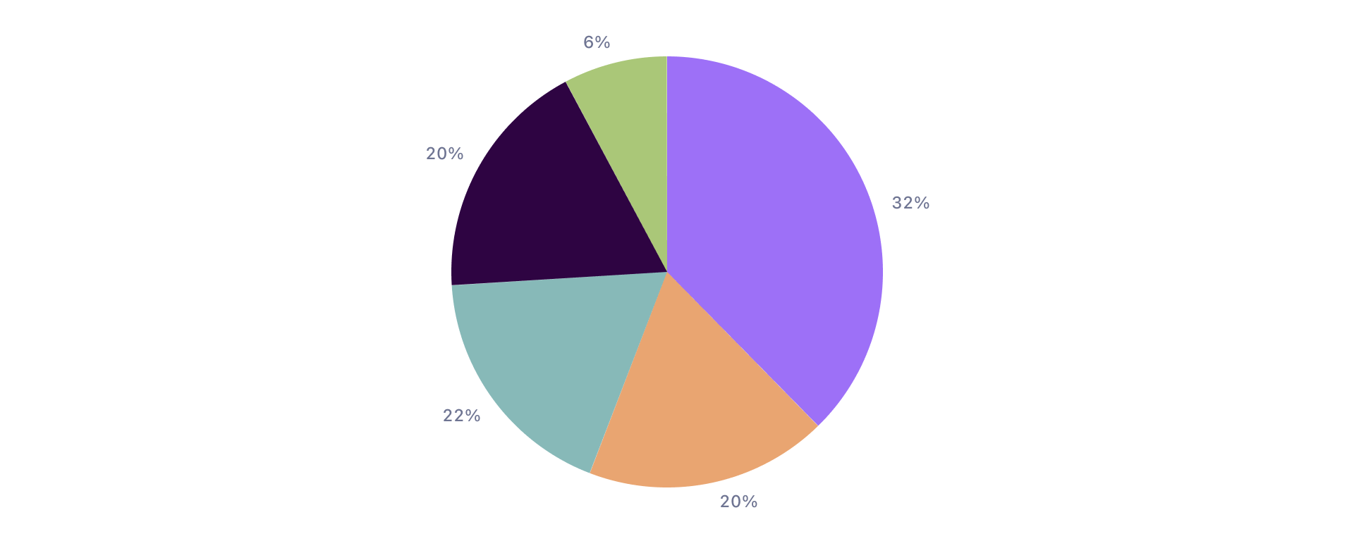
Pie
A pie chart is a circular statistical graphic, which is divided into slices to illustrate numerical proportion. In a pie chart, the arc length of each slice (and consequently its central angle and area) is proportional to the quantity it represents.
Bar
Bar charts use vertical or horizontal data markers to compare individual values. You can use them to compare data or show trends over time.

Grouped Bar
A grouped bar chart is used to compare values across multiple categories.

Stacked Bar
Stacked bar charts are useful for comparing data objects within a given category. They plot the relative value that each data series contributes to the total.

Column
Column charts use vertical or horizontal data markers to compare individual values. You can use them to compare data or show trends over time.

Grouped Column
A grouped column chart is used to compare values across multiple categories.

Stacked Column
Stacked column charts are useful for comparing data objects within a given category. They plot the relative value that each data series contributes to the total.

Chart Anatomy
Each data visualization contains multiple modules that are designed to work in harmony, navigate and understand data.
Charts with Axes
Most charts used within Adjust’s products feature two or three dimensions represented on a vertical and a horizontal axis. Rectangular charts typically contain a set of common elements including a legend, axis identifiers, data point tooltips and optional modules for filtering the plotted data.
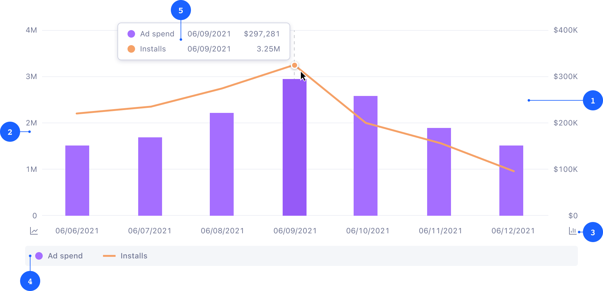
- 1 Graph and grid
- 2 Axis and ticks
- 3 Axis identifiers
- 4 Legend
- 5 Tooltip
Axes, Ticks, and the Grid
The grid is the main area where the graph is rendered on top of vertical or horizontal tick lines. Each axis features multiple ticks, which helps the reader to understand the proportions and scale of the shown data, as well as their unit of measure. Read more on axes usage.
Legend
The legend explains the chart’s meaning by defining each data set rendered in the grid area. Each item within the legend reflects the object’s color, title and visualization type (bar/column, or line). When there are many data sets, the legend provides an interface to navigate and toggle the visibility of individual objects. Read more on legend usage.
Tooltips
A tooltip appears when a cursor is positioned over an individual data point. Tooltips reveal more detailed information or context for specific elements, such as the exact value of the data point, or a trend compared to the previous data point. Each tooltip should reveal data and values of both axes.
Circular and Custom Charts
Certains charts, primarily Pie and Donut charts are circular and do not require the same set of elements as charts with axes.
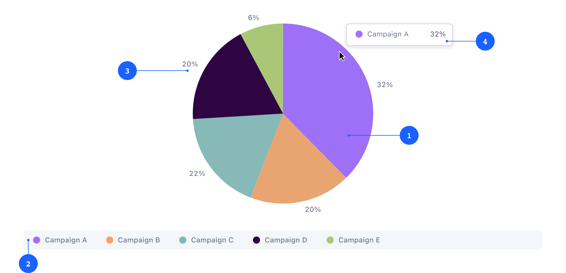
- 1 Graph
- 2 Legend
- 3 Labels
- 4 Tooltip
Labels
In a circular chart, labels offer the percentage value of the whole for an individual category.
Color palette
The color palette for data visualizations has been designed for accessibility and visual harmony.
| JavaScript | SASS | Value | Example |
|---|---|---|---|
| ColorChart1 | color-chart-1 | #A56EFF | |
| ColorChart2 | color-chart-2 | #F5A167 | |
| ColorChart3 | color-chart-3 | #78BBB9 | |
| ColorChart4 | color-chart-4 | #330045 | |
| ColorChart5 | color-chart-5 | #A2C86D | |
| ColorChart6 | color-chart-6 | #DD7208 | |
| ColorChart7 | color-chart-7 | #0B58FE | |
| ColorChart8 | color-chart-8 | #F9BD33 | |
| ColorChart9 | color-chart-9 | #005D5D | |
| ColorChart10 | color-chart-10 | #D9A6C1 | |
| ColorChart11 | color-chart-11 | #012D9C | |
| ColorChart12 | color-chart-12 | #B51A0C | |
| ColorChart13 | color-chart-13 | #009D9A | |
| ColorChart14 | color-chart-14 | #B602D0 | |
| ColorChart15 | color-chart-15 | #65579A | |
| ColorChart16 | color-chart-16 | #798858 | |
| ColorChart17 | color-chart-17 | #B18601 | |
| ColorChart18 | color-chart-18 | #0F93E8 | |
| ColorChart19 | color-chart-19 | #E46291 | |
| ColorChart20 | color-chart-20 | #198038 | |
| ColorChart21 | color-chart-21 | #E18971 | |
| ColorChart22 | color-chart-22 | #8D3A61 | |
| ColorChart23 | color-chart-23 | #FA4D56 | |
| ColorChart24 | color-chart-24 | #417AA9 | |
| ColorChart25 | color-chart-25 | #A3735E |
The colors of this palette should be applied in sequence strictly as described here. The sequence is carefully curated to maximize contrast between neighboring colors to help with visual differentiation. The start of the color sequence should be randomized to avoid having multiple charts with the same colors.
Accessibility
Avoid using these color combinations within the same chart to make the life of people with color blindness easier:
- Red & green
- Green & brown
- Green & blue
- Blue & gray
- Blue & purple (teals with reds or magenta)
- Green & gray
- Green & black
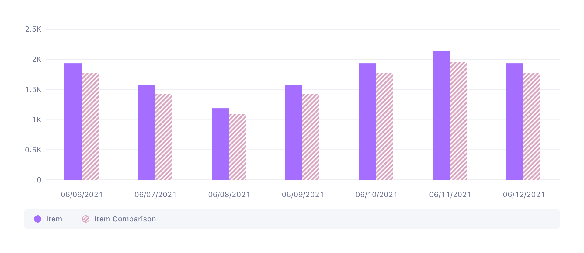
Texture
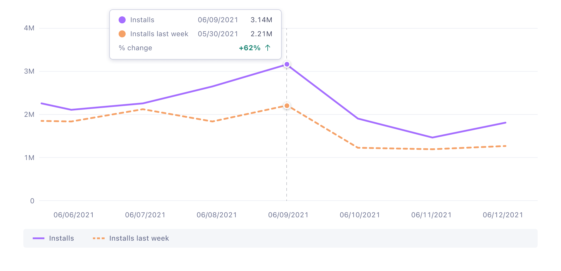
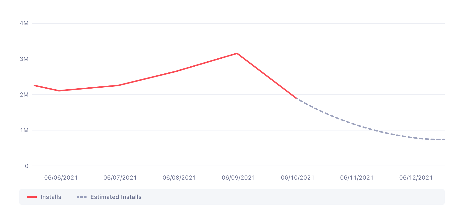
Using textures, such as dashed lines, dots, or diagonal lines can be helpful to visualize a comparison of the same data set over a previous time period. Dotted lines in Line charts should be used to continue or fill a data set where a gap in the provided data exists, or the future is not known, but can be estimated based on a trend.
Axes and Labels
Starting Points
Always start numerical axes at zero for charts that are supposed to visualize a comparison, such as bar and column charts. Truncating an axis can distort the perception, making a small difference look big and significant.
Line charts are less sensitive to this distortion because they are intended to communicate trends and not the relative size of the difference.
Negatives
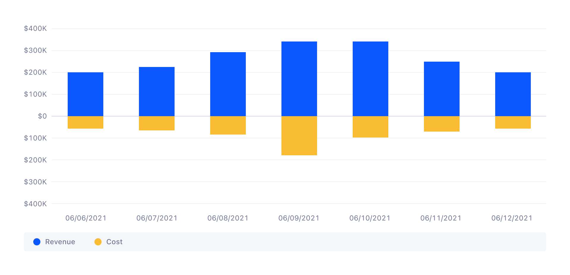
In some cases, it might make sense to have negative values, or a two dimensional Y-axis for better comparisons (think revenue vs. cost). When a negative dimension is added to a chart, make sure that positive and negative both use the same scale and amount of ticks.
Data Gaps
Avoid plotting data that does not exist. When there are gaps in the data set, leave the area empty. In some situations (e.g. trend curves) it might make sense to visualize estimations instead of not visualizing any data at all. Estimated trend lines should use dotted lines instead of a solid line.
Double Axes
Regularly we want to overlay one or multiple metrics on an existing chart. By doing so, it’s possible to visualize a trend over time, in comparison to another metric.
Example: I want to see the total eCPI in $ per day, for the last week, as a column chart. Additionally I’m overlaying two lines charts that reflect the total amount of Clicks and Installs per day. When two Y-axis are used within a chart, each axis needs to indicate the chart type that is plotted onto this axis.
Legends
Chart legends are used to provide information about the charts plotted on the chart area. The legend section is always placed underneath the chart area, and spans over the full width.
Legend Items

Each legend item reflects the color, texture, and name for a specific data series in the chart. Data plotted as line charts are represented by a bold line, while legend items for all other chart types are represented by a filled circle.
Overflow and hidden Items
When there are too many charts plotted within one chart area, the legend can become a bit crowded, or in some situations there is just not enough space to show all legend items at once. When visualizing many charts at once, we provide a “Show all” button that opens the Legend Panel.
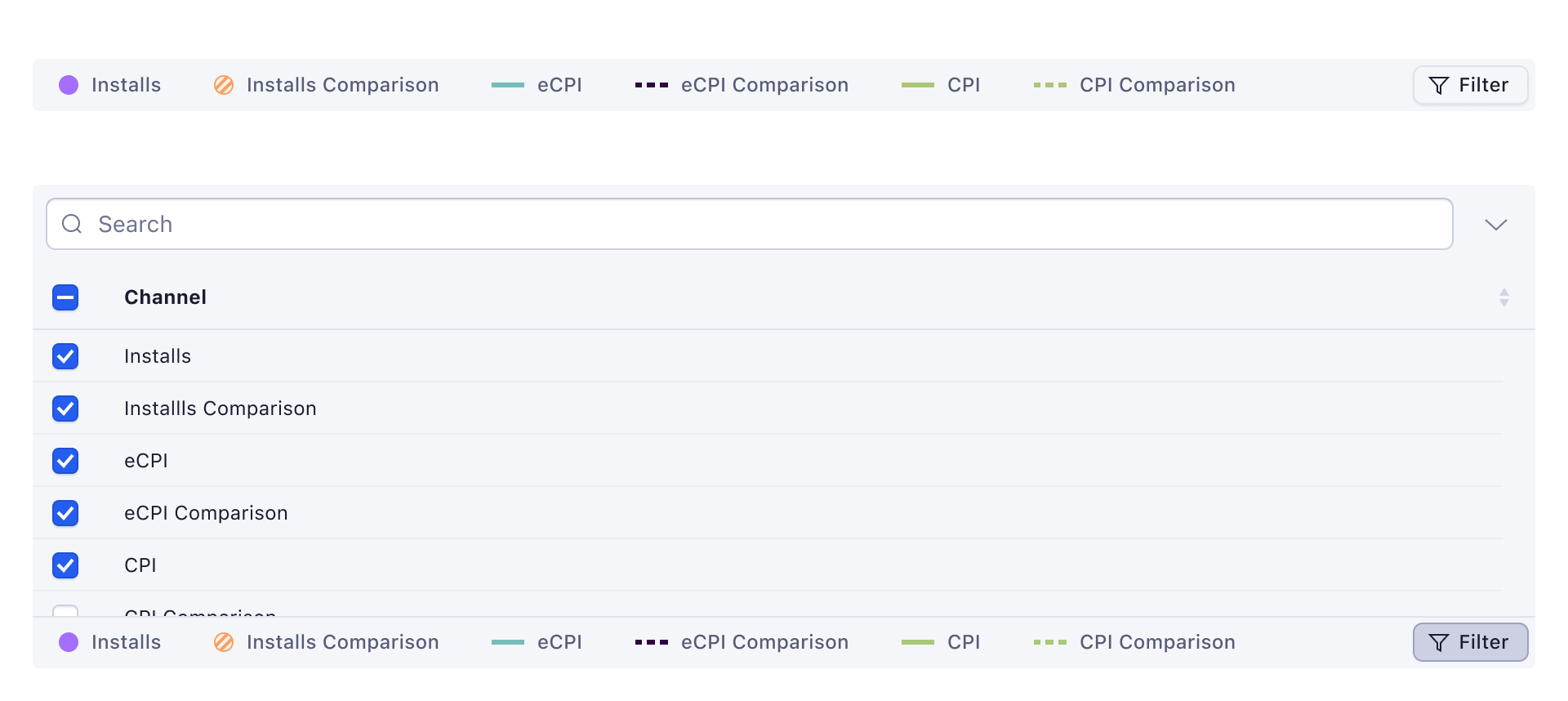
Legend Panel
The Legend Panel provides a list of all possible data series that can be shown inside the chart area. The list is sortable and searchable by name. Each item in the list provides a checkbox to toggle the visibility inside that chart area.