Error Handling
Notifications are an important method of communicating with users and providing feedback. Error notifications in particular must be using the correct design pattern and well written wording to explain what went wrong and how to fix it.
Notification Types
Notifications range in their priority and therefore should vary in their disruptiveness to users. It is important to match the urgency and priority of the information being communicated to the visual style and behavior of the notification. It’s important to avoid “dead-end” scenarios, in which users can’t accomplish their task. The last resort should be to redirect the user to a customer support page.
Deciding what to use
| Cause of error | Type | Interaction |
|---|---|---|
| 4xx Errors (e.g. 404 not found) | Error page | Button which redirects to home (e.g. Dashboard). |
| 5xx Errors | Persistent toast notification | Users can manually clear the error message and try again. |
| User input | Form error messages | Users can correct their input errors. Error message stays visible until solved. |
| User input which causes an error in other parts of the form (e.g. 4xx POST, PUT errors) | Form error message and Banner message. | Users can correct their input errors. Error message stays visible until solved. Banner stays visible until submitting the form again. |
| Missing data | Empty States | (Optional) buttons to reload, or links to documentation. |
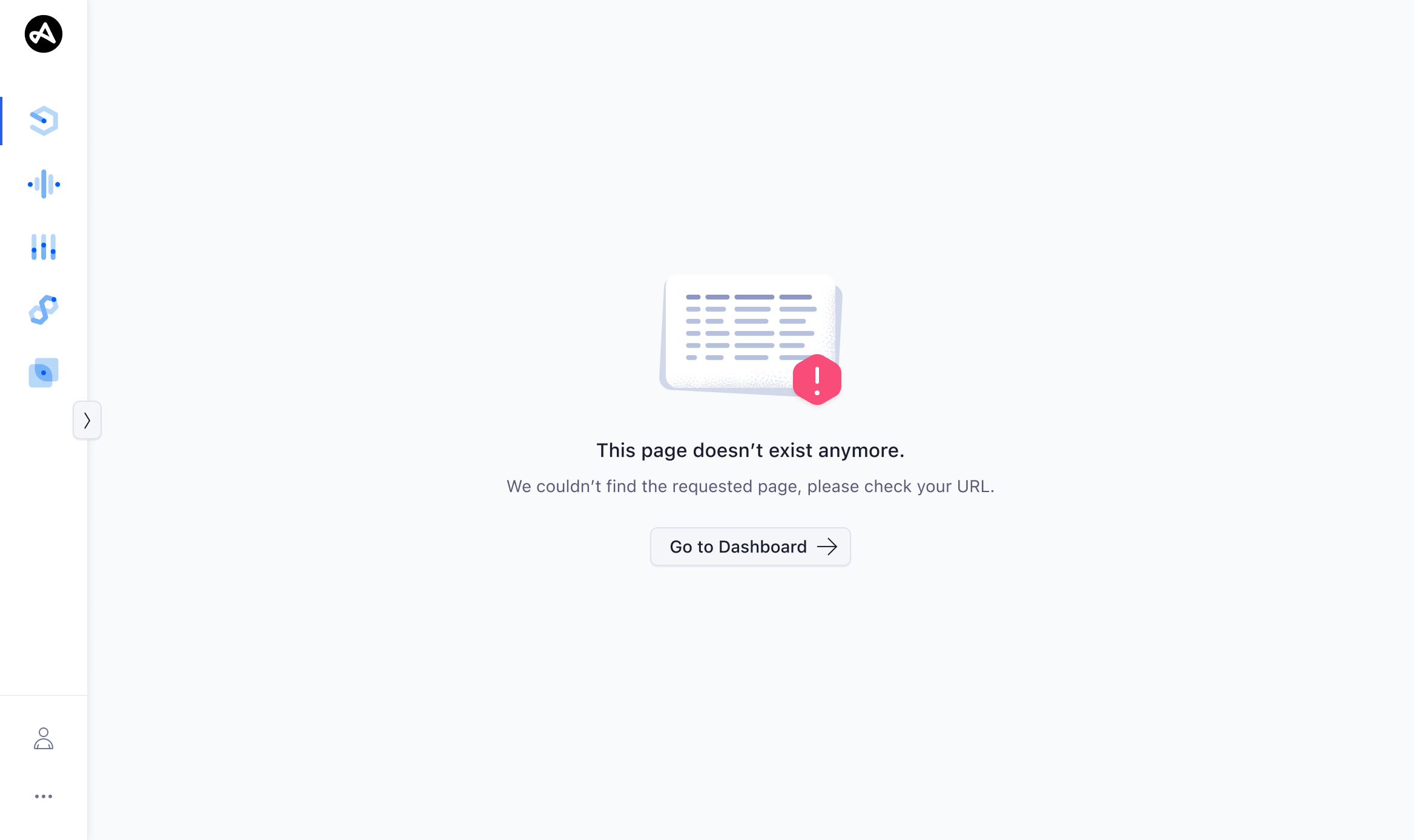
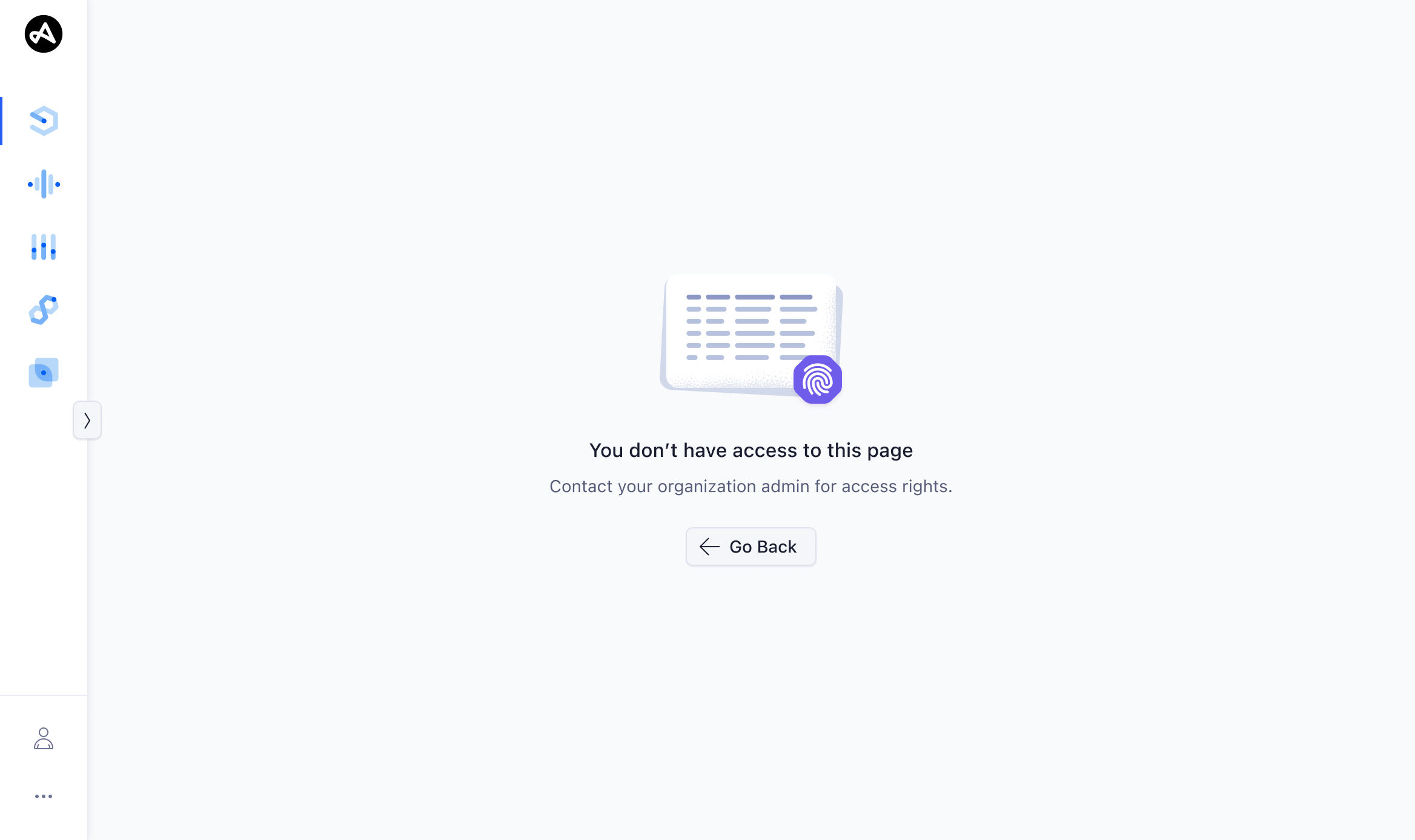
Dedicated error page
Error pages are used for critical errors where no alternative content can be provided. That applies to almost all 4xx client errors. Error pages feature an Empty State with clear messaging and a button that provides “a way out” – for example a redirect to the home page, or navigation to the previous page.
Persistent toast notifications
Toasts should be used for system errors (5xx, whenever something goes wrong on GET, POST, PUT, DELETE requests). The toast item should be persistent, but dismissible, and error messages of the same type should not stack.
Form error messages
Form error messages are shown when the user enters data in forms that don't match the validation rules of an input element. Validate the input as soon as a field loses focus. Input error messages should disappear when the requirements are met.
For server-side validation, an error message should appear in the affected input elements, as well as an additional Banner at the top of the form. This does typically apply to 4xx POST/PUT errors.
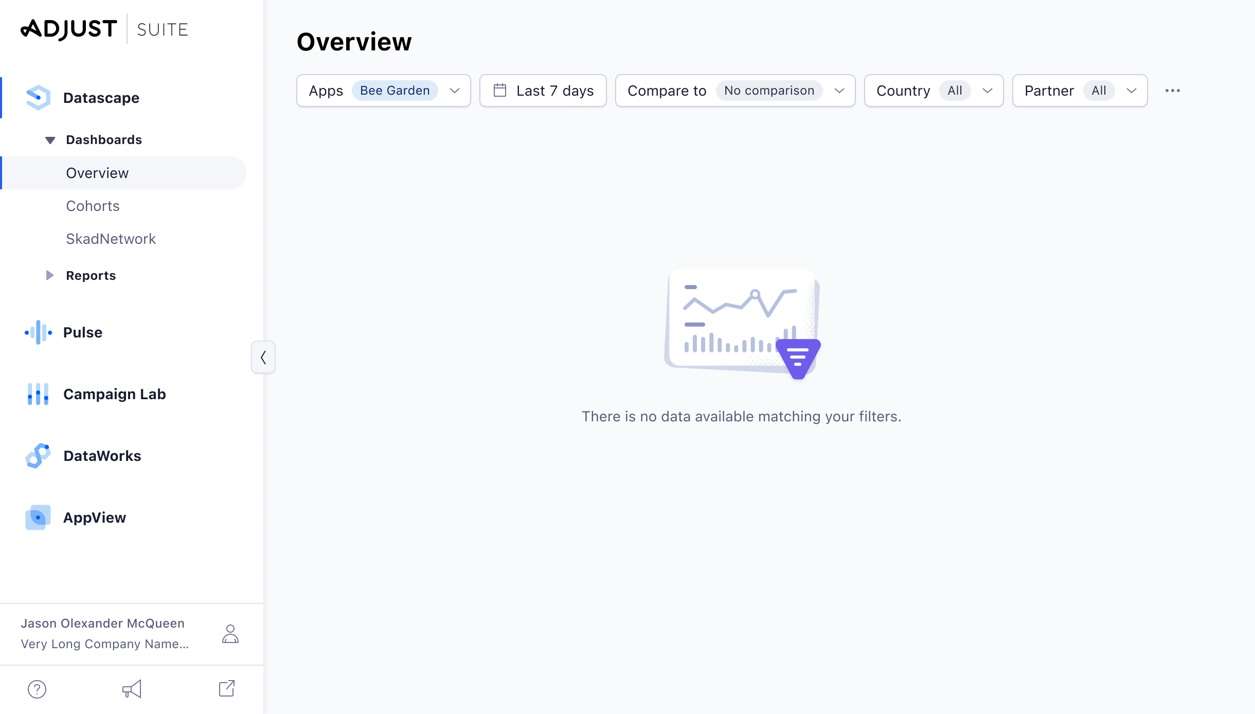
Empty States
Inline empty states (e.g. within a table, or dashboard tiles) are not exactly error messages, but should always be used whenever there is no data available.
Messaging
It’s important to consider the user’s context when writing notification messages. Use language that is accessible to the user and that will be easily understood. Use a tone that is appropriate for the situation and notification. Try to offer a way to solve the issues. See the copy writing guidelines.