Empty State
Empty states are messages that appear whenever an element has no content to display to the user. They are opportunities to educate, drive engagement, or inform the user about issues on either our or their end. Your empty states should never actually feel empty.
Use empty states when there is no data to show. Ideally, they will give an orientation about the next steps a user should take, and provide guidance with a clear call-to-action, or communicate the benefits of a feature.
Anatomy
Composition
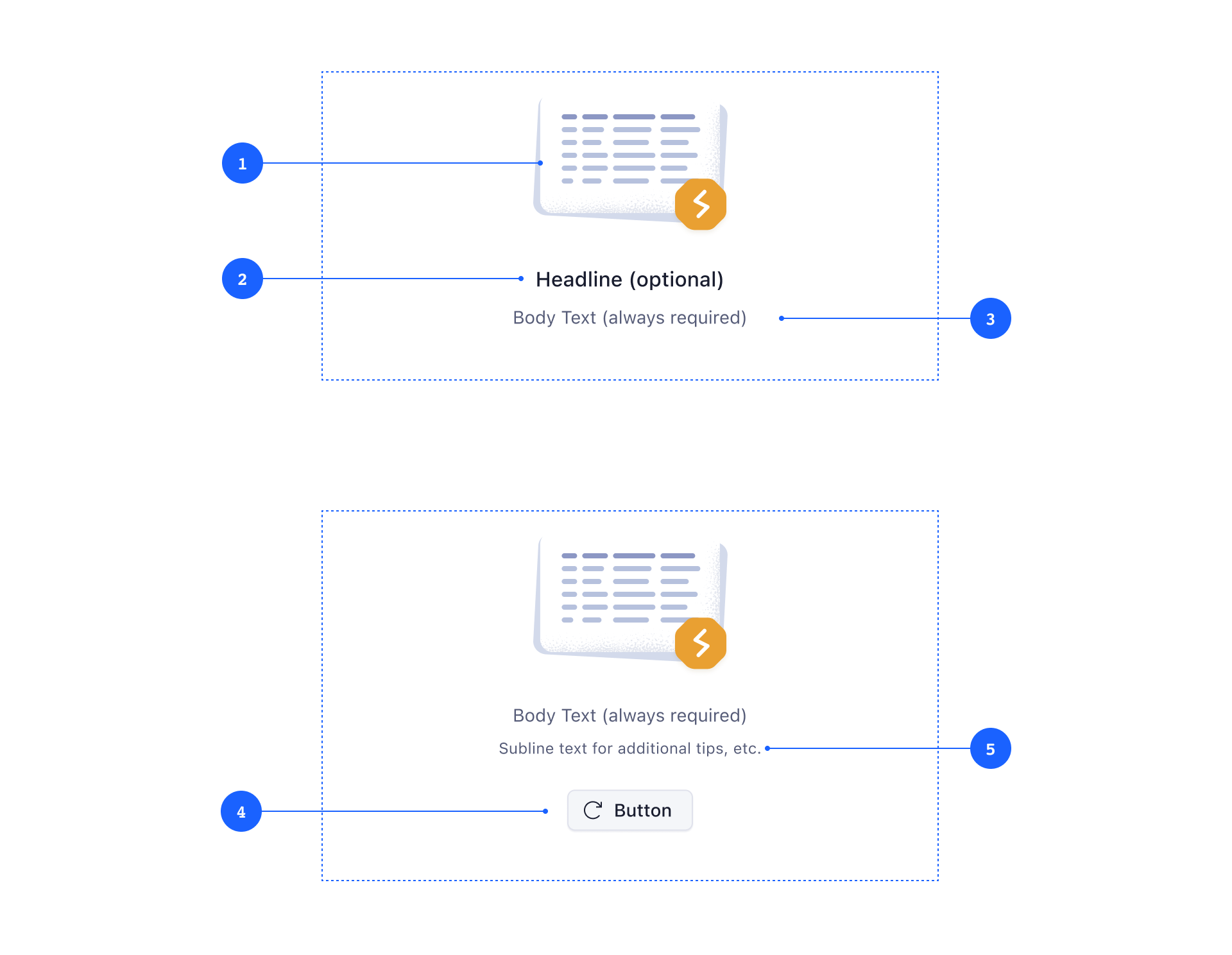
The empty state should always have an 1 illustration and a 3 body text. Additionally, empty states can have a 2 headline (only to be used in combination with a body text, never as a replacement) and a 4 subline (for secondary information and quick tips).
Body text should be short and informative, telling the user what’s happening. For readability, keep line length for each of these pieces under 60 characters per line. Please consider localization when writing copy that may cause wrapping to another line when localized.
Call to Action Buttons
A 5 Call to Action button draws attention to the most logical action. A CTA helps users move from an empty state to a situation where the page, component, or element at hand is useful to them. CTAs are optional, but helpful. They should be as specific as possible, answering the question What should the user do next?
The button variant should be defined by the importance of the action — eg. a primary button should be used for actions that need to be performed to proceed (adding an item, etc.), while secondary buttons should be used for actions like re-fetching data, retrying a failed set of filters, etc. Simple links that lead to external help pages, or other external resources, should be using the tertiary button style.
If there is a primary action button next to the empty state (eg. in a page header, or a sidebar), this action button should not be duplicated within the empty state. Consider hiding other action buttons in the UI to instead show them within the empty state and vice-versa.
Illustration
The empty state illustration is always built from two elements: the background and the key element. The background is always some abstract representation of the interface that would show up if there was data. The key element represents a specific state and helps to communicate (semantic colors, shape and icon) what went wrong.
Background Elements
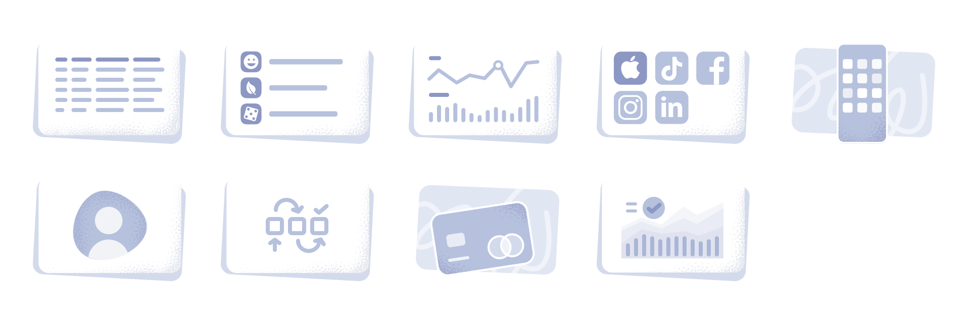
The following background elements are available at the moment:
- table
- graphs
- application list
- networks list
Key Elements
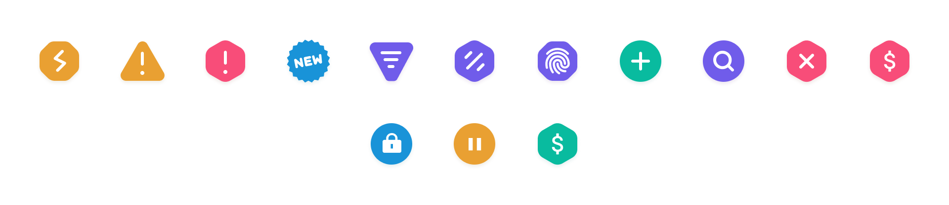
The following key elements are available at the moment:
- overload or disconnect warning
- generic warning sign
- error
- filter indicator (to be used for empty states that show up because there is no data matching the filters set by the user)
- no data
- authentication error
- no data, user needs to add item to proceed
- new (for new features, product announcements)
Variants
There are two variants of empty states available, but the only difference between the two is the sizing of the bounding box and the illustration icon.
The large variant should be used for page-level empty states, or empty states whose parent containers span over more than 50% of screen real estate.
The smaller variant should be used within panels, tiles, and sidebars that span only over a fraction of the screen real estate. In general it should be avoided to show multiple empty states next to each other to avoid information overload.
Behavior
Position and Size
Empty states should always be vertically and horizontally centered within its parent container. The width of empty states is dynamic, but defaults to 480 pixels.
Dos and Don’ts

