Forms
Forms are used to get information and guide people with minimal fuss. Designing forms well requires making the right decisions about data intake elements, structure, sequence, progression, field labels, help, and feedback.
Designing Forms
Forms are meant to gather information and guide people with as little fuss as possible. Allowing users to scan and complete a form quickly is the highest priority – and by following the guidelines below, you can make sure you are designing an easy-to-use form with the user in mind.
Data Intake
Text Inputs
Text inputs are the most commonly used components in forms across all Adjust applications.
| Control | Usage | Example |
|---|---|---|
Input  | Capture several words or a single string. | Numbers, names, short descriptions. |
Textarea  | Capture multiple lines of text. | Comments, support requests, etc. |
Best practices
- Use the correct Input type for your type of data intake (text, number, password, tel, email, url).
- Pre-populate known values when possible, e.g. a suggested bid price.
- The first required input field in the form should become auto-focused once presented to the user.
Data Inputs
The Atlas design system provides various data input controls that allow the user to select from a set of predetermined options or a limited range of values. Each component serves a specific use case.
| Control | Usage | Example |
|---|---|---|
Checkbox  | Select one or more choices from a list of no more than 5 options. | Select items that apply, agree to terms. |
Radio  | Select a single choice from a list of no more than 5 options. | Pick an exclusive type. |
Switch  | Choose between binary options. | Changing user settings and modes between on/off. |
Combo Box (multi select)  | Select one or multiple values from a list of 5-15 (or more) options. Also offers to search and create functionality. | Choose tags, labels, or multiple countries. |
Combo Box (single select)  | Select only one value from a list of mutually exclusive options when there are 5-15 options. | Select a country for an address, choose a campaign. |
Best practices
- Radio groups should have a pre-selected default option.
- Radio groups that require a null option, provide it as a regular option labeled “None”.
- Always arrange checkbox and radio group options vertically for better scannability.
- A label next to the switch must describe the affected property.
- Don’t use the label to describe the states of the switch.
Data Pickers
Pickers allow users to input data that needs to be formatted, standardized (e.g. dates, date ranges, times), and validated.
| Control | Usage | Example |
|---|---|---|
Date Range Picker  | Capture a date range. | Select a date range from when to when a campaign runs. |
Date Picker  | Capture a single date. | Select a date when the campaign starts. |
File Uploader  | Upload one or multiple files. | Upload of public and private keys for SDKs. |
Anatomy
Forms are an essential element of many web applications, and they often contain multiple sections. A section, in this context, is a logical grouping of data intake controls that share a common purpose. When designing forms, it is important to create sections that are distinct and easily recognizable.
To get a better idea of how complex forms are composed of different elements, including Tiles, Sections, and Groups, check out the full example provided below.
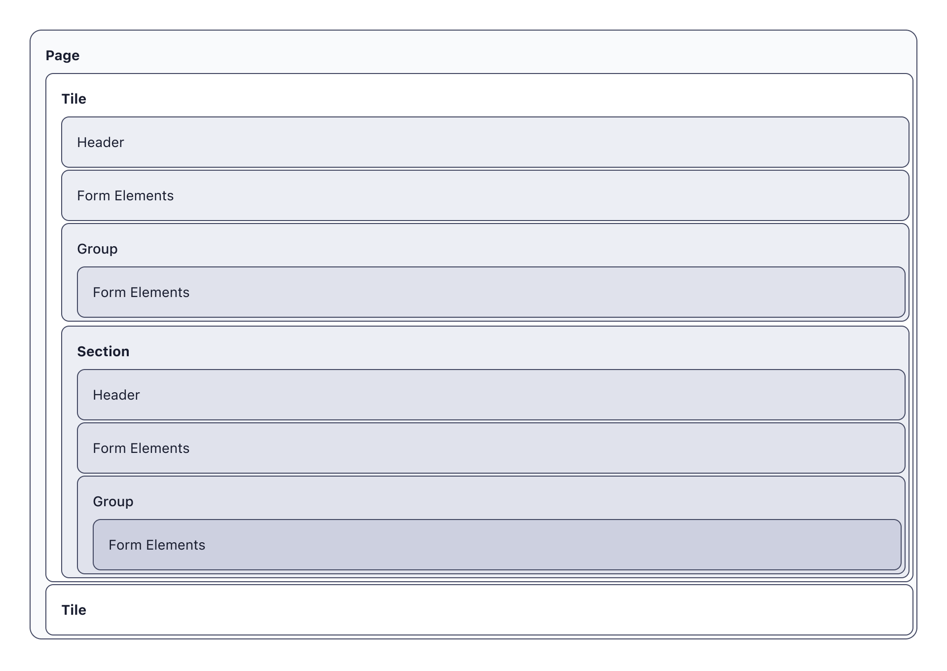
Tiles
In some cases, the differences between sections may be significant enough that they should be broken into separate tiles. Tiles provide a clear visual separation between sections and allow users to focus on one area at a time.
Sub Section
When organizing a form into logical sections, it is essential to consider the hierarchy of information. A sub section can be placed inside a tile and contain groups that provide additional detail. Each section can have a title and subtitle that accurately reflects the information contained within.
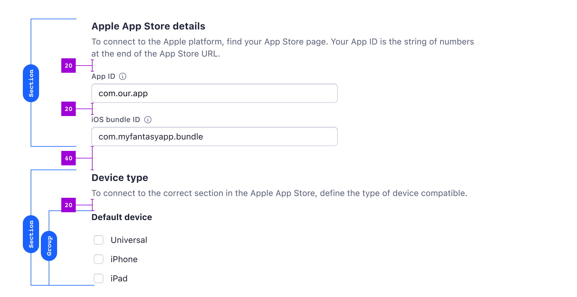
Input Groups
Input groups are a useful tool to help organize and group two or more input elements, including inputs, checkboxes, radiobuttons, and more. These groups provide a clear visual hierarchy, making it easier for users to understand how different inputs relate to each other.

To create an input group, you'll need to give it a title and, optionally, a subtitle. This will help users understand what the inputs in the group are for and how they should be used.
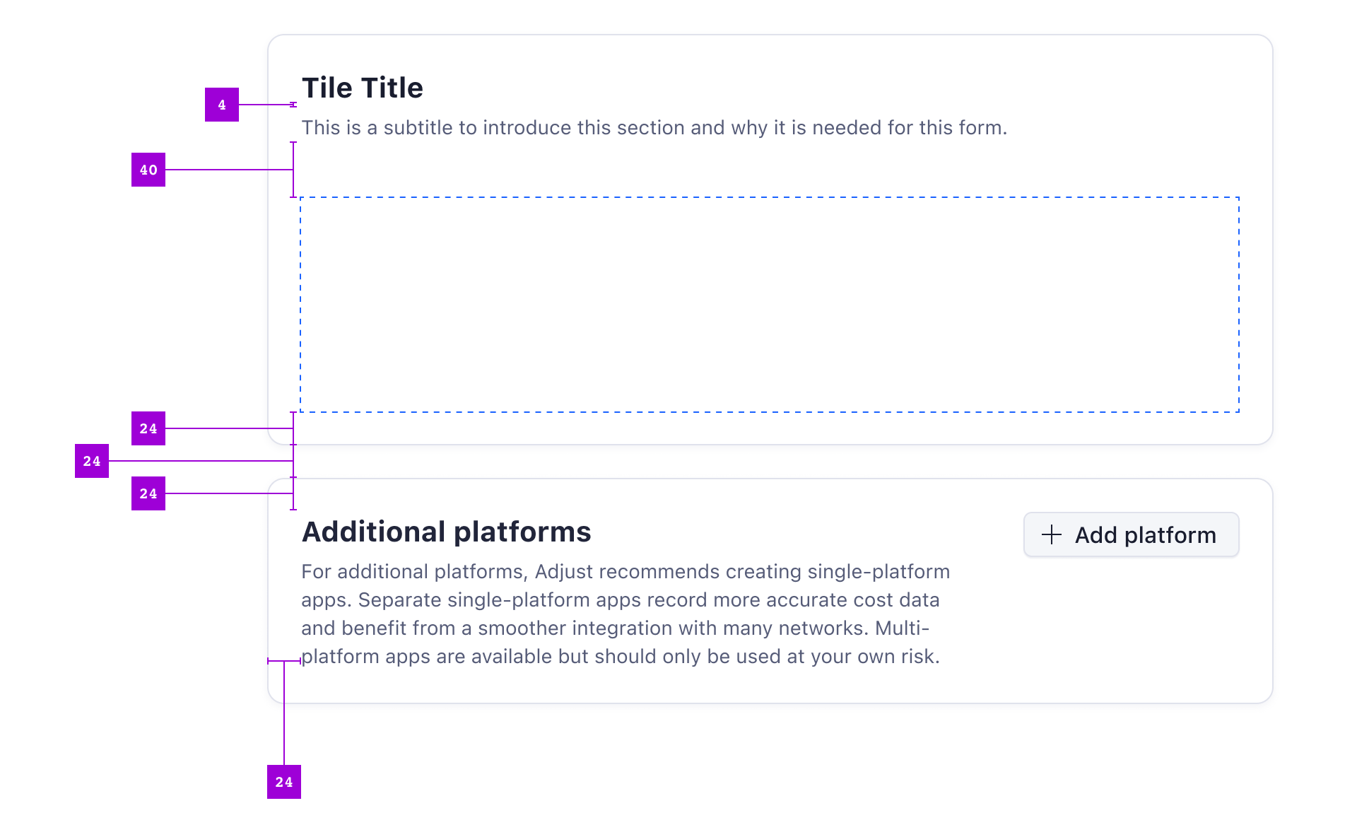
Spacing between form elements
To ensure that the form is easily scannable, appropriate spacing must be used between sections and individual inputs. For example, if the vertical spacing between individual inputs is 20, a 40-space gap should be added before the first input and between sections.
Since main sections are typically placed inside a tile, the total spacing should be defined by the tiles’ padding and the gutter between tiles. In most cases, this spacing will be 72 pixels (24 pixels for the padding on each side of the tile and a 24-pixel gutter between the tiles).
| Pixels | Spacing Token | |
|---|---|---|
| Between Title and Subtitle | 4px | $spacing-5 |
| Between Inputs | 20px | $spacing-25 |
| Between Sections | 40px | $spacing-50 |
| Between Tiles | 24px | $spacing-30 |
Text Hierarchy
It is important to follow the general Atlas guidelines for text hierarchy when designing forms. Proper use of headlines for pages, tiles, and sections ensures that the user can easily scan larger forms and find the information they need.
| Use case | HTML Hierarchy | Text Component Variant | Figma Text Style |
|---|---|---|---|
| Page headline | H1 | headline1 | size 5/3 - bold |
| Tile headline | H2 | headline2 | size 4/3 - bold |
| Tile subtitle | subline | size 2/1 - regular | |
| Sub section title | H3 | headline3 | size 3/3 - bold |
| Grouped inputs title | H4 | headline4 | size 2/3 - bold |
When designing forms, it is recommended to use clear and descriptive headlines that accurately convey the purpose and content of each section. This not only helps the user navigate the form more efficiently, but also makes it easier to understand and complete.
To achieve optimal text hierarchy, consider the following guidelines:
- Make use of the Text component, to ensure you are using a standard text style.
- Use descriptive and concise language for each headline.
- Make sure the font size and weight of each headline is appropriate and consistent throughout the form.
- Use proper spacing and indentation to create a clear visual hierarchy.
Optimal line length
It is important to consider the optimal line length for body text in forms. This can have a significant impact on the readability and overall user experience of the form.
Research has shown that the optimal line length for body text in forms is generally between 50 and 75 characters. This range has been found to strike a balance between readability and legibility, allowing users to read and understand the content without experiencing eye strain or fatigue.
However, it is important to note that the optimal line length can vary between languages. For example, languages that use longer words or have a higher frequency of complex characters may require a narrower line length to ensure readability. Additionally, factors such as font size, line spacing, and typeface can also impact the optimal line length.
When designing forms, it is recommended to test different line lengths to find the optimal balance between readability and user experience. Consider the language and content of the form, as well as the device and screen size on which it will be viewed.
Multi Column Forms
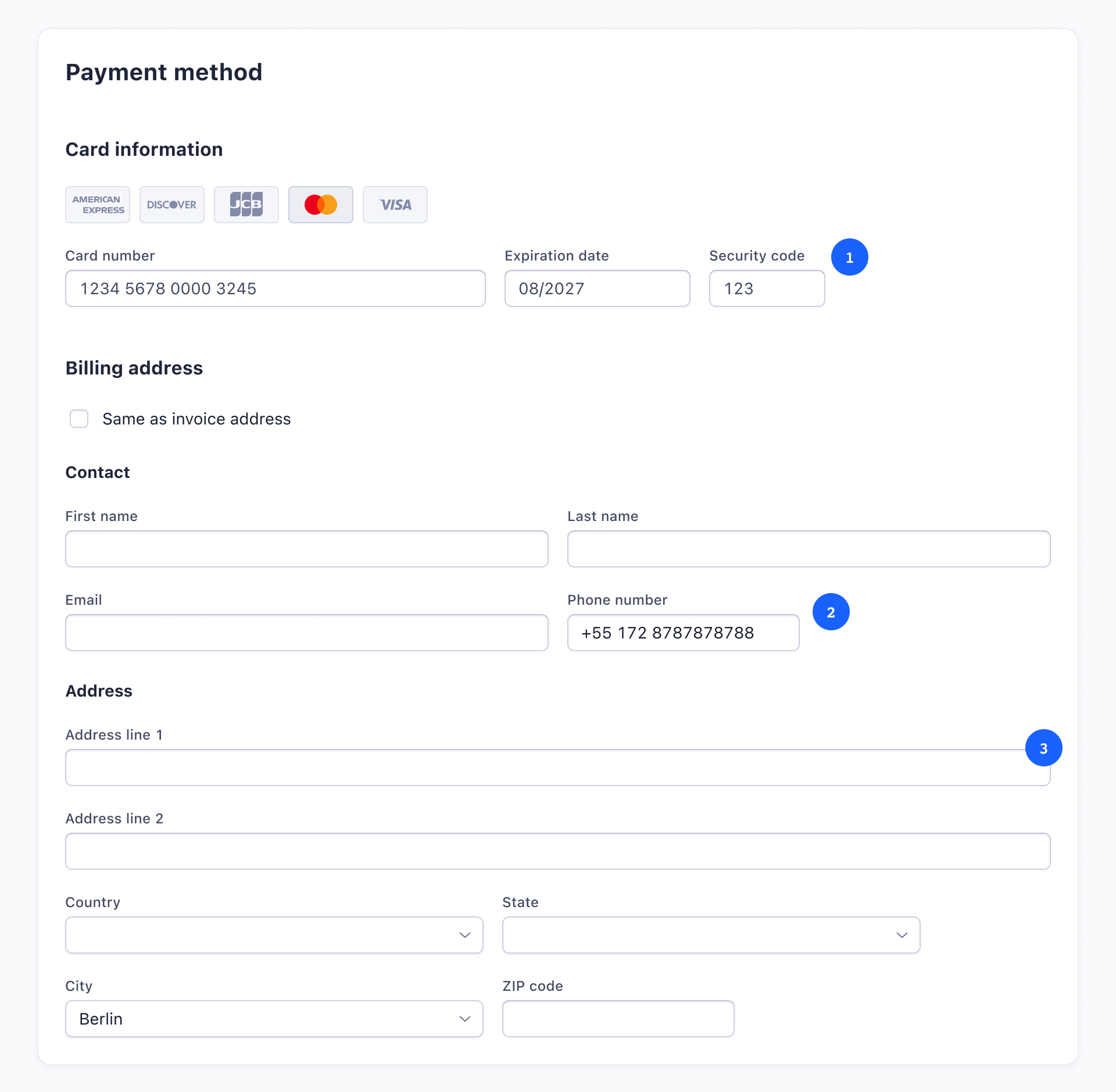
When designing forms for larger screens, it's important to consider using multiple columns to optimize the use of space. Additionally, it's essential to manage the input width according to the expected content. For instance, inputs that have a clear max character number should reflect that in their width 1, while those that expect longer data should have sufficient space to extend. For example, you can keep a "phone" input 2 short with enough space to fit the phone number. Keep in mind that certain input fields might require longer inputs in different languages, for example street names and addresses in general 3.
It's crucial to note that people read columns in different orders, such as left-up-down-right-up-down or left-right-left-right. Thus, when using more than one column for the form, each column should be used for a different section and separated visually to improve readability. Closely related fields can be shown inline, such as First name - Last name. Overall, it's essential to consider the optimal column layout to ensure efficient data input and readability for the user.
When in doubt, it's always better to use a single column form structure. While multi-column layouts can be beneficial in some cases, they can also make the form more complex and harder to fill out for some users. A single column layout ensures that the form is straightforward and easy to follow, which is especially important for longer forms or forms with multiple sections. Additionally, a single column layout can be more responsive and work better across different devices, without the need for excessive scrolling or zooming. Ultimately, the decision to use a single or multi-column layout should be based on the specific needs and goals of the form, as well as the preferences and behaviors of the target audience.
Full Example
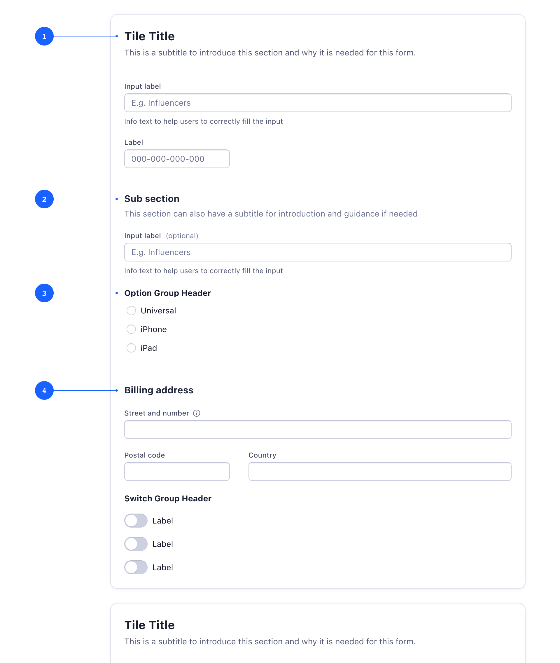
Title 1
Describes the form. Use a subtitle to give more context and explain why users should be doing this and the effects of these settings. Keep subtitles short, provide further information in context with tooltips.
Section title 2
Describes a group of inputs that belongs to the same initial context. Group related tasks to help users understand context and make the interface easier to scan. Can also have a subtitle.
Label for selection controls 3
Describes what you need to select when using checkboxes, radio buttons, switches.
Section without subtitle 4
Another group of inputs within a section. The subtitle is optional on sections and should only be used when additional instructions are useful.
Considerations for Internationalization
At Adjust, we use system fonts to prevent any unnecessary increase in page loading time. For languages such as Chinese, the font files can be quite large due to the vast amount of characters that need to be included.
When designing the layout of a page, it is important to consider the spacing requirements of other sets of characters and the potential length of text in different languages. Localized content can be up to two or three times longer than English, so it is essential to ensure that any components or elements are appropriately spaced to avoid overcrowding.
It is worth noting that Japanese, Chinese, and Korean scripts can have specific requirements in terms of line height, size, and word break. Therefore, extra attention must be paid when designing pages for these languages to ensure that the layout is optimized for their unique needs.
Guidance and Help
Tooltips

Tooltips can be added to data inputs (Input, Combo Box and Textarea) for providing additional explanation to users that may be unfamiliar with a particular form field. Avoid using tooltips to display essential information that should rather be visible at all times, and make sure to follow the general guidelines for Tooltips.
Helper text

Helper text appears below the input field and assists the user to provide the right information. Helper text is always available, which is why it’s the correct choice for essential information. Make sure the helper text is short and specific, and only used when truly necessary.
Placeholders

Placeholder text provides helpful hints or examples of what to enter (e.g. data in a specific format, or a dummy ID with the amount of expected digits). Placeholders should never contain crucial information and should be kept as short as possible and never overrun the input field.
Defaults
Default values can be set for all types of data inputs. Make sure that if a default value is provided, it is something that would commonly be used anyway and would not cause disruption or errors if the user forgets or opts not to make any changes to it before submitting the form.
Validation
Effective and immediate validation of data inputs helps the user to understand the problem and how to fix it. First, inform the user what has happened, then provide guidance on next steps or possible resolutions. Always present error states on the form, and use inline errors whenever possible.
Client-side validation
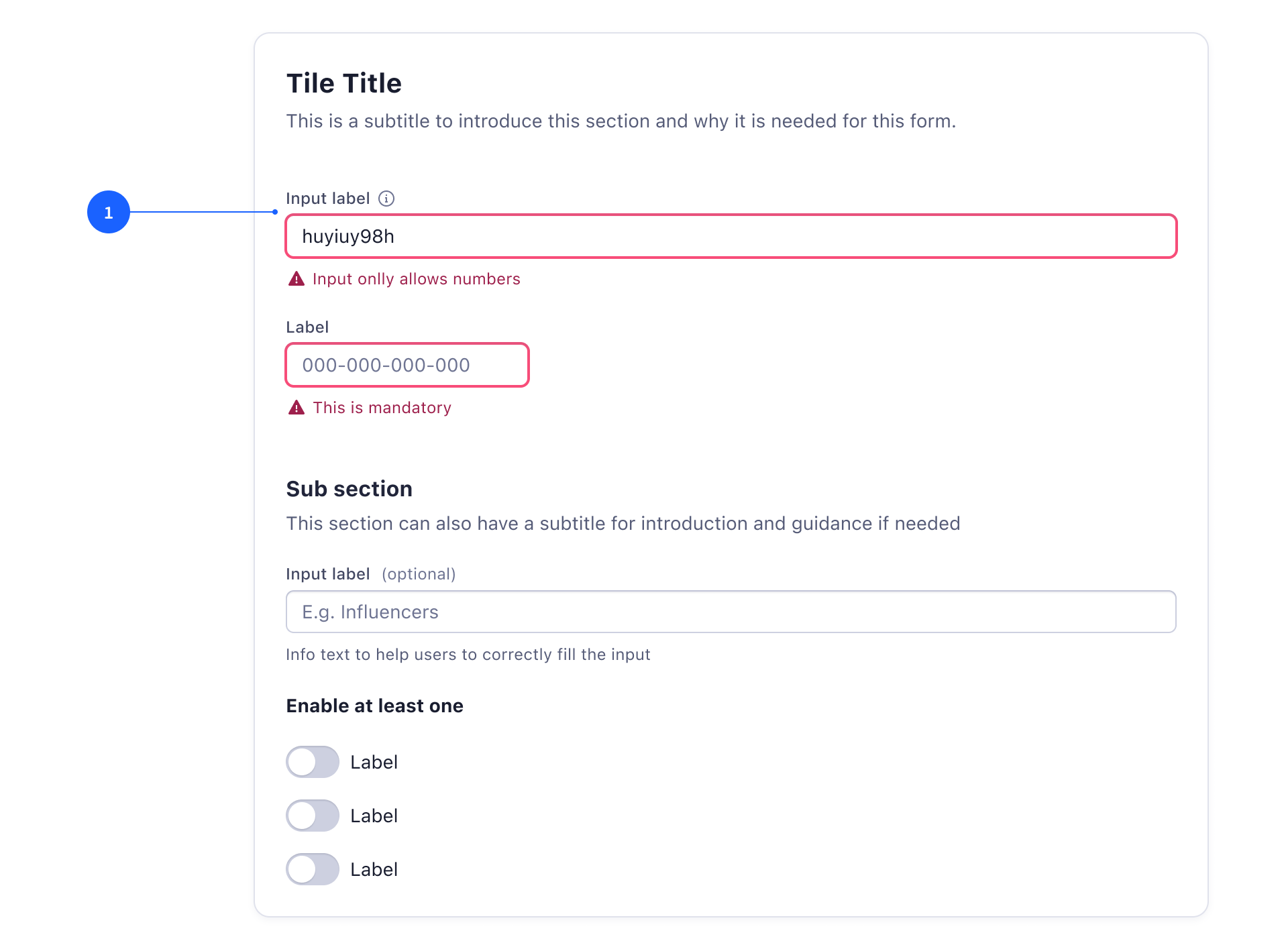
Validate the input as soon as a field loses focus 1, or an invalid input was made. Input error messages should disappear when the requirements are met. There are three different types of client-side validation on inputs, that determine when an error message appears underneat the input:
- Permissible values validation: requires a specific input. Example: only letters are allowed, and as soon as a number is entered, the error message appears.
- Formatting validation: requires an input matching a specific pattern. Example: a valid email address is required. As soon as the input field loses focus, the error message appears.
- CTA triggered validation: requires an input, but can only be validated on a button click. Example: complex forms might reveal parts of the form based on previous actions or inputs. Such "just revealed" inputs can't turn into an error state immediately, but will do so if the user tries to continue the workflow by clicking a button.
Server-side validation
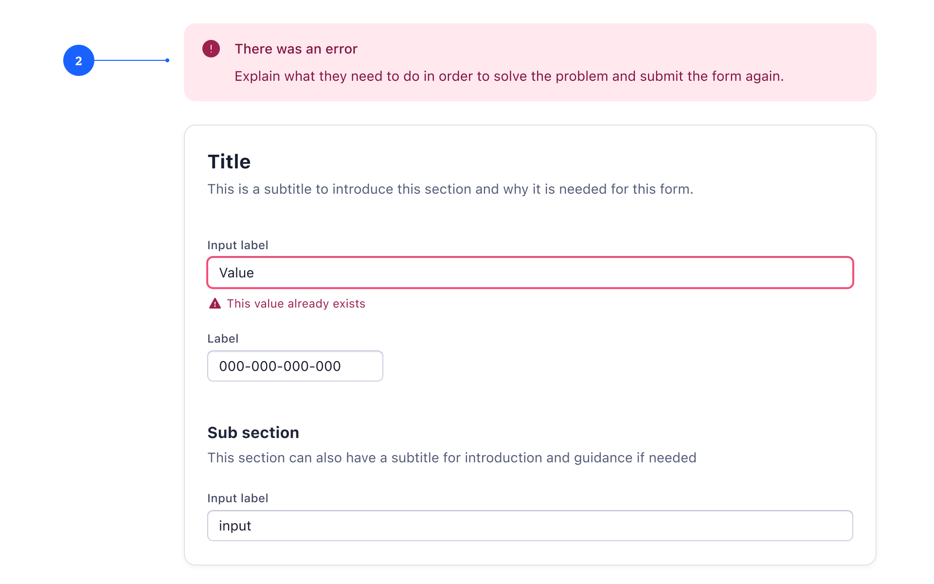
Show a spinner and indicate that the form is being submitted. If an error occurs, reload the form and display a banner 2 with the error detected and indicate how users can fix it. If a field contains an error only detected by the back-end, at this point also display an error on the corresponding field.
Button states
Primary buttons within a form (either to proceed to the next step, or to submit the form) that require validation should be disabled until all of the forms’ requirements are met and validated.
When a user submits a form, disable the submit button to prevent duplicate submissions. If it’s expected that a submission might take longer than one second, communicate that to the user via progress indicators like a spinner.
Complex Forms
Progressive Disclosure
Use progressive disclosure to make longer forms less overwhelming. Reveal additional content based on the user's selection to focus on relevant information only.
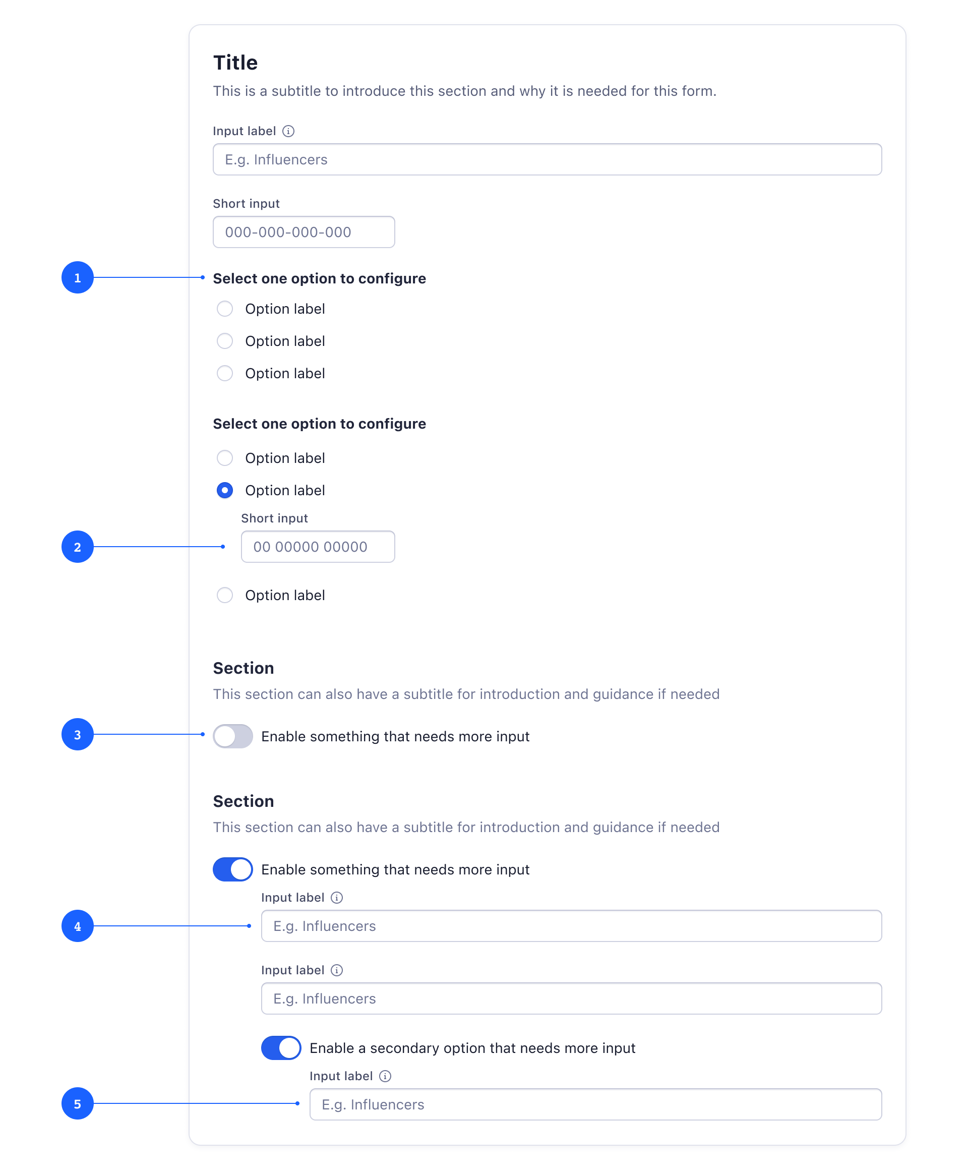
- 1 Hide additional fields when there is a selection control.
- 2 Reveal additional fields when the user selects an option that needs data input. To show that the field belongs to that option, align input with the control option label.
- 3 Hide additional fields for features that need to be enabled to be used.
- 4 Reveal inputs that need to be configured when the user enables a feature. To show that the field belongs to that option, align input with the control label.
- 5 Secondary options that need further controls are indented deeper to help users understand the hierarchy and dependencies.
Wizard Forms
A Wizard form breaks a complex form sections into multiple linear steps and incorporates a progress indicator (Sequence Map) to track a user’s status step by step. This approach is good for saving form progress along the journey and allows users to review their input before submission. Read more about when and how to use wizards on the dedicated Wizard Page Template section of the documentation.
Further Reading
- Group Form Elements Effectively Using White Space, (Nielsen Norman Group, 2013)
- Design Better Forms, (UX Collective, 2016)
- The Power of Defaults, (Nielsen Norman Group, 2015)
- UI Designer’s Guide to Creating Forms & Inputs, (UIPrep, 2020)