Panel
Panels are versatile containers to structure a Page, creating slices for logical sections of an application. Unlike Tiles, the position of a Panel is always fixed and cannot be changed by users.
Purpose
Panels establish the basic layout structure of any Adjust application. They literally draw the lines between different logical sections like header, sidebars, footer, main content area and so on. This helps users to better understand relations and delimitations — e.g. to anticipate the scope of an edit button (what would I edit?).
If you are unsure whether to use a Tile or a Panel, have a look at the comparison table.
Anatomy
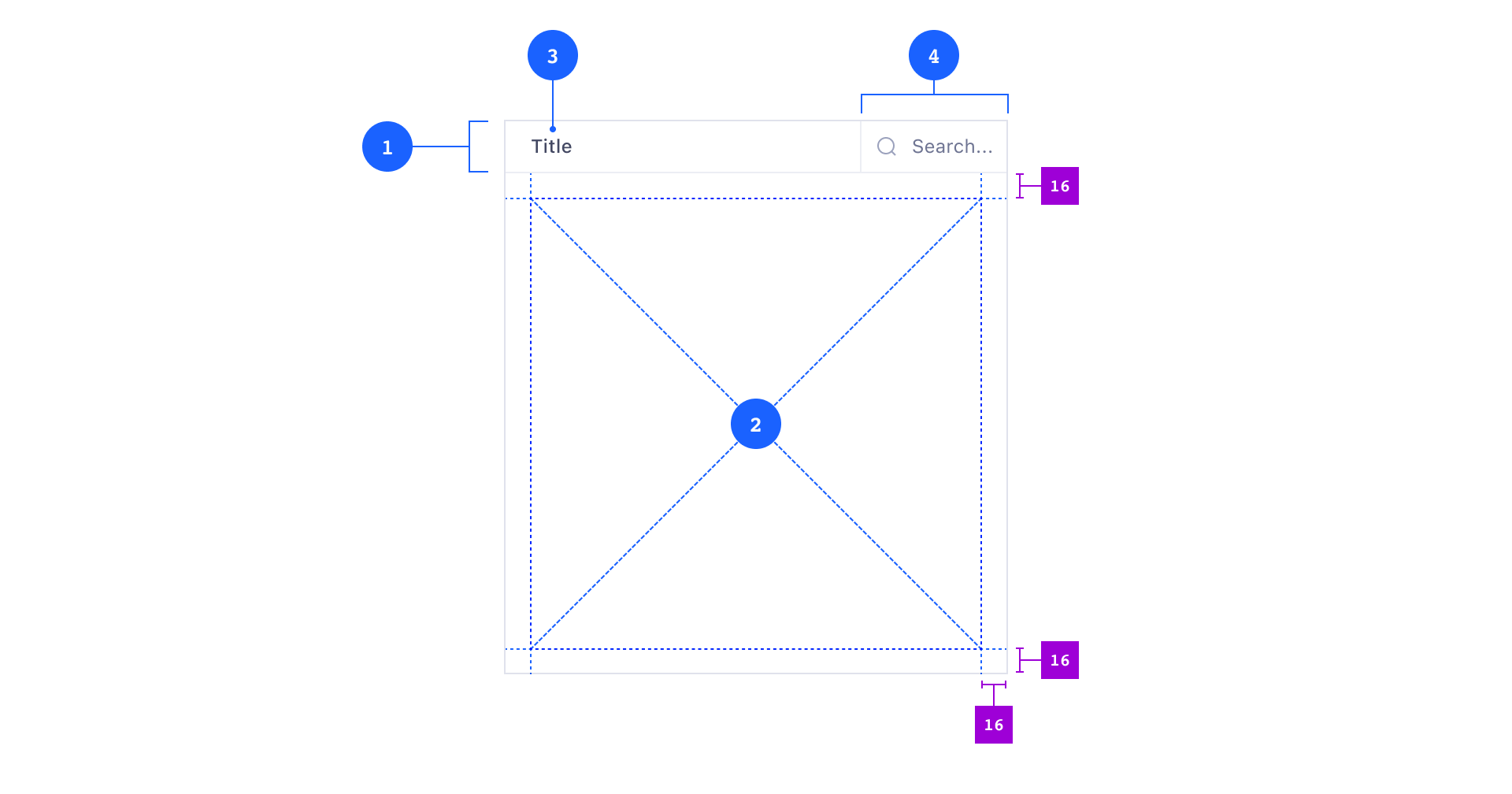
Composition
- 1 Panel Header (optional)
- 3 Panel Title (required)
- 4 Panel Search (optional)
- 2 Panel Body (required)
Panels consist of at least a Panel Body and may have a single Panel Header. Panel Headers always contain at least a Panel Title and may also contain an optional Panel Search component.
Child Componenents
You can put pretty much every other component inside a Panel, even another Panel — but you must not nest Panels deeper than one level.
When you lay out the content inside Panels, make sure you learn about Atlas’s spacing system first.
Variants
Panels have two different background color options: default 5 and contrast 6.

Default
You will use the default Panel variant most of the time. It has a neutral background color on which you can place all other components except Tiles.
Contrast
Use the contrast variant exclusively to create areas where you want to place Tiles. Think of this as a canvas 7 to display Tiles which users may also be able to interact with and to customize the layout by moving and resizing them.

Usage
Panels always expand into the whole available space of their parent component. This can be a Tile, a Page or an invisible box from a layout grid. Panels always reach from edge-to-edge of their parent component with no white space in-between. Real-world counterparts would be wooden wall- or floor panels.

Panels have no visible outer borders but there is a divider line wherever two Panels touch. Panels may be nested one level deep (one Panel inside another Panel). Outer Panels have a strong divider line (darker) 8, inner Panels have a soft divider line (lighter) 9.
You may also use Panels to add subdivisions to Tiles. This is especially useful if you wish to create scrollable areas inside Tiles.

To learn more about structuring a Page with Panels and Tiles, see the Page pattern.
Behavior
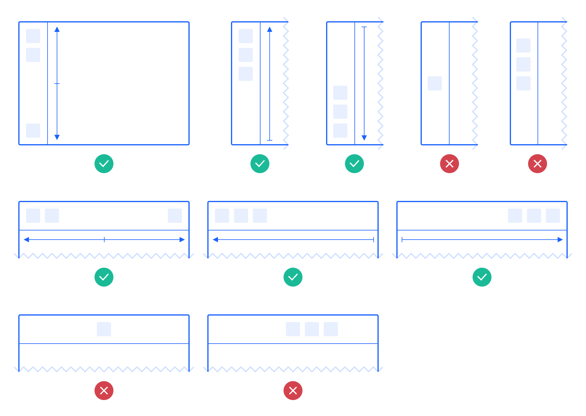
Position and Size
A Panel’s position is always fixed — users can not move Panels around.
Panels always fill the whole viewport from edge to edge and resize when the viewport resizes 10. Individual Panels may have settings for minimum and maximum or fixed height and/or width. This is useful to create slots for headers 11 and sidebars 12 where all UI elements always stay visible due to their parent Panel’s size constraints.

Content Overflow
Any Panel Body can scroll (vertically, horizontally, both). Soft shadows will automatically appear on the top or bottom parts to indicate the hidden overflow.
Panel Headers are always sticky 13 — they keep their position while the Panel Body is scrolling 14.

If a Panel shrinks below a certain width, the Panel Title may not fit the available space. In these cases, the Title gets truncated with an ellipsis. You can reveal the full Title inside a Tooltip on hover 15.
Ideally, the Panel content resizes horizontally with the Panel. However, if the content does not fit, Panels will also scroll horizontally 16.

Content Distribution
Depending on the orientation you need to decide how to distribute the components inside a Panel.
As a rule of thumb, the content either:
- Flows to the top or bottom when vertically oriented.
- Flows to the left or right when horizontally oriented.
If there is only a single component inside a Panel (e.g. a single Button), you should probably not center it. You must also avoid any other alignment that looks off since it may add distracting noise to the UI.
Search
Panels can be searchable. They can contain a PanelSearch component which features an expandable search input. The search query may life-update the Panel’s content.
