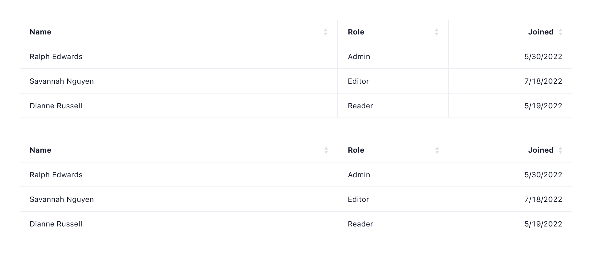
Tables
Tables are used to organize and display data, allowing users to compare, analyze, and process information efficiently. They can present datasets with multiple attributes or serve as entry point lists for navigating through entities.
Tables offer a structured way to handle large volumes of data, enabling users to interact with and make sense of the information at a glance.
Variants and anatomy
Tables can be presented in different contexts depending on the content and layout of the page.
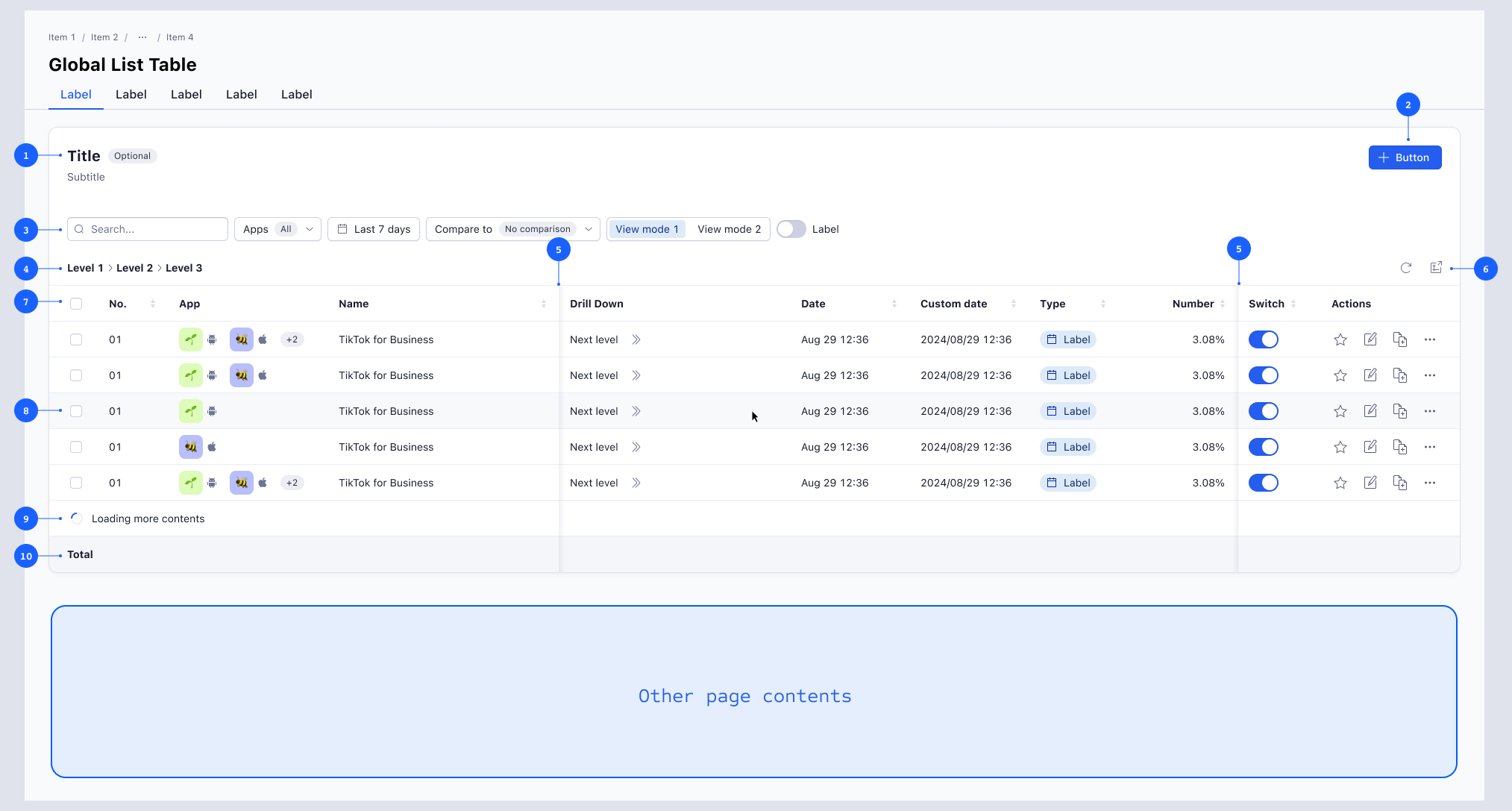
Full-width table
Used when the table is the primary content on the page. This layout utilizes the full width of the container, making it also suitable for data-heavy use cases where users need to focus on the table content.
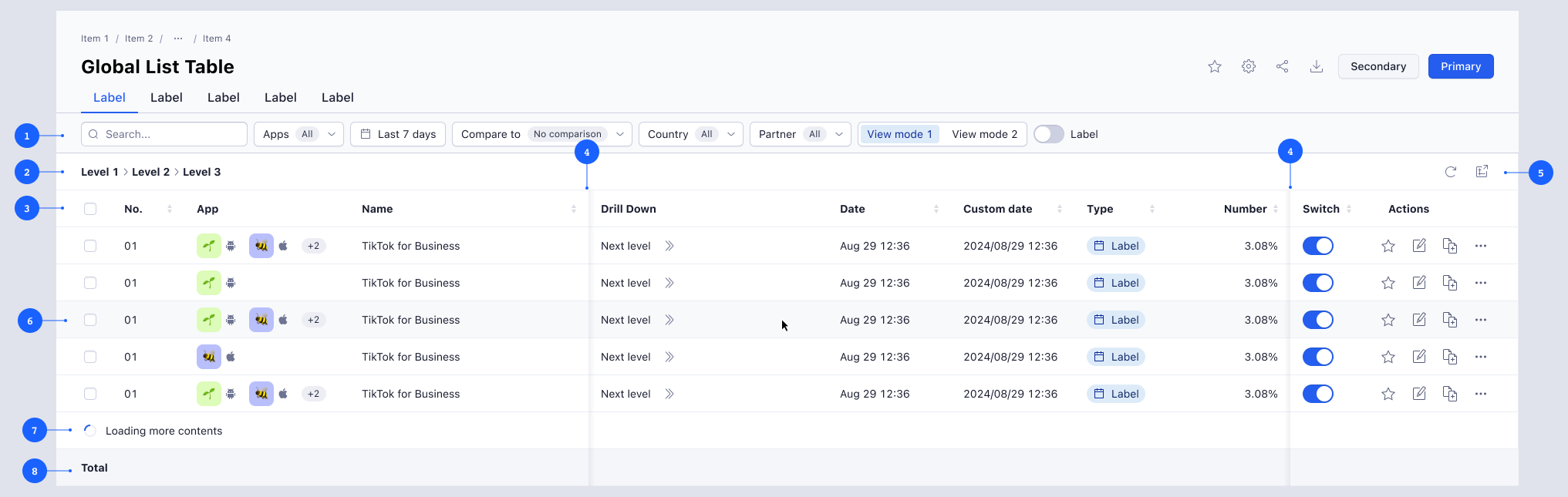
- 1 Filter bar
- 2 Drilldown navigation
- 3 Table header
- 4 Horizontal scroll overflow shadow
- 5 Table operation bar
- 6 Row hover state
- 7 Loading
- 8 Table footer
- 9 Loading
- 10 Table footer
Tile table
Used when the page contains multiple content elements besides the table, wizards and form pages without sidepanel. Tile tables follow the ‘form pattern’ behavior in terms of spacing, padding, button placement, and usage, maintaining visual consistency with other content tiles. It is recommended to use a tile title to indicate the table's content when placed alongside other tiles.
- 1 Tile title
- 2 Tile actions
- 3 Filter bar
- 4 Drilldown navigation
- 5 Horizontal scroll overflow shadow
- 6 Table operation bar
- 7 Table header
- 8 Row hover state
- 9 Loading
- 10 Table footer
Usage
The full-width table is used when it is the primary content on the page. When the page contains multiple content elements besides the table, use a tile table instead. Tile tables are also used in wizards and full screen forms.
Sizing
Tables are available in three sizes: small, medium, large. By default, all tables use medium size. Small and large can be used for clients to choose the data density.
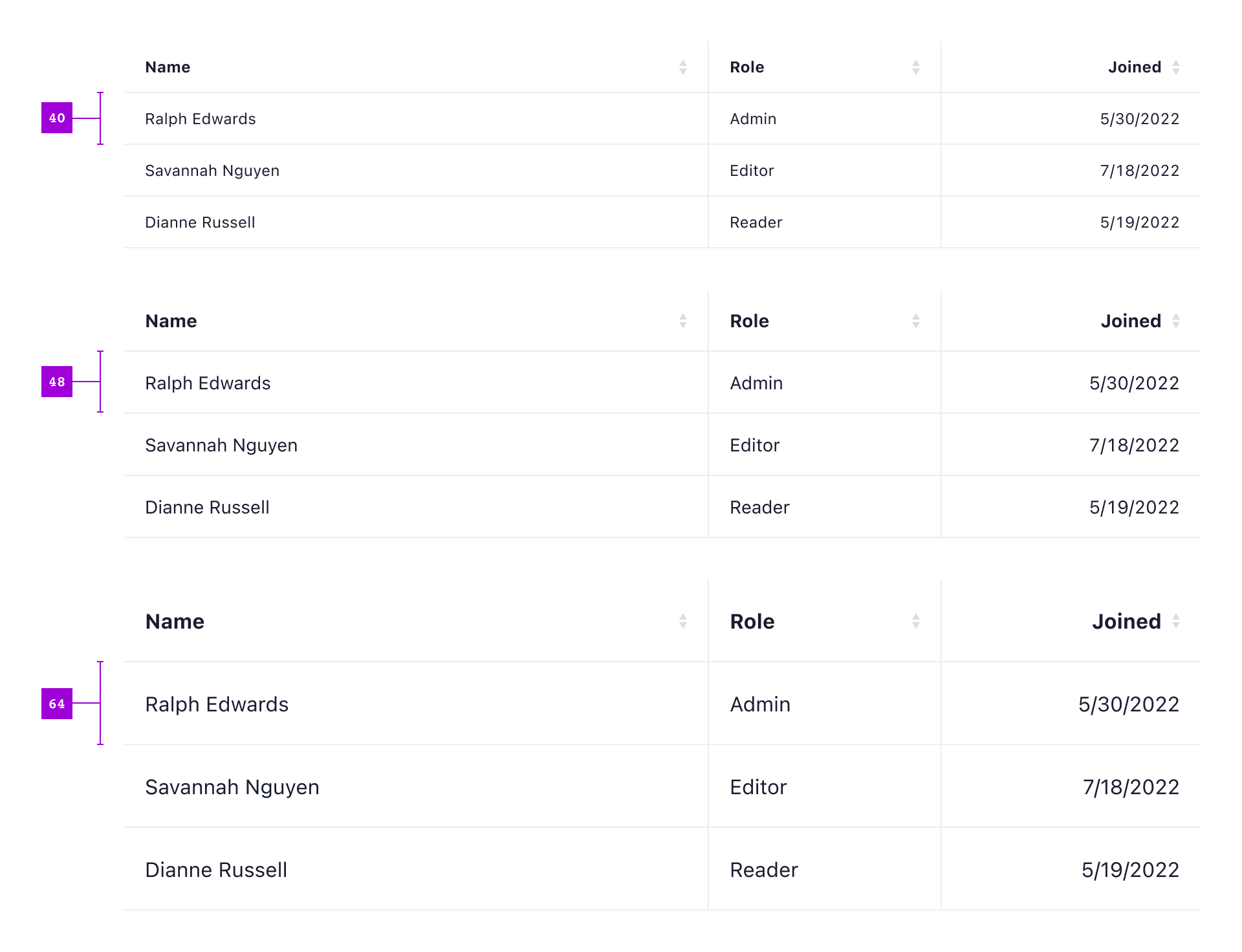
The table headers should always match the size of rows in the table body.
Column structure
Tables should use the available column types in the recommended order:
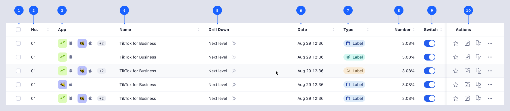
- 1 Selectable column
- 2 Counter column (Eg. ID)
- 3 Apps column
- 4 Text column (Eg. Report names in a report list)
- 5 Drilldown column (Eg. Lower campaign levels)
- 6 Date column
- 7 Status and type column
- 8 Number column (Eg. Metrics)
- 9 Switch control
- 10 Actions column
Selectable
Selectable columns contain checkboxes to select items from a list for bulk actions, or radio buttons for specific actions. It is only used when selection is needed and must be the first column of the table.
Counter
Counter columns show the row number or the ID of a list object. They must be at the start of the table for context.
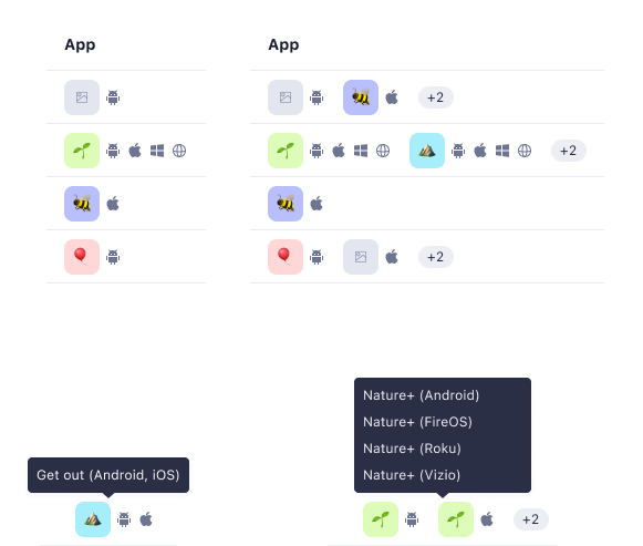
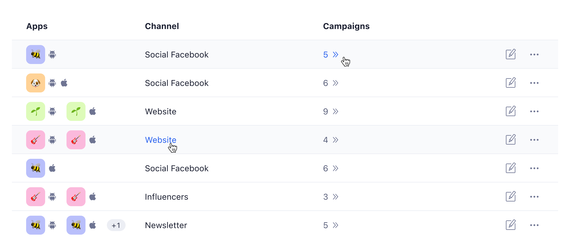
Apps
Data in Adjust is often created in context of one or multiple apps. It is recommended to place it at the start of the table after the selectable and counter columns.
The apps column displays up to 2 apps icons and the corresponding platform icons for context of the row content. The number of additional apps is displayed in a badge. On hover, a tooltip shows all apps and platforms from that cell. The minimum width of the column must account for the number of apps supported in that list and the platforms of each app.
Text
Any columns containing text content. They should be the next columns after the context of counters and apps, as they provide the name of a list object and their primary data. This type of column can also include badge components for temporary status or errors. If the list has a persistent status, it should use a status column instead.

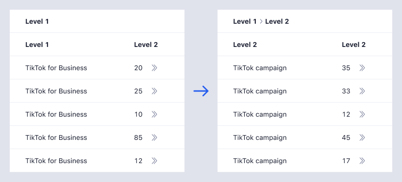
Drilldown
Allows users to view additional data when viewing multi-level data. This column type is different from nested tables. This type represents two or more connected tables.
Using this column will add a level toolbar on top of the table to let users navigate easily between different tables. New levels are revealed on further drilldown.
The column width is based on content type (Eg. numbers: 120px, short texts: 300px). Use truncation with tooltips for text and mixed content.
Date
Displays date values following Date localization component guidelines. Set the column width based on the date format used. As much as possible keep the full date in a single line. If necessary, use a width that breaks the date and time in separate lines.
Status and type
Status and type columns display information that is both informative and visually distinguishable to understand the current state of the item. To achieve this, leverage the Badge component. When there are multiple status types or information types, use separate columns.
Use badges with text, with optional icons. Do not use icon-only badges. The choice of badge colors should be consistent with the designated color-coding for each status to maintain a coherent visual hierarchy within the table. In cases where multiple badges employ the same color to indicate different statuses, you should make use of distinct icons inside the badges.
Number
Number columns represent numerical content such as price, earnings, views, and other performance metrics. The text must be right-aligned and the column should accomodate the largest value from the data set without truncation.
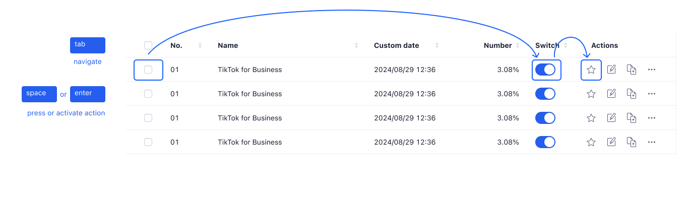
Switch
Switches can be used in a table to activate or deactivate a setting directly. Use small switches inside the table and the column header to label the switch control.
Do not group switches with other actions in an action column. Display a loading status indicator while waiting for the system to respond and change the Switch state after a successful response or keep its current state in case of a negative response. Display a toast accordingly to confirm the action or give instructions in case of an error.

If a list of items has other statuses that cannot be represented only by the switch being on and off, display these in a separate status column.
Actions
The action column is always the last column in the table and sticks to the right side of the table and contains actions that affect the row content or object. The column header must be ‘Actions.’
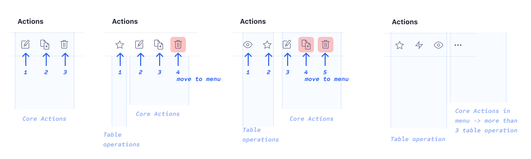
Action cells must follow the defined action order:
- Table operations (e.g., ‘Favorite,’ ‘Copy,’ etc.) should come first in order of usage.
- Core actions should follow, in the order of ‘Edit,’ ‘Duplicate,’ ‘Delete.’
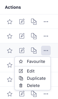
The column width is fixed to the amount of actions available. When a table cell accommodates more than three actions, up to three action buttons are displayed and the remaining actions are displayed in an overflow action menu.
The Action Menu serves as a comprehensive repository of all available actions, including the actions visible in the row, and must include an icon. A divider is used to separate different actions types.
Filters and table operations
Filter bar
To control the data shown, multiple filters can be applied. This depends on the type of table and the other data in the page.
When using Full-width tables, always use the filters in the page header.
When using a tile table, use a filter bar within the tile if the filters only affect the corresponding table content. If the filters affect the entire page across all tiles, use the filters in the page header.
Table operation bar
Operations, such as exporting data, importing data, refreshing the table, or editing columns, are located in the table operation toolbar. It is recommended to use only icon buttons to avoid clutter.
Formatting
Borders
Columns can be separated by subtle borders, which makes it easier to differentiate between cells that contain similar data. Column borders should always be used in the data table variant, but should be avoided in list table variants.
First and last column paddings
The first and last column in a table must align their content with the rest of the page or tile contents. Their padding changes according to the type of table and the screen size.
Tile tables always use a spacing-30 (24px) padding for the first and last columns to match the same padding of the tile content.
Full-width tables follow the corresponding measures:
| Screen size | First and last column padding |
|---|---|
| X-small | spacing-20 (16px) |
| Small | spacing-20 (16px) |
| Medium | spacing-30 (24px) |
| Large | spacing-40 (32px) |
| X-large | spacing-40 (32px) |
Text Alignment
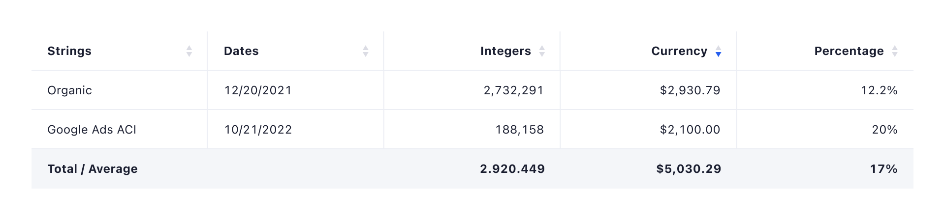
Text within table cells can be configured to be left aligned (default), or right aligned. Right aligned text should always be used for columns that exclusively contain only numbers.
Links styles
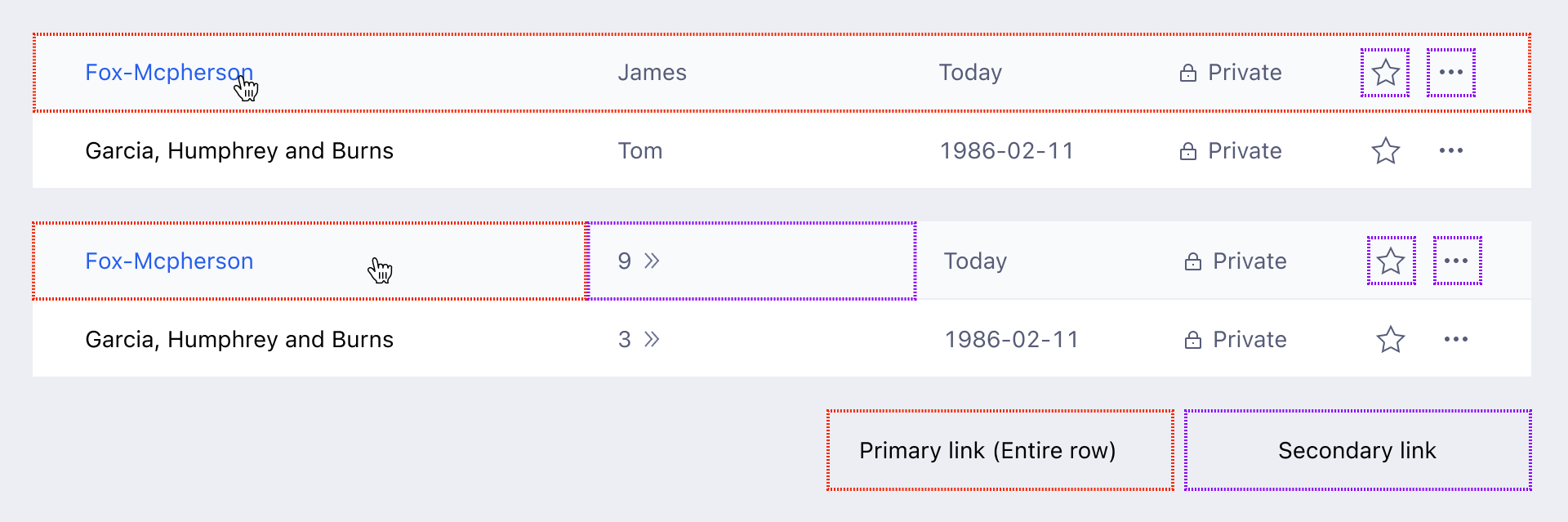
The clickable area in cells with links changes based on the number of links in the row:
- One link: Hover highlights the entire row and the link (text-link color).
- Multiple links: Hover highlights the row, but only the link's cell is clickable. This is the case when there is also a Drilldown column.
Link styles also depend on the number of links in the row.
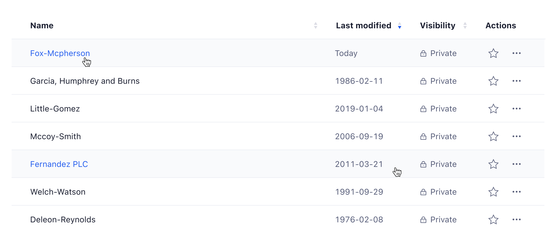 One link: Default text is black, turns blue on hover.
 Multiple links (Drilldown): Default text is black/gray, turns blue on hover (including icon).
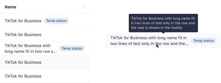
Multi Line and Truncations
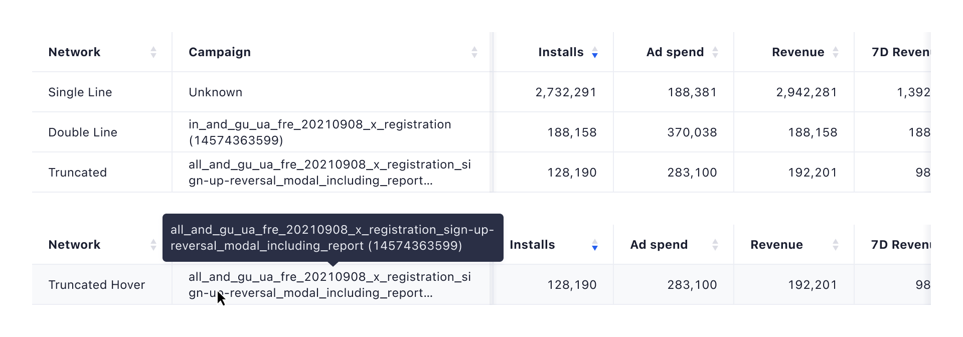
Table cells in column headers, as well as regular rows can contain text that spans over two lines of text. When there is not enough space available, or the cell content would create another line break, text is truncated and shows the full cell value on mouse over, in a tooltip.
Null or empty cell values
When a row doesn't have a value for a column, display a text showing "None" or a corresponding message. An optional tooltip can be used to inform the user why the cell value is empty.

Heatmaps
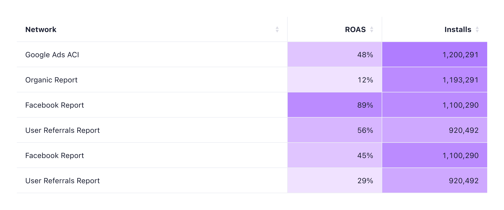
A heatmap is a graphical representation of data where the individual values contained in a matrix are represented as colors. Columns that have a heatmap applied can be scanned more quickly by the user, and can help to identify outlying data points. While heatmaps can be extremely powerful, make sure to not overuse them and only apply heatmaps when they offer some additional value.
Colors
The strength of the color is defined by the cell value. Each heatmap should have ten “color steps”, which define the alpha channel value of the color (e.g. on a possible cell value scale of 0 to 100, a value of 34 would have a background color with an opacity of 0.3).
The default heatmap color is purple, but there is a collection of other supported colors available:
| Token | Color |
|---|---|
heatmap-1 | #C19CFF |
heatmap-2 | #94ACFF |
heatmap-3 | #57B9F0 |
heatmap-4 | #4EC8C0 |
heatmap-5 | #6FC284 |
heatmap-6 | #A2C86D |
heatmap-7 | #C0C840 |
heatmap-8 | #F9BD33 |
heatmap-9 | #F5A167 |
heatmap-10 | #FF8F8F |
heatmap-11 | #D9A6C1 |
heatmap-12 | #D1A591 |
Behaviors
Hover

A row hover state helps users to visually scan the columns of data in a row.
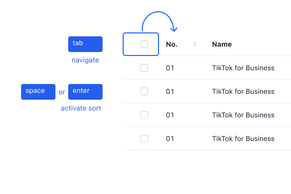
Sorting

Columns can be sorted in ascending or descending order. Sorting controls are located in the column headers and indicated with an arrow icon that changes based on the currently applied sorting mode.
Column Action
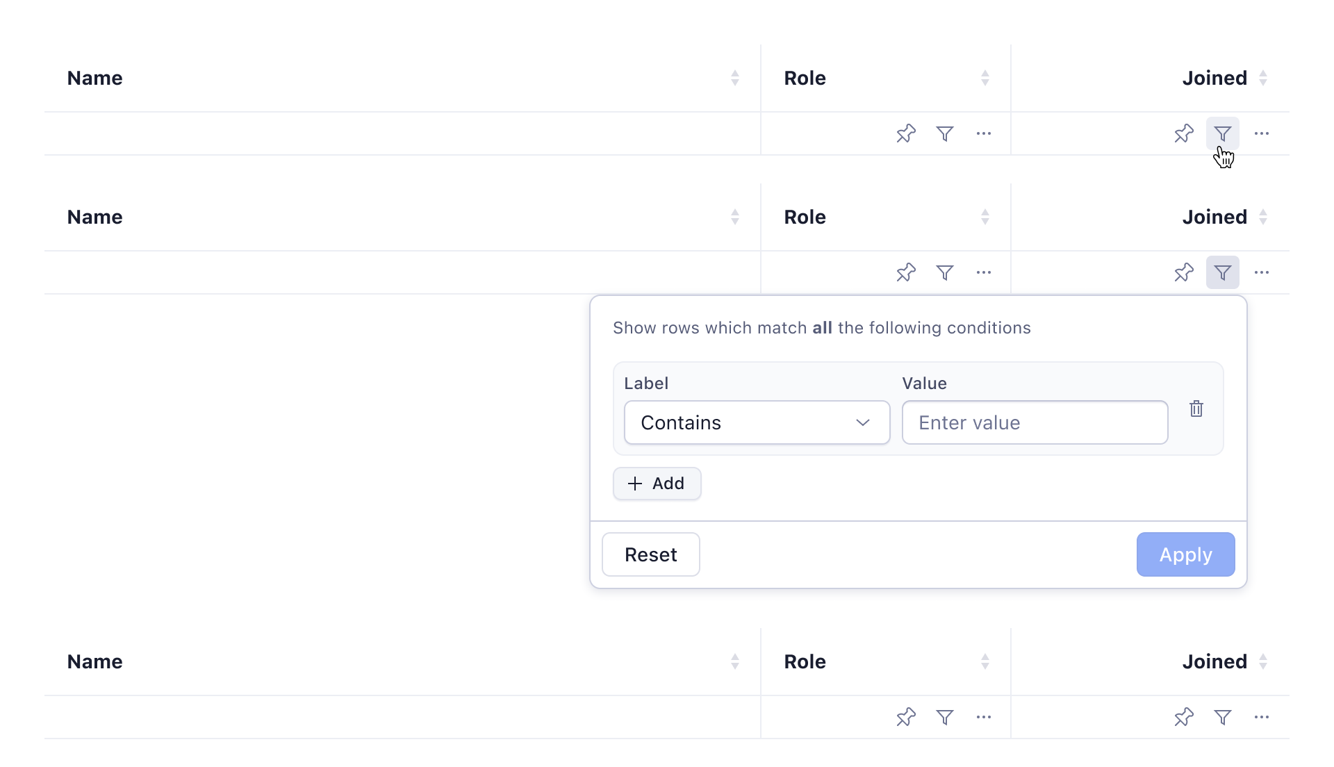
Column headers can contain one Icon Button to perform actions related to the columns data. These actions could be: filter the column data via a filter popover, quick action to remove the column, or edit the column title.
Column definition
Tooltips provide additional context for column headers:
- Delayed tooltips appear on mouse hover without a dotted underline.
- The tooltip title should match the full header title, followed by a description in caption text.
- Use 'top' orientation for tooltips.
Resizing Columns
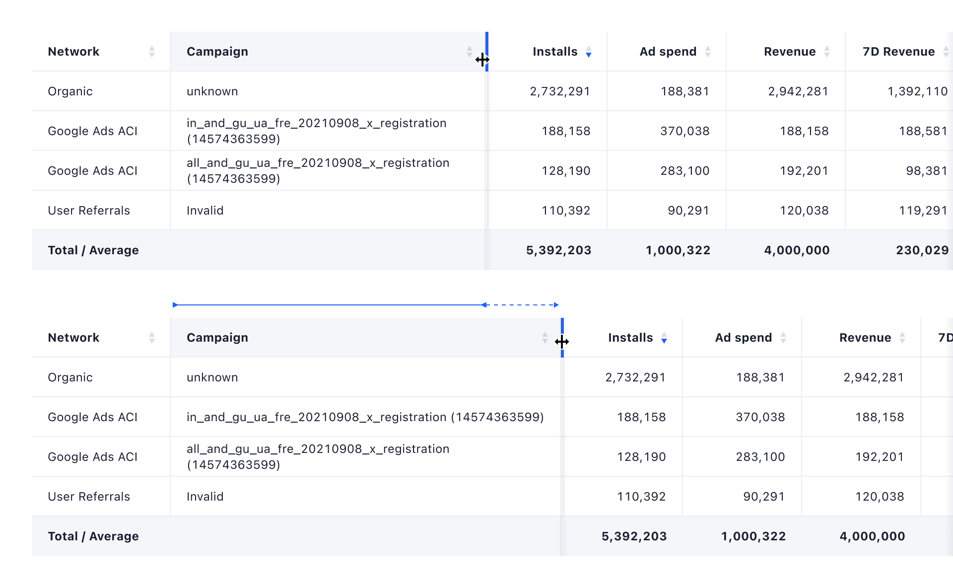
Columns can be set up to be resizable by the user. When resizing is enabled, moving the mouse cursor over the right border of a column header will show a resize drag handler.
Reorder Columns
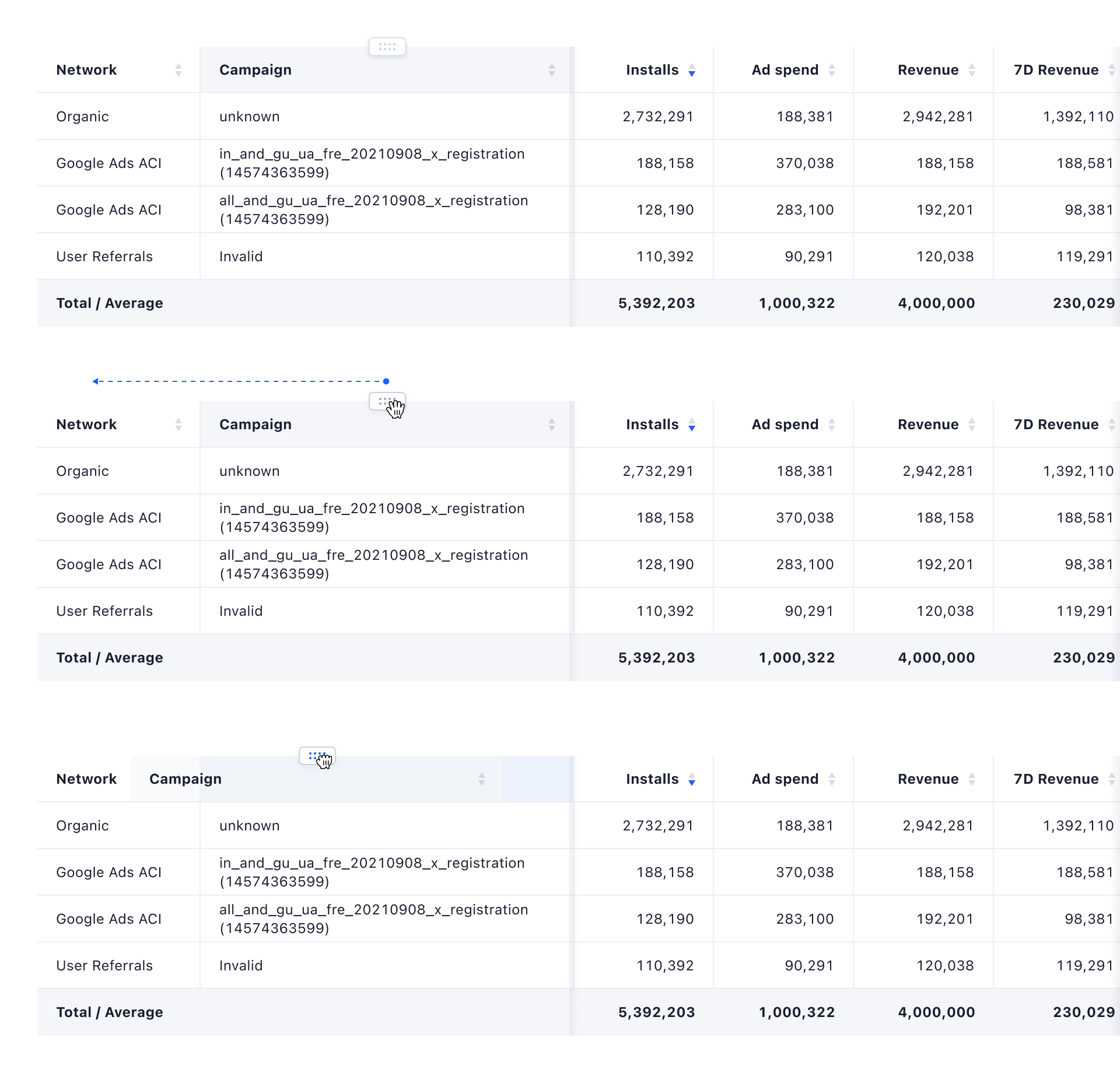
Columns can be set up to be moveable. When reordering columns is enabled, moving the mouse cursor over a column header will show a drag handler, which can be used to move the columns within the table. Columns can only be dragged within their designated area: when moving a column that is located inside a sticky column group, the column can only be moved within that group.
Scrolling
The scroll should only be within the table's content area, keeping the table header, filter bar, and toolbar sticky to the top.
Loading
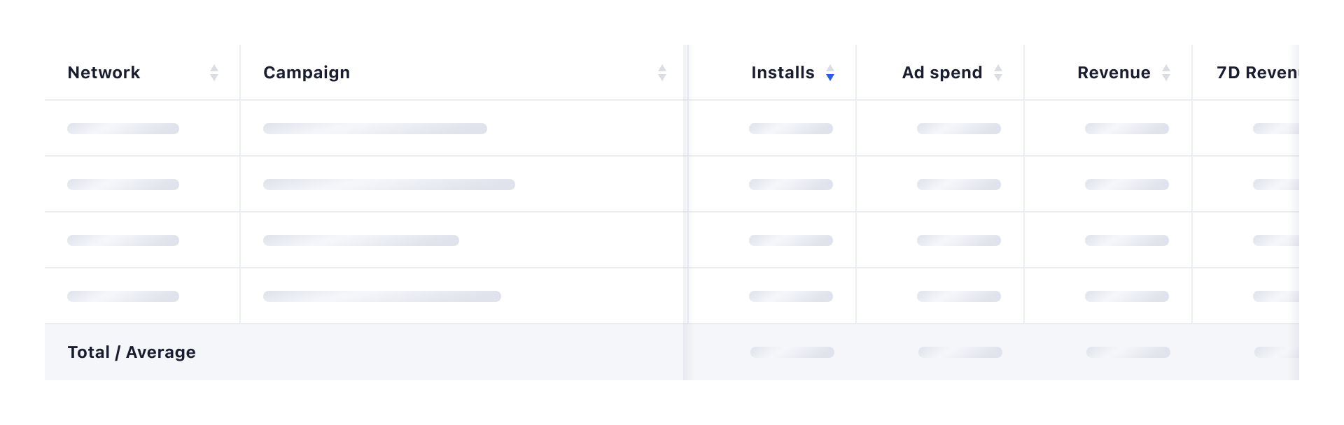
When a table can already be rendered (columns are known), but the data is not available yet, the table rows are shown with randomly distributed skeleton loaders. Skeleton loaders are then replaced with the data once available.
Empty State
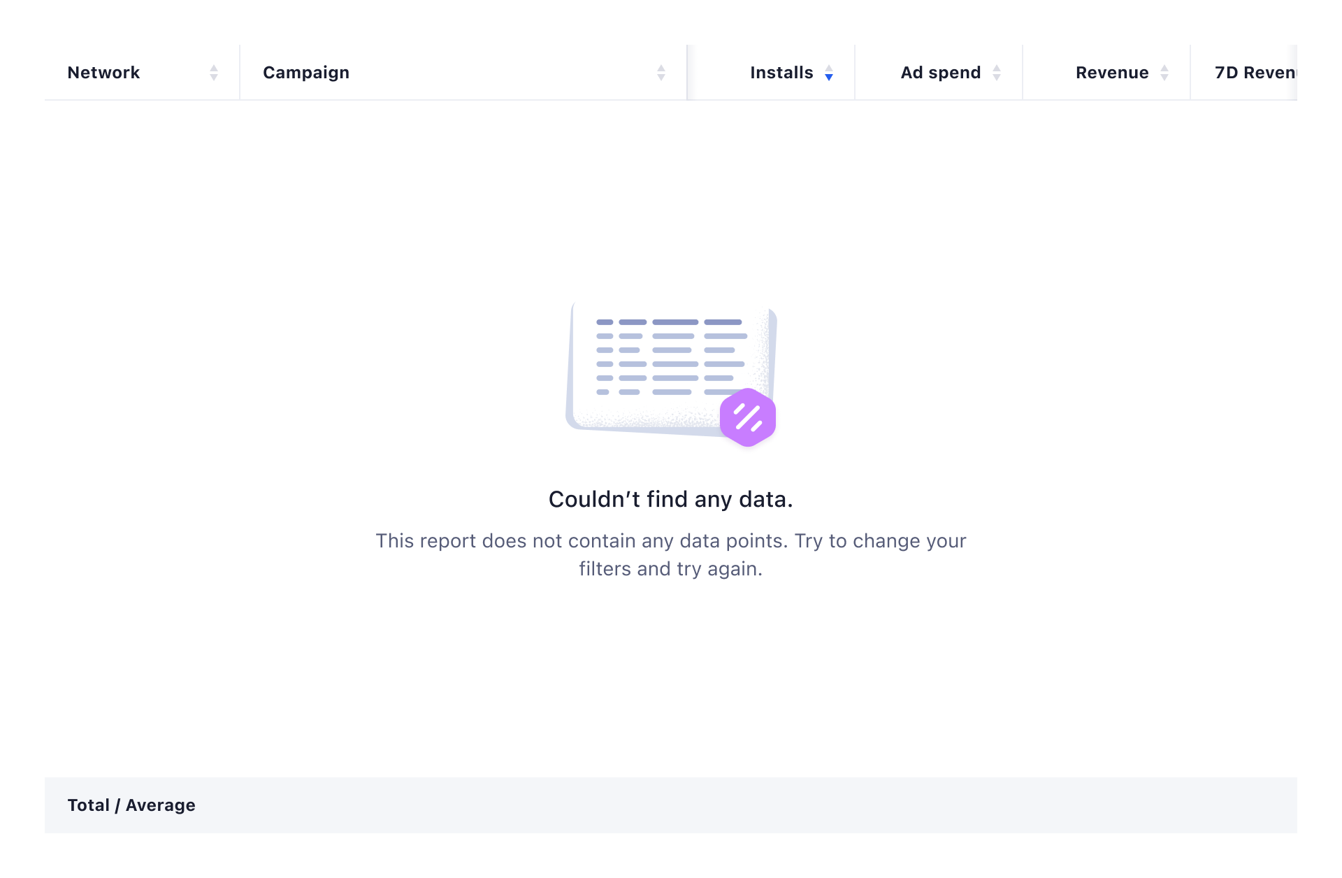
When there is no data available to be shown, the table body should contain an Empty State. The Empty State should use the related illustration (no data because set filters aren’t matching any data points, no data at all, or various errors) and communicate why there is no data showing up. To find out more about Empty States, head over to the patterns page.
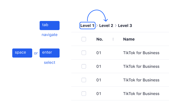
Accessibility and keyboard navigation
Tables use keyboard operations for improving the experience of blind users and others who operate via the keyboard.
Keyboard operations primarily use tab, enabling users to navigate and space, enter keys enabling users to select, and interact with table elements without relying on a mouse. Each press changes the focus showing with a blue rectangle. This approach is especially beneficial for users with mobility impairments or hand tremors, as it allows them to keep their fingers steady on a limited set of keys, enhancing accessibility and ease of use.