Icons
Atlas’ own UI icon set gives the team full control over the visual style to match the UI design language and allows for any custom icon which may not be found in third-party icon sets.
Core Features
Variable Stroke Width
All Atlas UI Icons are drawn with 1px wide strokes but we preserved the ability to change the stroke width through a property. There are two pre-defined weights: thin (1px) and grid (2px).
<>
  <Icon name="Check" weight="thin" />
  <Icon name="Check" weight="bold" />
</>
Variable Size
Each icon is drawn in two variants:
- small (16px canvas) — These are really small icons, eg. to use inside small or medium sized buttons. They are so small that most icons will not be properly readable when set to bold.
- medium (24px canvas) — Most of these icons have a bit more detail than their small variants and they all work equally well in thin and bold.
- And additionally: large (32px canvas) — These are the medium-sized icon variants, scaled up to 32px.
<>
  <Icon name="CogWheel" size="small" />
  <Icon name="CogWheel" size="medium" />
  <Icon name="CogWheel" size="large" />
</>
Variable Stroke or Fill Color
Atlas UI Icons are monochrome — but they can have any design token color:
<Icon name="CogWheel" size="large" color="ColorPrimary80" />
Browse the Icon Set
You can see the whole Atlas Icon set on the Icon component page.
Getting Started
Make sure you have access to the Atlas repository on GitHub. Check out the code and create a new branch to add your changes. You will mostly work inside the directory packages/components/src/Icon.
Guidelines
Atlas Icons are exported as SVG files. This means that the browser reads the SVG code and renders the icons while it renders the page. This has the advantage of being able to resize and color icons without the need to export a countless number of images for all possible variations. However, this means that the SVG files need careful preparation in order to render exactly as intended.
Grid
By drawing onto the pixel grid, the icons render crisp and are clearly readable. The guides for key shapes help to balance size and proportion.
- Atlas Icons are drawn precisely onto the pixel grid (16px and 24px).
- Objects are aligned to the key shape guides (in the Illustrator file).
- Objects do not extend into the safety padding unless needed for optical correction.
Drawing Vectors
Draw precisely and produce tidy files to avoid unexpected rendering issues:
- Set all lines to center (when we dynamically change the stroke width, the lines grow equally in all directions).
- Set all line caps to straight.
- Never set corners to rounded.
- Manually draw rounded corners with curves instead of using rounded corners (to keep the same appearance when we scale an icon).
- There are two border radii: 0.5px (on the 16px canvas) and 1px (on the 24px canvas).
- Combine all overlapping shapes (boolean operations, eg. via Pathfinder palette in Illustrator)
- Do not use masks (apply them to create simple shapes)
- Apply all transforms like eg. skew or rotate
- In general: apply all non-destructive operations, make sure that your drawing only consists of very simple paths and shapes
- Clean up anchor points, set them to full or half decimal points to render 1px wide strokes which are aligned perfectly to the pixel grid
- Delete any anchor point which you do not really need
Style
All Atlas UI Icons share the same visual style. Follow the instructions below to keep any new icon you may add consistent with the whole set.
Lines & Corners
- Draw with outlines instead of solid shapes (although there are a few exceptions).
- Always set line caps to straight, never rounded.
- Set rounded corners to either 1px or 0.5px border radius (use the Corners Dialog from Illustrator’s Life Corners feature).
- Do not apply rounded corners everywhere but only where it makes sense.
- Always apply straight conrners to arrows and similar objects.
Composition
- All icons of the same size aim for the same level of complexity.
- Small icon variants may have less detail than medium-sized variants.
- All icons aim for the same relative size so that no individual icon stands out from the rest of the set.
- Common shapes are placed and sized according to the key shapes guides in the Illustrator and Sketch files.
Character
- Atlas Icons are rather neutral and geometric than cute and organic.
- They are minimalistic and use just enough detail to be recognizeable.
From Illustrator to Sketch
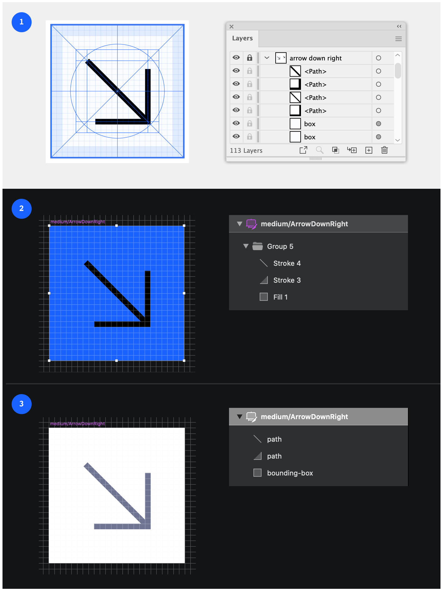
To copy icons from Illustrator to the Ui Icons.sketch file, please follow this checklist:
- Illustrator: select all objects on the artboard, including the positioning aid layer box and copy to clipboard 1
- Sketch: duplicate an icon artboard on the symbols page, rename it accordingly and paste your drawing
- Sketch: make sure the positioning aid is correctly positioned at y:0, x:0 2
- Sketch: rename the positioning aid to bounding-box (spelled exactly like this), move it to the very bottom of the symbol’s layer list and set it to no fill, no borders
- Sketch: flatten all groups, maybe rename all layers to “path” 3
- Sketch: set the default line (or fill) color to
neutral-80 - Sketch: make sure the symbol’s export settings are correct (no size, no prefix, format: SVG, artboard background color not included in export)
Handover to Development
Export icons from Figma (or Sketch) and add them via a pull request to the Atlas repository. For more detailed instructions, please see the icons readme file.
Export from Figma
Figma embeds a fixed neutral stroke or fill color in exported SVGs (for example #6E7492). Before opening a pull request, replace every shape fill and stroke with currentColor so icons inherit color from the Icon component’s color prop in product UIs.
- stroke="#6E7492"
+ stroke="currentColor"
- fill="#6E7492"
+ fill="currentColor"
Duo icons use currentColor with opacity (45% and 10%) for their secondary and tertiary shades — see the Icon readme.
Pull requests are checked automatically; invalid SVGs fail the Validate icon SVG colors CI job.